Product Updates
Set Default Organization on Dashboard
We've just shipped an update that will save unnecessary clicks (and frustration!) for those who primarily operate within Organizations. You can now set an Organization as the default destination upon logging into the DatoCMS Dashboard, instead of always being directed to your personal account.
To activate this option, simply click on the "bookmark" icon next to an Organization to make it your default account.
And don't worry, you can also switch back to your personal account or select a different Organization whenever you need to.
Environments renaming
It is now possible to change the name of existing environments, including the primary environment:
Renaming the environments does not cause work interruptions for the connected editors, and it is possible to perform this operation even using the latest version of the CLI:
npx datocms environments:rename old-name new-name
New lightweight Image component for React, Vue and Svelte
Now that both loading=lazy and aspect-ratio are broadly supported (> 93% of browsers), we are thrilled to enhance our React, Vue and Svelte SDKs by introducing a new image component that takes advantage of the browser's native capabilities!
What does it do?
The new image component:
Generates a single
<picture />element — much easier to style, no need for alayoutprop!;Implements lazy-loading using the native
loading="lazy"attribute;Sets the blur-up thumb placeholder as the background to the image itself;
Creates the smallest possible JS footprint — in the case of React, it's implemented as a server component, therefore it doesn't generate any JS and can be rendered and optionally cached on the server.
What's it called?
On React, this new image component is called <SRCImage /> to emphasize that it's a server component.
Its Vue and Svelte equivalents are both called <NakedImage />, to distinguish them from the existing <Image /> component that generates a more complex HTML output composed of multiple elements around the main <picture /> element.
What about the existing image component?
The "old" component <Image /> continues to be supported and remains relevant. Since it runs on the browser, it has the ability to set a cross-fade effect between the placeholder and the original image. It also implements lazy-loading through IntersectionObserver, which allows customization of the thresholds at which lazy loading occurs.
So in short, if you need more advanced configuration options, or need to support older browsers, the existing <Image /> continues to be the preferable solution.
Releases
For all the details, you can refer to the release page of individual npm packages:
Record titles on display when editing
We've just released a small yet nifty enhancement to the Content section. As you dive into editing a record, you'll now see the record's title displayed prominently at the top of the editing area, along with the collection's emoji if there is one. This tweak provides a clearer context as you make updates.
For those times when you need to switch from editing a record to viewing its associated model, and provided your account has the necessary permissions, just click on the menu located right next to the record title for quick access.


One-Click Field Access in Vercel Visual Editing
We've just rolled out an enhancement to our Vercel Visual Editing experience - when you click a visual editing spot on your site preview, you'll now be taken straight to the corresponding field on the record page. Exactly like this👇
It's a small update, but a big win for editors dealing with complex models, as they can skip the hassle of hunting for the right field, and get straight to work, saving time and avoiding potential errors.
Please note that Vercel Visual Editing is in beta for Pro and Enterprise Vercel customers, while it's currently available for Enterprise DatoCMS customers.
Automatic Image Optimization + Block serving raw videos
We're introducing a new "Asset CDN settings" section to the "Project settings" area, where administrators have precise control over the optimization of media assets in a project.
Automatic Image Optimization
You can now set a configuration that automatically applies imgix's powerful transformations to all image assets delivered through our CDN, without any code change.

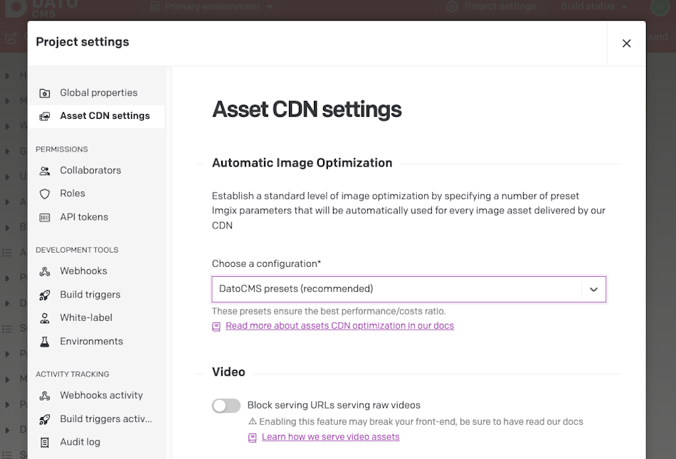
DatoCMS presets (recommended)
To simplify the developer experience, all images will be automatically fine-tuned with a curated preset of imgix parameters.
This preset handles the trade-off between image quality and compression, for an optimal user experience and reduced bandwidth usage and costs - all without touching your frontend.
This setting is the default for new DatoCMS projects.
Custom imgix parameters
If you need more control, you can customize your image delivery by applying different parameters available through imgix for compression, improvements, format, and more
We strongly recommend you read the documentation carefully before applying custom parameters, and stick with the DatoCMS presets if you have doubts.
No parameters
No parameter will be attached automatically - but you can still implement any of imgix's optimizations and transformations in your frontend code.
Block Serving Raw Videos
Administrators now have the option within the CDN settings to prevent raw video files from being served, thereby safeguarding your project against severe slowdowns and excessive bandwidth consumption. This feature is enabled by default for new projects.
Enabling this feature means that accessing a video's imgix URL will result in a Cloudflare Worker returning a 422 error. This policy supports our standard best practice of utilizing Mux for video delivery, optimizing video streaming and ensuring consistency across the platform.
A <VideoPlayer /> for everyone
We've released new <VideoPlayer /> components for React, Vue and Svelte. The component makes it straightforward to display a video from data retrieved from the GraphQL API, and acts as a wrapper around Mux's video player web component.
Given a query like this:
query {blogPost {titlecover {video {muxPlaybackIdtitlewidthheightblurUpThumb}}}}
It's possible to display the video with:
React, Next.js, Remix
import React from 'react';import { VideoPlayer } from 'react-datocms';<VideoPlayer data={data.blogPost.cover.video} />
Vue, Nuxt
import Vue from 'vue';import { DatocmsVideoPlayerPlugin } from 'vue-datocms';Vue.use(DatocmsVideoPlayerPlugin);<datocms-video-player :data="data.blogPost.video" />
Svelte, SvelteKit
import { VideoPlayer } from '@datocms/svelte';<VideoPlayer data={data.blogPost.cover.video} />
Size limit for Records
Starting March 4, 2024, we are introducing a size limit for new and updated records in the CMS. The standard limit is set to 300KB per record to ensure optimal service performance for all our customers, while allowing a smooth usage of DatoCMS across any scenario. Record size calculation includes content in nested blocks, but does not count assets and linked records.
Please note that the maximum record size allowed by your plan may exceed the default 300KB limit. To confirm whether your plan supports a larger maximum record size, check the 'Plan and Billing' section in your Account dashboard.
It is extremely unlikely to hit the record size limit. In any case, for maximum trasparency, here's what's changing:
New Records: If a new record does not comply your size limit, you will be notified on save by an error message, and you'll need to go back and trim the record to save it.
Existing Records: All existing records that are over your limit will continue to function normally. You can still access and use these records without any disruption.
If you wish to edit and save any of these oversized records, you will need to reduce the record size under your plan's limit.
This size restriction also applies when duplicating a record or attempting to revert to a previous version that surpasses your plan's maximum allowed record size.
Emoji picker 🎉
After seeing in action the new Schema Interface that we launched last week, we've decided to step 🆙 our emoji game a little more. Hence why, we've just rolled out a handy emoji picker that's available throughout DatoCMS.
You can use it to spruce up the following with some visual flair:
Models, Blocks, and Groups in the Schema section
Menu Items and Saved Filters under the Content tab
Saved Filters in the Media library
Any Fieldset within a model
Introducing Modular Content (Single Block)
We're thrilled to reveal a major upgrade to DatoCMS's schema modeling capabilities: the Single Block variant of our Modular Content, along with its Frameless display mode.
Simplified data fetching
With the Single Block variant of the Modular Content field, authors can easily insert a single block within a field.
At the same time, developers can finally retrieve just one block, rather than an array that would always contain that one block. This eliminates unnecessary complexity and clutter in your content structure, and puts an end to all the pointless [0] occurrences in your frontend code.
Reuse fields across models with "Frameless" mode
The Frameless display mode takes the Single Block variant one step further by allowing the reuse of schema between models, which is one of the most requested features in our Community.
Activating this mode hides the Modular Content field from the authoring interface, causing the inner block's fields to appear as though they are an integral part of the model.
This approach not only provides a more straightforward experience for authors but also offers an efficient solution for reusing common fields across different models without duplicating or manually synchronizing them.
A small caveat: in order to use the Frameless presentation, you will need to have only one allowed block, plus mark the field as required. If either of these conditions is not met, the block will fall back to the default "Framed block" view.
Discover more about this new feature in our docs.
Switching from single to multiple
You can also convert an existing Modular Content field from a single block to multiple blocks at any time, or vice versa.
Note that if you transition from multiple blocks to a single block, only the first block will be preserved, and the rest will be discarded. This change is irreversible, so we recommend testing it in a sandbox environment before implementation.