Quite often, a plugin needs to offer a set of configuration options to the user who installs it.
DatoCMS offers every plugin a configuration screen and a read-write object that can be used to store such settings. It is a free-form object, with no restrictions in the format. Plugins can store what they want in it, and retrieve its value anytime they need in any hook.
As the configuration parameters are completely arbitrary, it is up to the plugin itself to show the user a form through which they can be changed.
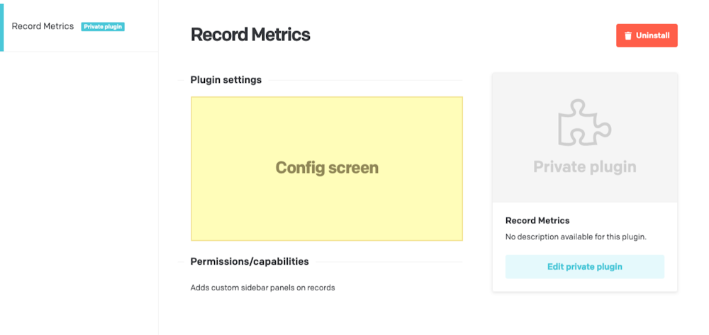
The hook provided for this purpose is called renderConfigScreen, and it will be called by DatoCMS when the user visits the details page of the installed plugin:
Implementing a simple configuration form
To give a very simple example, let's say our plugin wants to provide the end user with a simple boolean flag called debugMode. If this flag is enabled, then the plugin will display a series of debug messages in the console as it works.
The first step is to implement the renderConfigScreen hook, which will simply initialize React by rendering a custom component called ConfigScreen:
The hook, in its ctx argument, provides a series of information and methods for interacting with the main application, and for now we'll just pass the whole object to the component, in the form of a React prop:
1
import{ Canvas }from'datocms-react-ui';
2
3
type PropTypes ={
4
ctx: RenderConfigScreenCtx;
5
};
6
7
functionConfigScreen({ctx}: PropTypes){
8
return (
9
<Canvasctx={ctx}>
10
Hello from the config screen!
11
</Canvas>
12
);
13
}
Always use the canvas!
It is important to wrap the content inside the Canvas component, so that the iframe will continuously auto-adjust its size based on the content we're rendering, and to give our app the look and feel of the DatoCMS web app.
we can access the currently saved configuration object through ctx.plugin.attributes.parameters
we can call ctx.updatePluginParameters() to save a new configuration object.
Once saved, settings are always available as ctx.plugin.attributes.parameters in any of the other hooks, so that your plugin can have different behaviours based on them.
Parameters are updated in real-time
When the configuration form is saved, the parameters are persisted and propagated in real-time to all other users who are looking at the same form.
Using a form management library
If you have more complex settings, feel free to use one of the many form management libraries available for React to avoid code repetition.
We recommend react-final-form, as it works well and is quite lightweight (~8kb). Here's a more complete example using it:
This function will be called when the plugin needs to render the plugin's
configuration form.
Context object
The following properties and methods are available in the ctx argument:
Properties and methods available in every hook
Every hook available in the Plugin SDK shares the same minumum set of properties and
methods.
Authentication properties
Information about the current user using the CMS.
ctx.currentUser: User | SsoUser | Account | Organization The current DatoCMS user. It can either be the owner or one of the
collaborators (regular or SSO).
The current DatoCMS user. It can either be the owner or one of the
collaborators (regular or SSO).
ctx.currentUserAccessToken: string | undefined The access token to perform API calls on behalf of the current user. Only
available if currentUserAccessToken additional permission is granted.
The access token to perform API calls on behalf of the current user. Only
available if currentUserAccessToken additional permission is granted.
These methods can be used to open custom dialogs/confirmation panels.
ctx.openModal(modal: Modal) => Promise<unknown> Opens a custom modal. Returns a promise resolved with what the modal itself
returns calling the resolve() function.
Opens a custom modal. Returns a promise resolved with what the modal itself
returns calling the resolve() function.
ctx.openConfirm(options: ConfirmOptions) => Promise<unknown> Opens a UI-consistent confirmation dialog. Returns a promise resolved with
the value of the choice made by the user.
Opens a UI-consistent confirmation dialog. Returns a promise resolved with
the value of the choice made by the user.
'Lorem Ipsum is simply dummy text of the printing and typesetting industry',
5
choices: [
6
{
7
label:'Positive',
8
value:'positive',
9
intent:'positive',
10
},
11
{
12
label:'Negative',
13
value:'negative',
14
intent:'negative',
15
},
16
],
17
cancel:{
18
label:'Cancel',
19
value:false,
20
},
21
});
22
23
if (result) {
24
ctx.notice(`Success! ${result}`);
25
}else{
26
ctx.alert('Cancelled!');
27
}
Entity repos properties
These properties provide access to "entity repos", that is, the collection of
resources of a particular type that have been loaded by the CMS up to this
moment. The entity repos are objects, indexed by the ID of the entity itself.
ctx.itemTypes: Partial<Record<string, ItemType>> All the models of the current DatoCMS project, indexed by ID.
All the models of the current DatoCMS project, indexed by ID.
ctx.fields: Partial<Record<string, Field>> All the fields currently loaded for the current DatoCMS project, indexed by
ID. If some fields you need are not present, use the loadItemTypeFields
function to load them.
All the fields currently loaded for the current DatoCMS project, indexed by
ID. If some fields you need are not present, use the loadItemTypeFields
function to load them.
ctx.fieldsets: Partial<Record<string, Fieldset>> All the fieldsets currently loaded for the current DatoCMS project, indexed
by ID. If some fields you need are not present, use the
loadItemTypeFieldsets function to load them.
All the fieldsets currently loaded for the current DatoCMS project, indexed
by ID. If some fields you need are not present, use the
loadItemTypeFieldsets function to load them.
ctx.users: Partial<Record<string, User>> All the regular users currently loaded for the current DatoCMS project,
indexed by ID. It will always contain the current user. If some users you
need are not present, use the loadUsers function to load them.
All the regular users currently loaded for the current DatoCMS project,
indexed by ID. It will always contain the current user. If some users you
need are not present, use the loadUsers function to load them.
ctx.ssoUsers: Partial<Record<string, SsoUser>> All the SSO users currently loaded for the current DatoCMS project, indexed
by ID. It will always contain the current user. If some users you need are
not present, use the loadSsoUsers function to load them.
All the SSO users currently loaded for the current DatoCMS project, indexed
by ID. It will always contain the current user. If some users you need are
not present, use the loadSsoUsers function to load them.
These methods let you open the standard DatoCMS dialogs needed to interact
with records.
ctx.createNewItem(itemTypeId: string) => Promise<Item | null> Opens a dialog for creating a new record. It returns a promise resolved
with the newly created record or null if the user closes the dialog
without creating anything.
Opens a dialog for creating a new record. It returns a promise resolved
with the newly created record or null if the user closes the dialog
without creating anything.
const itemTypeId =prompt('Please insert a model ID:');
2
3
const item =await ctx.createNewItem(itemTypeId);
4
5
if (item) {
6
ctx.notice(`Success! ${item.id}`);
7
}else{
8
ctx.alert('Closed!');
9
}
ctx.selectItem Opens a dialog for selecting one (or multiple) record(s) from a list of
existing records of type itemTypeId. It returns a promise resolved with
the selected record(s), or null if the user closes the dialog without
choosing any record.
Opens a dialog for selecting one (or multiple) record(s) from a list of
existing records of type itemTypeId. It returns a promise resolved with
the selected record(s), or null if the user closes the dialog without
choosing any record.
ctx.editItem(itemId: string) => Promise<Item | null> Opens a dialog for editing an existing record. It returns a promise
resolved with the edited record, or null if the user closes the dialog
without persisting any change.
Opens a dialog for editing an existing record. It returns a promise
resolved with the edited record, or null if the user closes the dialog
without persisting any change.
const itemId =prompt('Please insert a record ID:');
2
3
const item =await ctx.editItem(itemId);
4
5
if (item) {
6
ctx.notice(`Success! ${item.id}`);
7
}else{
8
ctx.alert('Closed!');
9
}
Load data methods
These methods can be used to asyncronously load additional information your
plugin needs to work.
ctx.loadItemTypeFields(itemTypeId: string) => Promise<Field[]> Loads all the fields for a specific model (or block). Fields will be
returned and will also be available in the the fields property.
Loads all the fields for a specific model (or block). Fields will be
returned and will also be available in the the fields property.
ctx.loadItemTypeFieldsets(itemTypeId: string) => Promise<Fieldset[]> Loads all the fieldsets for a specific model (or block). Fieldsets will be
returned and will also be available in the the fieldsets property.
Loads all the fieldsets for a specific model (or block). Fieldsets will be
returned and will also be available in the the fieldsets property.
ctx.loadFieldsUsingPlugin() => Promise<Field[]> Loads all the fields in the project that are currently using the plugin for
one of its manual field extensions.
Loads all the fields in the project that are currently using the plugin for
one of its manual field extensions.
ctx.cdaEndpointUrl: string The URL of the Content Delivery API (GraphQL) endpoint for the current
project and environment.
In the vast majority of cases you don't need this: the CDA endpoint is at a
well-known, stable URL. It's exposed here only to support DatoCMS internal
testing against non-production environments (e.g. staging).
The URL of the Content Delivery API (GraphQL) endpoint for the current
project and environment.
In the vast majority of cases you don't need this: the CDA endpoint is at a
well-known, stable URL. It's exposed here only to support DatoCMS internal
testing against non-production environments (e.g. staging).
ctx.cmaBaseUrl: string The base URL of the Content Management API.
In the vast majority of cases you don't need this: the CMA lives at a
well-known, stable URL. It's exposed here only to support DatoCMS internal
testing against non-production environments (e.g. staging).
The base URL of the Content Management API.
In the vast majority of cases you don't need this: the CMA lives at a
well-known, stable URL. It's exposed here only to support DatoCMS internal
testing against non-production environments (e.g. staging).
ctx.cssDesignTokens: CssDesignTokens Semantic color tokens for the current DatoCMS project, pre-computed by
the host. A map of CSS custom property names (e.g.
--color--raised--surface) to their resolved values for the current
color scheme.
Semantic color tokens for the current DatoCMS project, pre-computed by
the host. A map of CSS custom property names (e.g.
--color--raised--surface) to their resolved values for the current
color scheme.
ctx.colorScheme: 'light' | 'dark' The appearance color scheme the host CMS is currently using. Resolved —
'system' is already expanded to 'light' or 'dark' by the host.
The SDK runtime reflects this onto document.documentElement two ways:
the data-color-scheme="light" / data-color-scheme="dark" attribute,
so plugin CSS can branch with [data-color-scheme="dark"] { … }
selectors; and the actual color-scheme CSS property, so light-dark()
resolves to the correct branch (and native form controls / scrollbars
match) everywhere in the plugin frame. For non-CSS decisions (choosing a
logo asset, a syntax-highlighting preset, …) branch on ctx.colorScheme
directly.
The appearance color scheme the host CMS is currently using. Resolved —
'system' is already expanded to 'light' or 'dark' by the host.
The SDK runtime reflects this onto document.documentElement two ways:
the data-color-scheme="light" / data-color-scheme="dark" attribute,
so plugin CSS can branch with [data-color-scheme="dark"] { … }
selectors; and the actual color-scheme CSS property, so light-dark()
resolves to the correct branch (and native form controls / scrollbars
match) everywhere in the plugin frame. For non-CSS decisions (choosing a
logo asset, a syntax-highlighting preset, …) branch on ctx.colorScheme
directly.
A number of methods that you can use to control the size of the plugin frame.
ctx.startAutoResizer() => void Listens for DOM changes and automatically calls setHeight when it detects
a change. If you're using datocms-react-ui package, the ``
component already takes care of calling this method for you.
Listens for DOM changes and automatically calls setHeight when it detects
a change. If you're using datocms-react-ui package, the <Canvas />
component already takes care of calling this method for you.
ctx.updateHeight(newHeight?: number) => void Triggers a change in the size of the iframe. If you don't explicitely pass
a newHeight it will be automatically calculated using the iframe content
at the moment.
Triggers a change in the size of the iframe. If you don't explicitely pass
a newHeight it will be automatically calculated using the iframe content
at the moment.
These methods can be used to update both plugin parameters and manual field
extensions configuration.
ctx.updatePluginParameters(params: Record<string, unknown>) => Promise<void> Updates the plugin parameters.
Always check ctx.currentRole.meta.final_permissions.can_edit_schema
before calling this, as the user might not have the permission to perform
the operation.
Updates the plugin parameters.
Always check ctx.currentRole.meta.final_permissions.can_edit_schema
before calling this, as the user might not have the permission to perform
the operation.
ctx.updateFieldAppearance(...) Performs changes in the appearance of a field. You can install/remove a
manual field extension, or tweak their parameters. If multiple changes are
passed, they will be applied sequencially.
Always check ctx.currentRole.meta.final_permissions.can_edit_schema
before calling this, as the user might not have the permission to perform
the operation.
Performs changes in the appearance of a field. You can install/remove a
manual field extension, or tweak their parameters. If multiple changes are
passed, they will be applied sequencially.
Always check ctx.currentRole.meta.final_permissions.can_edit_schema
before calling this, as the user might not have the permission to perform
the operation.
ctx.notice(`Successfully edited field ${field.attributes.api_key}`);
36
}
Upload dialog methods
These methods let you open the standard DatoCMS dialogs needed to interact
with Media Area assets.
ctx.selectUpload Opens a dialog for selecting one (or multiple) existing asset(s). It
returns a promise resolved with the selected asset(s), or null if the
user closes the dialog without selecting any upload.
Opens a dialog for selecting one (or multiple) existing asset(s). It
returns a promise resolved with the selected asset(s), or null if the
user closes the dialog without selecting any upload.
ctx.editUpload(...) Opens a dialog for editing a Media Area asset. It returns a promise
resolved with:
The updated asset, if the user persists some changes to the asset itself
null, if the user closes the dialog without persisting any change
An asset structure with an additional deleted property set to true, if
the user deletes the asset.
Opens a dialog for editing a Media Area asset. It returns a promise
resolved with:
The updated asset, if the user persists some changes to the asset itself
null, if the user closes the dialog without persisting any change
An asset structure with an additional deleted property set to true, if
the user deletes the asset.
const uploadId =prompt('Please insert an asset ID:');
2
3
const item =await ctx.editUpload(uploadId);
4
5
if (item) {
6
ctx.notice(`Success! ${item.id}`);
7
}else{
8
ctx.alert('Closed!');
9
}
ctx.editUploadMetadata(...) Opens a dialog for editing a "single asset" field structure. It returns a
promise resolved with the updated structure, or null if the user closes
the dialog without persisting any change.
Opens a dialog for editing a "single asset" field structure. It returns a
promise resolved with the updated structure, or null if the user closes
the dialog without persisting any change.