Sidebars and sidebar panels
Through plugins it is possible to customize the standard sidebars that DatoCMS offers when editing a record or an asset in the Media Area.
Sidebars vs Sidebar Panels
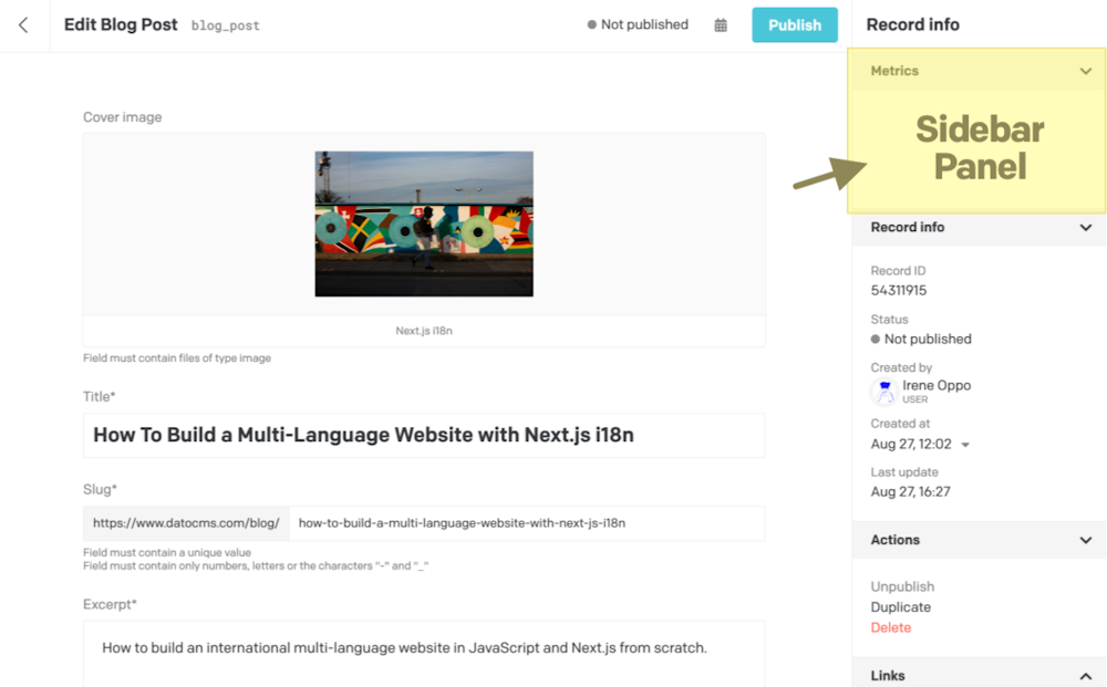
The SDK offers two ways to customize the sidebar interface. You can either add new collapsible panels to the default sidebar:
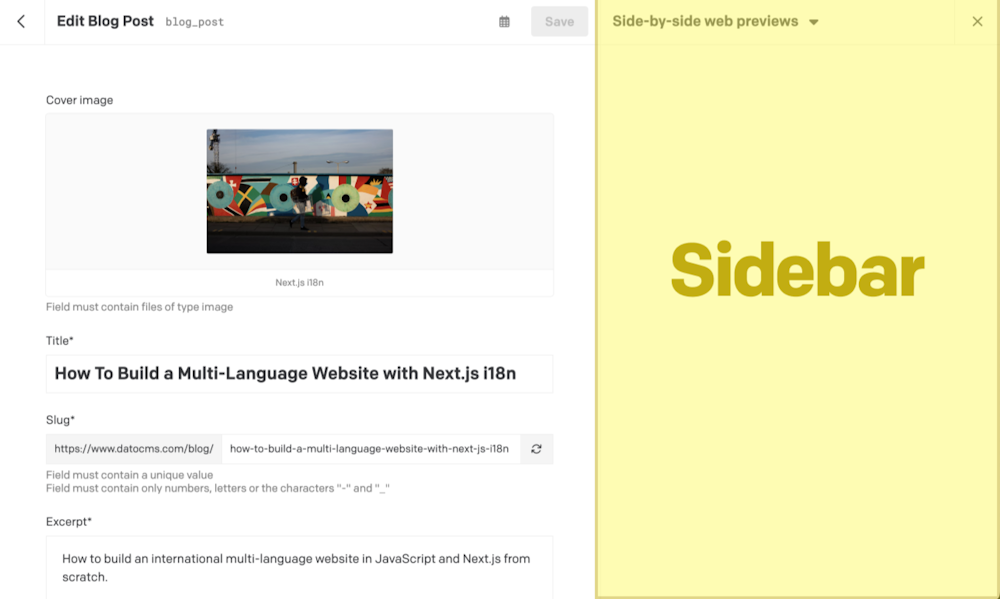
Or offer complete alternative sidebars, as in the example below:
Depending on the size of the content you need to display, you can choose one or the other. Or even offer both. You can take a look at a real-world example of both sidebars and sidebar panels in the Web Previews plugin.
Inside sidebars and sidebar panels, the plugin developer can render what they prefer, while also having the possibility to:
access a series of information relating to the record that's being edited, the project in which the plugin is installed or the logged-in user;
make calls to DatoCMS to produce various effects and interact with the main application (changing form values, navigating to other pages, triggering notifications, opening modals, etc.);
Implementing a Sidebar Panel
Let's say we want to create a sidebar panel that will show a link pointing to the website page related to the record we're editing.
The first step is to implement the itemFormSidebarPanels hook, to declare our intent to add the panel to the sidebar:
1import { connect, ItemFormSidebarPanelsCtx } from 'datocms-plugin-sdk';2
3connect({4  itemFormSidebarPanels(model: ItemType, ctx: ItemFormSidebarPanelsCtx) {5    return [6      {7        id: 'firstPanel',8        label: 'First panel',9        startOpen: true,10        placement: ['before', 'info'], // Where to place it relative to our default panels11        rank: 1 // Tiebreaker if two panels have the same `placement` value. Must be >= 1. Lower values are visually higher up.12      },13      {14        id: 'secondPanel',15        label: 'Second Panel',16        startOpen: true,17        placement: ['before', 'info'],18        rank: 219      },20    ];21  },22});
The code above will add a panel to every record in our project... but maybe not every record in DatoCMS has a specific page in the final website, right?
It might be better to add some settings to our plugin to let the final user declare the set of models that have permalinks, and the relative URL structure enforced on the frontend:
1itemFormSidebarPanels(model: ItemType, ctx: ItemFormSidebarPanelsCtx) {2  const { permalinksByModel } = ctx.plugin.attributes.parameters;3
4  // Assuming we're saving user preferences in this format:5  // {6  //   'blog_post': '/blog/:slug',7  //   'author': '/author/:slug',8  //   ...9  // }10  }11
12  if (!permalinksByModel[model.attributes.api_key]) {13    // Don't add the panel!14    return [];15  }16
17  // Add the panel!18}
Rendering the panel
The final step is to actually render the panel itself by implementing the renderItemFormSidebarPanel hook.
Inside of this hook we initialize React and render a custom component called GoToWebsiteItemFormSidebarPanel, passing down as a prop the second ctx argument, which provides a series of information and methods for interacting with the main application:
1import React from 'react';2import ReactDOM from 'react-dom';3import { connect, RenderItemFormSidebarPanelCtx } from 'datocms-plugin-sdk';4
5connect({6  renderItemFormSidebarPanel(7    sidebarPanelId,8    ctx: RenderItemFormSidebarPanelCtx,9  ) {10    ReactDOM.render(11      <React.StrictMode>12        <GoToWebsiteItemFormSidebarPanel ctx={ctx} />13      </React.StrictMode>,14      document.getElementById('root'),15    );16  },17});
A plugin might render different panels, so we can use the sidebarPanelId argument to know which one we are requested to render, and write a specific React component for each of them.
1import { Canvas } from 'datocms-react-ui';2
3type PropTypes = {4  ctx: RenderItemFormSidebarPanelCtx;5};6
7function GoToWebsiteItemFormSidebarPanel({ ctx }: PropTypes) {8 return (9 <Canvas ctx={ctx}>10 Hello from the sidebar!11 </Canvas>12 );13}It is important to wrap the content inside the Canvas component, so that the iframe will continuously auto-adjust its size based on the content we're rendering, and to give our app the look and feel of the DatoCMS web app.
All we need to do now is to actually render the link to the website, reading from ctx.formValues the slug value and generating the final frontend URL:
1import { ButtonLink } from 'datocms-react-ui';2
3function GoToWebsiteItemFormSidebarPanel({ ctx }: PropTypes) {4  if (ctx.itemStatus === 'new') {5    // we're in a record that still has not been persisted6    return <div>Please save the record first!</div>;7  }8
9  const { permalinksByModel } = ctx.plugin.attributes.parameters;10  const permalinkStructure = permalinksByModel[ctx.itemType.attributes.api_key];11  const url = permalinkStructure.replace(':slug', ctx.formValues.slug);12
13  return (14    <Canvas ctx={ctx}>15      <ButtonLink href={url} fullWidth>16        View it on the website!17      </ButtonLink>18    </Canvas>19  );20}
Controlling Sidebar Panel positioning
To control the positioning of one or more sidebar panels, you can use the placement and rank parameters of the itemFormSidebarPanels() hook:
The
placementparameter controls where your panel appears relative to the default DatoCMS panels. It accepts a two-element array like['before', 'info']or['after', 'links']:This is an optional parameter. If not defined, your custom panel will appear below all the default DatoCMS panels. This is the default behavior, and is equivalent to
placement: ['after', 'history'].To place at your panel at the top of the sidebar, above anything else, specify
placement: ['before', 'info'].If defined, the first array element must be
'before'or'after'. The second array element must be the ID of one of the default existing panels:'info','publishedVersion','schedule','links', or'history'. These correspond to the default sidebar panels of any DatoCMS record.
The
rankparameter is a tie-breaker that controls what happens when multiple custom panels have the sameplacement:This is also is an optional parameter. When not defined, an implicit
rank: 9999is assumed (which would normally place the panel towards the bottom).If defined, it must be an integer, and lower numbers are higher up visually.
0and negative integers are OK, and will be even higher up thanrank: 1.Panels with an explicit rank
>= 10000will appear below panels without any explicit rank (because unranked panels are assumed to have a rank of9999).In case of a tie, panels declared earlier in the
itemFormSidebarPanels()return array will be higher up visually.
Example:
1import { connect, ItemFormSidebarPanelsCtx } from 'datocms-plugin-sdk';2
3connect({4  itemFormSidebarPanels(model: ItemType, ctx: ItemFormSidebarPanelsCtx) {5    return [6      {7        id: 'firstPanel',8        label: 'First panel',9        startOpen: true,10        placement: ['before', 'info'], // Where to place it relative to our default panels11        rank: 1 // Tiebreaker if two panels have the same `placement` value. Lower values are visually higher up.12      },13      {14        id: 'secondPanel',15        label: 'Second Panel',16        startOpen: false,17        placement: ['before', 'info'],18        rank: 219      },20
21      // The following two panels have no explicit rank, so they'll be auto-positioned.22      {23        id: 'otherPanel1',24        label: 'otherPanel1',25        startOpen: false,26        placement: ['before', 'info'],27      },28      {29        id: 'otherPanel2',30        label: 'otherPanel2',31        startOpen: false,32        placement: ['before', 'info'],33      },34
35      // This will show up after `secondPanel` but before the rankless `otherPanels`36      {37        id: 'rankConflict',38        label: 'Another panel with Rank 2',39        startOpen: false,40        placement: ['before', 'info'],41        rank: 2 // Rank conflict with another panel; we'll auto-position it42      },43    ];44  },45});
Becomes this sidebar:

Implementing a custom Sidebar
Suppose that instead of presenting a link to a webpage, we want to embed the actual web page alongside the record. To do that we need more space than what a sidebar panel can offer, so creating a completely separate sidebar is more appropriate.
Managing sidebars is very similar to what we just did with sidebar panels. The main difference is in the way you define them. To declare our intent to add the sidebar, implement the itemFormSidebars hook:
1import { connect, ItemFormSidebarsCtx } from 'datocms-plugin-sdk';2
3connect({4  itemFormSidebars(model: ItemType, ctx: ItemFormSidebarsCtx) {5    return [6      {7        id: "sideBySidePreview",8        label: "Side-by-side preview",9        preferredWidth: 900,10      },11    ];12  },13});
With the preferredWidth, you can control the ideal width for the sidebar when it opens. Users will then be able to resize it if they want. There is one constraint though: the sidebar width cannot exceed 60% of the screen, taking up too much screen real estate. If the preferredWidth is bigger than this value, it will be capped.
Rendering the sidebar
Now, to render the sidebar itself, we can implement the renderItemFormSidebar hook.
Just like we did with the sidebar panel, we initialize React and render a custom component, passing down as a prop the second ctx argument, which provides a series of information and methods for interacting with the main application:
1import React from 'react';2import ReactDOM from 'react-dom';3import { connect, RenderItemFormSidebarCtx } from 'datocms-plugin-sdk';4
5connect({6  renderItemFormSidebar(7    sidebarId,8    ctx: RenderItemFormSidebarCtx,9  ) {10    ReactDOM.render(11      <React.StrictMode>12        <SideBySidePreviewSidebar ctx={ctx} />13      </React.StrictMode>,14      document.getElementById('root'),15    );16  },17});
A plugin might render different sidebars, so we can use the sidebarId argument to know which one we are requested to render, and write a specific React component for each of them.
In our <SideBySidePreviewSidebar> component, we can simply render an iframe pointing to the webpage, copying most of the logic from our previous sidebar panel:
1import { Canvas } from 'datocms-react-ui';2
3type PropTypes = {4  ctx: RenderItemFormSidebarCtx;5};6
7function SideBySidePreviewSidebar({ ctx }: PropTypes) {8  const { permalinksByModel } = ctx.plugin.attributes.parameters;9  const permalinkStructure = permalinksByModel[ctx.itemType.attributes.api_key];10  const url = permalinkStructure.replace(':slug', ctx.formValues.slug);11
12  return (13    <Canvas ctx={ctx}>14      <iframe src={url} />15    </Canvas>16  );17}
Asset Sidebars and Sidebar Panels
The asset sidebars and sidebar panels in the following examples requires v2.x.x or higher of the DatoCMS Plugins SDK. If you're still on v1, please upgrade before proceeding.
In addition to being able to customize the sidebars of a record, it is also possible to do the same in the detail view of an asset in the Media Area:


The implementation is absolutely similar to the one just seen. The only thing that changes is the hooks to be used:
For sidebars:
uploadSidebarsandrenderUploadSidebarFor sidebar panels:
uploadSidebarPanelsandrenderUploadSidebarPanel
Here's an example:
1import {2  connect,3  UploadSidebarPanelsCtx,4  RenderUploadSidebarPanelCtx,5  UploadSidebarsCtx,6  RenderUploadSidebarCtx7} from 'datocms-plugin-sdk';8
9connect({10  uploadSidebars(ctx: UploadSidebarsCtx) {11    return [12      {13        id: "customSidebar",14        label: "My Custom Sidebar",15        preferredWidth: 900,16      },17    ];18  },19  renderUploadSidebar(sidebarId: string, ctx: RenderUploadSidebarCtx) {20    render(<CustomSidebar ctx={ctx} />);21  },22
23  uploadSidebarPanels(ctx: UploadSidebarPanelsCtx) {24    return [25      {26        id: 'customSidebarPanel',27        label: 'Custom Sidebar Panel',28        startOpen: true,29      },30    ];31  },32  renderUploadSidebarPanel(sidebarPanelId: string, ctx: RenderUploadSidebarPanelCtx) {33    render(<CustomSidebarPanel ctx={ctx} />);34  },35});
itemFormSidebars(itemType: ItemType, ctx)
Use this function to declare new sidebar to be shown when the user edits records of a particular model.
Return value
The function must return: ItemFormSidebar[].
Context object
The following properties and methods are available in the ctx argument:
Properties and methods available in every hook
Every hook available in the Plugin SDK shares the same minumum set of properties and methods.
Authentication properties
ctx.currentUser: User | SsoUser | Account | Organization The current DatoCMS user. It can either be the owner or one of the
collaborators (regular or SSO).
ctx.currentUser: User | SsoUser | Account | Organization The current DatoCMS user. It can either be the owner or one of the
collaborators (regular or SSO). The current DatoCMS user. It can either be the owner or one of the collaborators (regular or SSO).
ctx.currentRole: Role The role for the current DatoCMS user.
ctx.currentRole: Role The role for the current DatoCMS user. The role for the current DatoCMS user.
ctx.currentUserAccessToken: string | undefined The access token to perform API calls on behalf of the current user. Only
available if currentUserAccessToken additional permission is granted.
ctx.currentUserAccessToken: string | undefined The access token to perform API calls on behalf of the current user. Only
available if currentUserAccessToken additional permission is granted. The access token to perform API calls on behalf of the current user. Only
available if currentUserAccessToken additional permission is granted.
Custom dialog methods
ctx.openModal(modal: Modal) => Promise<unknown> Opens a custom modal. Returns a promise resolved with what the modal itself
returns calling the resolve() function.
ctx.openModal(modal: Modal) => Promise<unknown> Opens a custom modal. Returns a promise resolved with what the modal itself
returns calling the resolve() function. Opens a custom modal. Returns a promise resolved with what the modal itself
returns calling the resolve() function.
1const result = await ctx.openModal({2  id: 'regular',3  title: 'Custom title!',4  width: 'l',5  parameters: { foo: 'bar' },6});7
8if (result) {9  ctx.notice(`Success! ${JSON.stringify(result)}`);10} else {11  ctx.alert('Closed!');12}
ctx.openConfirm(options: ConfirmOptions) => Promise<unknown> Opens a UI-consistent confirmation dialog. Returns a promise resolved with
the value of the choice made by the user.
ctx.openConfirm(options: ConfirmOptions) => Promise<unknown> Opens a UI-consistent confirmation dialog. Returns a promise resolved with
the value of the choice made by the user. Opens a UI-consistent confirmation dialog. Returns a promise resolved with the value of the choice made by the user.
1const result = await ctx.openConfirm({2  title: 'Custom title',3  content:4    'Lorem Ipsum is simply dummy text of the printing and typesetting industry',5  choices: [6    {7      label: 'Positive',8      value: 'positive',9      intent: 'positive',10    },11    {12      label: 'Negative',13      value: 'negative',14      intent: 'negative',15    },16  ],17  cancel: {18    label: 'Cancel',19    value: false,20  },21});22
23if (result) {24  ctx.notice(`Success! ${result}`);25} else {26  ctx.alert('Cancelled!');27}
Entity repos properties
ctx.itemTypes: Partial<Record<string, ItemType>> All the models of the current DatoCMS project, indexed by ID.
ctx.itemTypes: Partial<Record<string, ItemType>> All the models of the current DatoCMS project, indexed by ID. All the models of the current DatoCMS project, indexed by ID.
ctx.fields: Partial<Record<string, Field>> All the fields currently loaded for the current DatoCMS project, indexed by
ID. If some fields you need are not present, use the loadItemTypeFields
function to load them.
ctx.fields: Partial<Record<string, Field>> All the fields currently loaded for the current DatoCMS project, indexed by
ID. If some fields you need are not present, use the loadItemTypeFields
function to load them. All the fields currently loaded for the current DatoCMS project, indexed by
ID. If some fields you need are not present, use the loadItemTypeFields
function to load them.
ctx.fieldsets: Partial<Record<string, Fieldset>> All the fieldsets currently loaded for the current DatoCMS project, indexed
by ID. If some fields you need are not present, use the
loadItemTypeFieldsets function to load them.
ctx.fieldsets: Partial<Record<string, Fieldset>> All the fieldsets currently loaded for the current DatoCMS project, indexed
by ID. If some fields you need are not present, use the
loadItemTypeFieldsets function to load them. All the fieldsets currently loaded for the current DatoCMS project, indexed
by ID. If some fields you need are not present, use the
loadItemTypeFieldsets function to load them.
ctx.users: Partial<Record<string, User>> All the regular users currently loaded for the current DatoCMS project,
indexed by ID. It will always contain the current user. If some users you
need are not present, use the loadUsers function to load them.
ctx.users: Partial<Record<string, User>> All the regular users currently loaded for the current DatoCMS project,
indexed by ID. It will always contain the current user. If some users you
need are not present, use the loadUsers function to load them. All the regular users currently loaded for the current DatoCMS project,
indexed by ID. It will always contain the current user. If some users you
need are not present, use the loadUsers function to load them.
ctx.ssoUsers: Partial<Record<string, SsoUser>> All the SSO users currently loaded for the current DatoCMS project, indexed
by ID. It will always contain the current user. If some users you need are
not present, use the loadSsoUsers function to load them.
ctx.ssoUsers: Partial<Record<string, SsoUser>> All the SSO users currently loaded for the current DatoCMS project, indexed
by ID. It will always contain the current user. If some users you need are
not present, use the loadSsoUsers function to load them. All the SSO users currently loaded for the current DatoCMS project, indexed
by ID. It will always contain the current user. If some users you need are
not present, use the loadSsoUsers function to load them.
Item dialog methods
ctx.createNewItem(itemTypeId: string) => Promise<Item | null> Opens a dialog for creating a new record. It returns a promise resolved
with the newly created record or null if the user closes the dialog
without creating anything.
ctx.createNewItem(itemTypeId: string) => Promise<Item | null> Opens a dialog for creating a new record. It returns a promise resolved
with the newly created record or null if the user closes the dialog
without creating anything. Opens a dialog for creating a new record. It returns a promise resolved
with the newly created record or null if the user closes the dialog
without creating anything.
1const itemTypeId = prompt('Please insert a model ID:');2
3const item = await ctx.createNewItem(itemTypeId);4
5if (item) {6  ctx.notice(`Success! ${item.id}`);7} else {8  ctx.alert('Closed!');9}
ctx.selectItem Opens a dialog for selecting one (or multiple) record(s) from a list of
existing records of type itemTypeId. It returns a promise resolved with
the selected record(s), or null if the user closes the dialog without
choosing any record.
ctx.selectItem Opens a dialog for selecting one (or multiple) record(s) from a list of
existing records of type itemTypeId. It returns a promise resolved with
the selected record(s), or null if the user closes the dialog without
choosing any record. Opens a dialog for selecting one (or multiple) record(s) from a list of
existing records of type itemTypeId. It returns a promise resolved with
the selected record(s), or null if the user closes the dialog without
choosing any record.
1const itemTypeId = prompt('Please insert a model ID:');2
3const items = await ctx.selectItem(itemTypeId, { multiple: true });4
5if (items) {6  ctx.notice(`Success! ${items.map((i) => i.id).join(', ')}`);7} else {8  ctx.alert('Closed!');9}
ctx.editItem(itemId: string) => Promise<Item | null> Opens a dialog for editing an existing record. It returns a promise
resolved with the edited record, or null if the user closes the dialog
without persisting any change.
ctx.editItem(itemId: string) => Promise<Item | null> Opens a dialog for editing an existing record. It returns a promise
resolved with the edited record, or null if the user closes the dialog
without persisting any change. Opens a dialog for editing an existing record. It returns a promise
resolved with the edited record, or null if the user closes the dialog
without persisting any change.
1const itemId = prompt('Please insert a record ID:');2
3const item = await ctx.editItem(itemId);4
5if (item) {6  ctx.notice(`Success! ${item.id}`);7} else {8  ctx.alert('Closed!');9}
Load data methods
ctx.loadItemTypeFields(itemTypeId: string) => Promise<Field[]> Loads all the fields for a specific model (or block). Fields will be
returned and will also be available in the the fields property.
ctx.loadItemTypeFields(itemTypeId: string) => Promise<Field[]> Loads all the fields for a specific model (or block). Fields will be
returned and will also be available in the the fields property. Loads all the fields for a specific model (or block). Fields will be
returned and will also be available in the the fields property.
1const itemTypeId = prompt('Please insert a model ID:');2
3const fields = await ctx.loadItemTypeFields(itemTypeId);4
5ctx.notice(6  `Success! ${fields7    .map((field) => field.attributes.api_key)8    .join(', ')}`,9);
ctx.loadItemTypeFieldsets(itemTypeId: string) => Promise<Fieldset[]> Loads all the fieldsets for a specific model (or block). Fieldsets will be
returned and will also be available in the the fieldsets property.
ctx.loadItemTypeFieldsets(itemTypeId: string) => Promise<Fieldset[]> Loads all the fieldsets for a specific model (or block). Fieldsets will be
returned and will also be available in the the fieldsets property. Loads all the fieldsets for a specific model (or block). Fieldsets will be
returned and will also be available in the the fieldsets property.
1const itemTypeId = prompt('Please insert a model ID:');2
3const fieldsets = await ctx.loadItemTypeFieldsets(itemTypeId);4
5ctx.notice(6  `Success! ${fieldsets7    .map((fieldset) => fieldset.attributes.title)8    .join(', ')}`,9);
ctx.loadFieldsUsingPlugin() => Promise<Field[]> Loads all the fields in the project that are currently using the plugin for
one of its manual field extensions.
ctx.loadFieldsUsingPlugin() => Promise<Field[]> Loads all the fields in the project that are currently using the plugin for
one of its manual field extensions. Loads all the fields in the project that are currently using the plugin for one of its manual field extensions.
1const fields = await ctx.loadFieldsUsingPlugin();2
3ctx.notice(4  `Success! ${fields5    .map((field) => field.attributes.api_key)6    .join(', ')}`,7);
ctx.loadUsers() => Promise<User[]> Loads all regular users. Users will be returned and will also be available
in the the users property.
ctx.loadUsers() => Promise<User[]> Loads all regular users. Users will be returned and will also be available
in the the users property. Loads all regular users. Users will be returned and will also be available
in the the users property.
1const users = await ctx.loadUsers();2
3ctx.notice(`Success! ${users.map((user) => user.id).join(', ')}`);
ctx.loadSsoUsers() => Promise<SsoUser[]> Loads all SSO users. Users will be returned and will also be available in
the the ssoUsers property.
ctx.loadSsoUsers() => Promise<SsoUser[]> Loads all SSO users. Users will be returned and will also be available in
the the ssoUsers property. Loads all SSO users. Users will be returned and will also be available in
the the ssoUsers property.
1const users = await ctx.loadSsoUsers();2
3ctx.notice(`Success! ${users.map((user) => user.id).join(', ')}`);
Navigate methods
ctx.navigateTo(path: string) => Promise<void> Moves the user to another URL internal to the backend.
ctx.navigateTo(path: string) => Promise<void> Moves the user to another URL internal to the backend. Moves the user to another URL internal to the backend.
1await ctx.navigateTo('/');Plugin properties
ctx.plugin: Plugin The current plugin.
ctx.plugin: Plugin The current plugin. The current plugin.
Project properties
ctx.site: Site The current DatoCMS project.
ctx.site: Site The current DatoCMS project. The current DatoCMS project.
ctx.environment: string The ID of the current environment.
ctx.environment: string The ID of the current environment. The ID of the current environment.
ctx.isEnvironmentPrimary: boolean Whether the current environment is the primary one.
ctx.isEnvironmentPrimary: boolean Whether the current environment is the primary one. Whether the current environment is the primary one.
ctx.cdaEndpointUrl: string The URL of the Content Delivery API (GraphQL) endpoint for the current
project and environment.
In the vast majority of cases you don't need this: the CDA endpoint is at a
well-known, stable URL. It's exposed here only to support DatoCMS internal
testing against non-production environments (e.g. staging).
ctx.cdaEndpointUrl: string The URL of the Content Delivery API (GraphQL) endpoint for the current
project and environment.
In the vast majority of cases you don't need this: the CDA endpoint is at a
well-known, stable URL. It's exposed here only to support DatoCMS internal
testing against non-production environments (e.g. staging). The URL of the Content Delivery API (GraphQL) endpoint for the current project and environment.
In the vast majority of cases you don't need this: the CDA endpoint is at a well-known, stable URL. It's exposed here only to support DatoCMS internal testing against non-production environments (e.g. staging).
ctx.cmaBaseUrl: string The base URL of the Content Management API.
In the vast majority of cases you don't need this: the CMA lives at a
well-known, stable URL. It's exposed here only to support DatoCMS internal
testing against non-production environments (e.g. staging).
ctx.cmaBaseUrl: string The base URL of the Content Management API.
In the vast majority of cases you don't need this: the CMA lives at a
well-known, stable URL. It's exposed here only to support DatoCMS internal
testing against non-production environments (e.g. staging). The base URL of the Content Management API.
In the vast majority of cases you don't need this: the CMA lives at a well-known, stable URL. It's exposed here only to support DatoCMS internal testing against non-production environments (e.g. staging).
ctx.owner: Account | Organization The account/organization that is the project owner.
ctx.owner: Account | Organization The account/organization that is the project owner. The account/organization that is the project owner.
ctx.ui UI preferences of the current user (right now, only the preferred locale is
available).
ctx.ui UI preferences of the current user (right now, only the preferred locale is
available). UI preferences of the current user (right now, only the preferred locale is available).
ctx.cssDesignTokens: CssDesignTokens Semantic color tokens for the current DatoCMS project, pre-computed by
the host. A map of CSS custom property names (e.g.
--color--raised--surface) to their resolved values for the current
color scheme.
ctx.cssDesignTokens: CssDesignTokens Semantic color tokens for the current DatoCMS project, pre-computed by
the host. A map of CSS custom property names (e.g.
--color--raised--surface) to their resolved values for the current
color scheme. Semantic color tokens for the current DatoCMS project, pre-computed by
the host. A map of CSS custom property names (e.g.
--color--raised--surface) to their resolved values for the current
color scheme.
ctx.colorScheme: 'light' | 'dark' The appearance color scheme the host CMS is currently using. Resolved —
'system' is already expanded to 'light' or 'dark' by the host.
The SDK runtime reflects this onto document.documentElement two ways:
the data-color-scheme="light" / data-color-scheme="dark" attribute,
so plugin CSS can branch with [data-color-scheme="dark"] { … }
selectors; and the actual color-scheme CSS property, so light-dark()
resolves to the correct branch (and native form controls / scrollbars
match) everywhere in the plugin frame. For non-CSS decisions (choosing a
logo asset, a syntax-highlighting preset, …) branch on ctx.colorScheme
directly.
ctx.colorScheme: 'light' | 'dark' The appearance color scheme the host CMS is currently using. Resolved —
'system' is already expanded to 'light' or 'dark' by the host.
The SDK runtime reflects this onto document.documentElement two ways:
the data-color-scheme="light" / data-color-scheme="dark" attribute,
so plugin CSS can branch with [data-color-scheme="dark"] { … }
selectors; and the actual color-scheme CSS property, so light-dark()
resolves to the correct branch (and native form controls / scrollbars
match) everywhere in the plugin frame. For non-CSS decisions (choosing a
logo asset, a syntax-highlighting preset, …) branch on ctx.colorScheme
directly. The appearance color scheme the host CMS is currently using. Resolved —
'system' is already expanded to 'light' or 'dark' by the host.
The SDK runtime reflects this onto document.documentElement two ways:
the data-color-scheme="light" / data-color-scheme="dark" attribute,
so plugin CSS can branch with [data-color-scheme="dark"] { … }
selectors; and the actual color-scheme CSS property, so light-dark()
resolves to the correct branch (and native form controls / scrollbars
match) everywhere in the plugin frame. For non-CSS decisions (choosing a
logo asset, a syntax-highlighting preset, …) branch on ctx.colorScheme
directly.
Toast methods
ctx.alert(message: string) => Promise<void> Triggers an "error" toast displaying the selected message.
ctx.alert(message: string) => Promise<void> Triggers an "error" toast displaying the selected message. Triggers an "error" toast displaying the selected message.
1const message = prompt(2  'Please insert a message:',3  'This is an alert message!',4);5
6await ctx.alert(message);
ctx.notice(message: string) => Promise<void> Triggers a "success" toast displaying the selected message.
ctx.notice(message: string) => Promise<void> Triggers a "success" toast displaying the selected message. Triggers a "success" toast displaying the selected message.
1const message = prompt(2  'Please insert a message:',3  'This is a notice message!',4);5
6await ctx.notice(message);
ctx.customToast Triggers a custom toast displaying the selected message (and optionally a
CTA).
ctx.customToast Triggers a custom toast displaying the selected message (and optionally a
CTA). Triggers a custom toast displaying the selected message (and optionally a CTA).
1const result = await ctx.customToast({2  type: 'warning',3  message: 'Just a sample warning notification!',4  dismissOnPageChange: true,5  dismissAfterTimeout: 5000,6  cta: {7    label: 'Execute call-to-action',8    value: 'cta',9  },10});11
12if (result === 'cta') {13  ctx.notice(`Clicked CTA!`);14}
Update plugin parameters methods
ctx.updatePluginParameters(params: Record<string, unknown>) => Promise<void> Updates the plugin parameters.
Always check ctx.currentRole.meta.final_permissions.can_edit_schema
before calling this, as the user might not have the permission to perform
the operation.
ctx.updatePluginParameters(params: Record<string, unknown>) => Promise<void> Updates the plugin parameters.
Always check ctx.currentRole.meta.final_permissions.can_edit_schema
before calling this, as the user might not have the permission to perform
the operation. Updates the plugin parameters.
Always check ctx.currentRole.meta.final_permissions.can_edit_schema
before calling this, as the user might not have the permission to perform
the operation.
1await ctx.updatePluginParameters({ debugMode: true });2await ctx.notice('Plugin parameters successfully updated!');
ctx.updateFieldAppearance(...) Performs changes in the appearance of a field. You can install/remove a
manual field extension, or tweak their parameters. If multiple changes are
passed, they will be applied sequencially.
Always check ctx.currentRole.meta.final_permissions.can_edit_schema
before calling this, as the user might not have the permission to perform
the operation.
ctx.updateFieldAppearance(...) Performs changes in the appearance of a field. You can install/remove a
manual field extension, or tweak their parameters. If multiple changes are
passed, they will be applied sequencially.
Always check ctx.currentRole.meta.final_permissions.can_edit_schema
before calling this, as the user might not have the permission to perform
the operation. Performs changes in the appearance of a field. You can install/remove a manual field extension, or tweak their parameters. If multiple changes are passed, they will be applied sequencially.
Always check ctx.currentRole.meta.final_permissions.can_edit_schema
before calling this, as the user might not have the permission to perform
the operation.
1const fields = await ctx.loadFieldsUsingPlugin();2
3if (fields.length === 0) {4  ctx.alert('No field is using this plugin as a manual extension!');5  return;6}7
8for (const field of fields) {9  const { appearance } = field.attributes;10  const operations = [];11
12  if (appearance.editor === ctx.plugin.id) {13    operations.push({14      operation: 'updateEditor',15      newParameters: {16        ...appearance.parameters,17        foo: 'bar',18      },19    });20  }21
22  appearance.addons.forEach((addon, i) => {23    if (addon.id !== ctx.plugin.id) {24      return;25    }26
27    operations.push({28      operation: 'updateAddon',29      index: i,30      newParameters: { ...addon.parameters, foo: 'bar' },31    });32  });33
34  await ctx.updateFieldAppearance(field.id, operations);35  ctx.notice(`Successfully edited field ${field.attributes.api_key}`);36}
Upload dialog methods
ctx.selectUpload Opens a dialog for selecting one (or multiple) existing asset(s). It
returns a promise resolved with the selected asset(s), or null if the
user closes the dialog without selecting any upload.
ctx.selectUpload Opens a dialog for selecting one (or multiple) existing asset(s). It
returns a promise resolved with the selected asset(s), or null if the
user closes the dialog without selecting any upload. Opens a dialog for selecting one (or multiple) existing asset(s). It
returns a promise resolved with the selected asset(s), or null if the
user closes the dialog without selecting any upload.
1const item = await ctx.selectUpload({ multiple: false });2
3if (item) {4  ctx.notice(`Success! ${item.id}`);5} else {6  ctx.alert('Closed!');7}
ctx.editUpload(...) Opens a dialog for editing a Media Area asset. It returns a promise
resolved with:
The updated asset, if the user persists some changes to the asset itself
null, if the user closes the dialog without persisting any change
An asset structure with an additional deleted property set to true, if
the user deletes the asset.
ctx.editUpload(...) Opens a dialog for editing a Media Area asset. It returns a promise
resolved with:
The updated asset, if the user persists some changes to the asset itself
null, if the user closes the dialog without persisting any change
An asset structure with an additional deleted property set to true, if
the user deletes the asset. Opens a dialog for editing a Media Area asset. It returns a promise resolved with:
- The updated asset, if the user persists some changes to the asset itself
null, if the user closes the dialog without persisting any change- An asset structure with an additional
deletedproperty set to true, if the user deletes the asset.
1const uploadId = prompt('Please insert an asset ID:');2
3const item = await ctx.editUpload(uploadId);4
5if (item) {6  ctx.notice(`Success! ${item.id}`);7} else {8  ctx.alert('Closed!');9}
ctx.editUploadMetadata(...) Opens a dialog for editing a "single asset" field structure. It returns a
promise resolved with the updated structure, or null if the user closes
the dialog without persisting any change.
ctx.editUploadMetadata(...) Opens a dialog for editing a "single asset" field structure. It returns a
promise resolved with the updated structure, or null if the user closes
the dialog without persisting any change. Opens a dialog for editing a "single asset" field structure. It returns a
promise resolved with the updated structure, or null if the user closes
the dialog without persisting any change.
1const uploadId = prompt('Please insert an asset ID:');2
3const result = await ctx.editUploadMetadata({4  upload_id: uploadId,5  alt: null,6  title: null,7  custom_data: {},8  focal_point: null,9  poster_time: null,10});11
12if (result) {13  ctx.notice(`Success! ${JSON.stringify(result)}`);14} else {15  ctx.alert('Closed!');16}
renderItemFormSidebar(sidebarId: string, ctx)
This function will be called when the plugin needs to render a sidebar (see
the itemFormSidebars hook).
Context object
The following properties and methods are available in the ctx argument:
Hook-specific properties and methods
This hook exposes additional information and operations specific to the context in which it operates.
Item form additional methods
ctx.toggleField(path: string, show: boolean) => Promise<void> Hides/shows a specific field in the form. Please be aware that when a field
is hidden, the field editor for that field will be removed from the DOM
itself, including any associated plugins. When it is shown again, its
plugins will be reinitialized.
ctx.toggleField(path: string, show: boolean) => Promise<void> Hides/shows a specific field in the form. Please be aware that when a field
is hidden, the field editor for that field will be removed from the DOM
itself, including any associated plugins. When it is shown again, its
plugins will be reinitialized. Hides/shows a specific field in the form. Please be aware that when a field is hidden, the field editor for that field will be removed from the DOM itself, including any associated plugins. When it is shown again, its plugins will be reinitialized.
1const fieldPath = prompt(2  'Please insert the path of a field in the form',3  ctx.fieldPath,4);5
6await ctx.toggleField(fieldPath, true);
ctx.disableField(path: string, disable: boolean) => Promise<void> Disables/re-enables a specific field in the form.
ctx.disableField(path: string, disable: boolean) => Promise<void> Disables/re-enables a specific field in the form. Disables/re-enables a specific field in the form.
1const fieldPath = prompt(2  'Please insert the path of a field in the form',3  ctx.fieldPath,4);5
6await ctx.disableField(fieldPath, true);
ctx.scrollToField(path: string, locale?: string) => Promise<void> Smoothly navigates to a specific field in the form. If the field is
localized it will switch language tab and then navigate to the chosen
field.
ctx.scrollToField(path: string, locale?: string) => Promise<void> Smoothly navigates to a specific field in the form. If the field is
localized it will switch language tab and then navigate to the chosen
field. Smoothly navigates to a specific field in the form. If the field is localized it will switch language tab and then navigate to the chosen field.
1const fieldPath = prompt(2  'Please insert the path of a field in the form',3  ctx.fieldPath,4);5
6await ctx.scrollToField(fieldPath);
ctx.setFieldValue(path: string, value: unknown) => Promise<void> Changes a specific path of the formValues object.
ctx.setFieldValue(path: string, value: unknown) => Promise<void> Changes a specific path of the formValues object. Changes a specific path of the formValues object.
1const fieldPath = prompt(2  'Please insert the path of a field in the form',3  ctx.fieldPath,4);5
6await ctx.setFieldValue(fieldPath, 'new value');
ctx.formValuesToItem(...) Takes the internal form state, and transforms it into an Item entity
compatible with DatoCMS API.
When skipUnchangedFields, only the fields that changed value will be
serialized.
If the required nested blocks are still not loaded, this method will return
undefined.
ctx.formValuesToItem(...) Takes the internal form state, and transforms it into an Item entity
compatible with DatoCMS API.
When skipUnchangedFields, only the fields that changed value will be
serialized.
If the required nested blocks are still not loaded, this method will return
undefined. Takes the internal form state, and transforms it into an Item entity compatible with DatoCMS API.
When skipUnchangedFields, only the fields that changed value will be
serialized.
If the required nested blocks are still not loaded, this method will return
undefined.
1await ctx.formValuesToItem(ctx.formValues, false);
ctx.itemToFormValues(...) Takes an Item entity, and converts it into the internal form state.
ctx.itemToFormValues(...) Takes an Item entity, and converts it into the internal form state. Takes an Item entity, and converts it into the internal form state.
1await ctx.itemToFormValues(ctx.item);
ctx.saveCurrentItem(showToast?: boolean) => Promise<void> Triggers a submit form for current record.
ctx.saveCurrentItem(showToast?: boolean) => Promise<void> Triggers a submit form for current record. Triggers a submit form for current record.
1await ctx.saveCurrentItem();Item form additional properties
ctx.locale: string The currently active locale for the record.
ctx.locale: string The currently active locale for the record. The currently active locale for the record.
ctx.item: Item | null If an already persisted record is being edited, returns the full record
entity.
ctx.item: Item | null If an already persisted record is being edited, returns the full record
entity. If an already persisted record is being edited, returns the full record entity.
ctx.itemType: ItemType The model for the record being edited.
ctx.itemType: ItemType The model for the record being edited. The model for the record being edited.
ctx.formValues: Record<string, unknown> The complete internal form state.
ctx.formValues: Record<string, unknown> The complete internal form state. The complete internal form state.
ctx.itemStatus: 'new' | 'draft' | 'updated' | 'published' The current status of the record being edited.
ctx.itemStatus: 'new' | 'draft' | 'updated' | 'published' The current status of the record being edited. The current status of the record being edited.
ctx.isSubmitting: boolean Whether the form is currently submitting itself or not.
ctx.isSubmitting: boolean Whether the form is currently submitting itself or not. Whether the form is currently submitting itself or not.
ctx.isFormDirty: boolean Whether the form has some non-persisted changes or not.
ctx.isFormDirty: boolean Whether the form has some non-persisted changes or not. Whether the form has some non-persisted changes or not.
ctx.blocksAnalysis: BlocksAnalysis Provides information on how many blocks are currently present in the form.
ctx.blocksAnalysis: BlocksAnalysis Provides information on how many blocks are currently present in the form. Provides information on how many blocks are currently present in the form.
Properties and methods
ctx.sidebarId: string The ID of the sidebar that needs to be rendered.
ctx.sidebarId: string The ID of the sidebar that needs to be rendered. The ID of the sidebar that needs to be rendered.
ctx.parameters: Record<string, unknown> The arbitrary parameters of the declared in the itemFormSidebars
function.
ctx.parameters: Record<string, unknown> The arbitrary parameters of the declared in the itemFormSidebars
function. The arbitrary parameters of the declared in the itemFormSidebars
function.
Properties and methods available in every hook
Every hook available in the Plugin SDK shares the same minumum set of properties and methods.
Authentication properties
ctx.currentUser: User | SsoUser | Account | Organization The current DatoCMS user. It can either be the owner or one of the
collaborators (regular or SSO).
ctx.currentUser: User | SsoUser | Account | Organization The current DatoCMS user. It can either be the owner or one of the
collaborators (regular or SSO). The current DatoCMS user. It can either be the owner or one of the collaborators (regular or SSO).
ctx.currentRole: Role The role for the current DatoCMS user.
ctx.currentRole: Role The role for the current DatoCMS user. The role for the current DatoCMS user.
ctx.currentUserAccessToken: string | undefined The access token to perform API calls on behalf of the current user. Only
available if currentUserAccessToken additional permission is granted.
ctx.currentUserAccessToken: string | undefined The access token to perform API calls on behalf of the current user. Only
available if currentUserAccessToken additional permission is granted. The access token to perform API calls on behalf of the current user. Only
available if currentUserAccessToken additional permission is granted.
Custom dialog methods
ctx.openModal(modal: Modal) => Promise<unknown> Opens a custom modal. Returns a promise resolved with what the modal itself
returns calling the resolve() function.
ctx.openModal(modal: Modal) => Promise<unknown> Opens a custom modal. Returns a promise resolved with what the modal itself
returns calling the resolve() function. Opens a custom modal. Returns a promise resolved with what the modal itself
returns calling the resolve() function.
1const result = await ctx.openModal({2  id: 'regular',3  title: 'Custom title!',4  width: 'l',5  parameters: { foo: 'bar' },6});7
8if (result) {9  ctx.notice(`Success! ${JSON.stringify(result)}`);10} else {11  ctx.alert('Closed!');12}
ctx.openConfirm(options: ConfirmOptions) => Promise<unknown> Opens a UI-consistent confirmation dialog. Returns a promise resolved with
the value of the choice made by the user.
ctx.openConfirm(options: ConfirmOptions) => Promise<unknown> Opens a UI-consistent confirmation dialog. Returns a promise resolved with
the value of the choice made by the user. Opens a UI-consistent confirmation dialog. Returns a promise resolved with the value of the choice made by the user.
1const result = await ctx.openConfirm({2  title: 'Custom title',3  content:4    'Lorem Ipsum is simply dummy text of the printing and typesetting industry',5  choices: [6    {7      label: 'Positive',8      value: 'positive',9      intent: 'positive',10    },11    {12      label: 'Negative',13      value: 'negative',14      intent: 'negative',15    },16  ],17  cancel: {18    label: 'Cancel',19    value: false,20  },21});22
23if (result) {24  ctx.notice(`Success! ${result}`);25} else {26  ctx.alert('Cancelled!');27}
Entity repos properties
ctx.itemTypes: Partial<Record<string, ItemType>> All the models of the current DatoCMS project, indexed by ID.
ctx.itemTypes: Partial<Record<string, ItemType>> All the models of the current DatoCMS project, indexed by ID. All the models of the current DatoCMS project, indexed by ID.
ctx.fields: Partial<Record<string, Field>> All the fields currently loaded for the current DatoCMS project, indexed by
ID. If some fields you need are not present, use the loadItemTypeFields
function to load them.
ctx.fields: Partial<Record<string, Field>> All the fields currently loaded for the current DatoCMS project, indexed by
ID. If some fields you need are not present, use the loadItemTypeFields
function to load them. All the fields currently loaded for the current DatoCMS project, indexed by
ID. If some fields you need are not present, use the loadItemTypeFields
function to load them.
ctx.fieldsets: Partial<Record<string, Fieldset>> All the fieldsets currently loaded for the current DatoCMS project, indexed
by ID. If some fields you need are not present, use the
loadItemTypeFieldsets function to load them.
ctx.fieldsets: Partial<Record<string, Fieldset>> All the fieldsets currently loaded for the current DatoCMS project, indexed
by ID. If some fields you need are not present, use the
loadItemTypeFieldsets function to load them. All the fieldsets currently loaded for the current DatoCMS project, indexed
by ID. If some fields you need are not present, use the
loadItemTypeFieldsets function to load them.
ctx.users: Partial<Record<string, User>> All the regular users currently loaded for the current DatoCMS project,
indexed by ID. It will always contain the current user. If some users you
need are not present, use the loadUsers function to load them.
ctx.users: Partial<Record<string, User>> All the regular users currently loaded for the current DatoCMS project,
indexed by ID. It will always contain the current user. If some users you
need are not present, use the loadUsers function to load them. All the regular users currently loaded for the current DatoCMS project,
indexed by ID. It will always contain the current user. If some users you
need are not present, use the loadUsers function to load them.
ctx.ssoUsers: Partial<Record<string, SsoUser>> All the SSO users currently loaded for the current DatoCMS project, indexed
by ID. It will always contain the current user. If some users you need are
not present, use the loadSsoUsers function to load them.
ctx.ssoUsers: Partial<Record<string, SsoUser>> All the SSO users currently loaded for the current DatoCMS project, indexed
by ID. It will always contain the current user. If some users you need are
not present, use the loadSsoUsers function to load them. All the SSO users currently loaded for the current DatoCMS project, indexed
by ID. It will always contain the current user. If some users you need are
not present, use the loadSsoUsers function to load them.
Item dialog methods
ctx.createNewItem(itemTypeId: string) => Promise<Item | null> Opens a dialog for creating a new record. It returns a promise resolved
with the newly created record or null if the user closes the dialog
without creating anything.
ctx.createNewItem(itemTypeId: string) => Promise<Item | null> Opens a dialog for creating a new record. It returns a promise resolved
with the newly created record or null if the user closes the dialog
without creating anything. Opens a dialog for creating a new record. It returns a promise resolved
with the newly created record or null if the user closes the dialog
without creating anything.
1const itemTypeId = prompt('Please insert a model ID:');2
3const item = await ctx.createNewItem(itemTypeId);4
5if (item) {6  ctx.notice(`Success! ${item.id}`);7} else {8  ctx.alert('Closed!');9}
ctx.selectItem Opens a dialog for selecting one (or multiple) record(s) from a list of
existing records of type itemTypeId. It returns a promise resolved with
the selected record(s), or null if the user closes the dialog without
choosing any record.
ctx.selectItem Opens a dialog for selecting one (or multiple) record(s) from a list of
existing records of type itemTypeId. It returns a promise resolved with
the selected record(s), or null if the user closes the dialog without
choosing any record. Opens a dialog for selecting one (or multiple) record(s) from a list of
existing records of type itemTypeId. It returns a promise resolved with
the selected record(s), or null if the user closes the dialog without
choosing any record.
1const itemTypeId = prompt('Please insert a model ID:');2
3const items = await ctx.selectItem(itemTypeId, { multiple: true });4
5if (items) {6  ctx.notice(`Success! ${items.map((i) => i.id).join(', ')}`);7} else {8  ctx.alert('Closed!');9}
ctx.editItem(itemId: string) => Promise<Item | null> Opens a dialog for editing an existing record. It returns a promise
resolved with the edited record, or null if the user closes the dialog
without persisting any change.
ctx.editItem(itemId: string) => Promise<Item | null> Opens a dialog for editing an existing record. It returns a promise
resolved with the edited record, or null if the user closes the dialog
without persisting any change. Opens a dialog for editing an existing record. It returns a promise
resolved with the edited record, or null if the user closes the dialog
without persisting any change.
1const itemId = prompt('Please insert a record ID:');2
3const item = await ctx.editItem(itemId);4
5if (item) {6  ctx.notice(`Success! ${item.id}`);7} else {8  ctx.alert('Closed!');9}
Load data methods
ctx.loadItemTypeFields(itemTypeId: string) => Promise<Field[]> Loads all the fields for a specific model (or block). Fields will be
returned and will also be available in the the fields property.
ctx.loadItemTypeFields(itemTypeId: string) => Promise<Field[]> Loads all the fields for a specific model (or block). Fields will be
returned and will also be available in the the fields property. Loads all the fields for a specific model (or block). Fields will be
returned and will also be available in the the fields property.
1const itemTypeId = prompt('Please insert a model ID:');2
3const fields = await ctx.loadItemTypeFields(itemTypeId);4
5ctx.notice(6  `Success! ${fields7    .map((field) => field.attributes.api_key)8    .join(', ')}`,9);
ctx.loadItemTypeFieldsets(itemTypeId: string) => Promise<Fieldset[]> Loads all the fieldsets for a specific model (or block). Fieldsets will be
returned and will also be available in the the fieldsets property.
ctx.loadItemTypeFieldsets(itemTypeId: string) => Promise<Fieldset[]> Loads all the fieldsets for a specific model (or block). Fieldsets will be
returned and will also be available in the the fieldsets property. Loads all the fieldsets for a specific model (or block). Fieldsets will be
returned and will also be available in the the fieldsets property.
1const itemTypeId = prompt('Please insert a model ID:');2
3const fieldsets = await ctx.loadItemTypeFieldsets(itemTypeId);4
5ctx.notice(6  `Success! ${fieldsets7    .map((fieldset) => fieldset.attributes.title)8    .join(', ')}`,9);
ctx.loadFieldsUsingPlugin() => Promise<Field[]> Loads all the fields in the project that are currently using the plugin for
one of its manual field extensions.
ctx.loadFieldsUsingPlugin() => Promise<Field[]> Loads all the fields in the project that are currently using the plugin for
one of its manual field extensions. Loads all the fields in the project that are currently using the plugin for one of its manual field extensions.
1const fields = await ctx.loadFieldsUsingPlugin();2
3ctx.notice(4  `Success! ${fields5    .map((field) => field.attributes.api_key)6    .join(', ')}`,7);
ctx.loadUsers() => Promise<User[]> Loads all regular users. Users will be returned and will also be available
in the the users property.
ctx.loadUsers() => Promise<User[]> Loads all regular users. Users will be returned and will also be available
in the the users property. Loads all regular users. Users will be returned and will also be available
in the the users property.
1const users = await ctx.loadUsers();2
3ctx.notice(`Success! ${users.map((user) => user.id).join(', ')}`);
ctx.loadSsoUsers() => Promise<SsoUser[]> Loads all SSO users. Users will be returned and will also be available in
the the ssoUsers property.
ctx.loadSsoUsers() => Promise<SsoUser[]> Loads all SSO users. Users will be returned and will also be available in
the the ssoUsers property. Loads all SSO users. Users will be returned and will also be available in
the the ssoUsers property.
1const users = await ctx.loadSsoUsers();2
3ctx.notice(`Success! ${users.map((user) => user.id).join(', ')}`);
Navigate methods
ctx.navigateTo(path: string) => Promise<void> Moves the user to another URL internal to the backend.
ctx.navigateTo(path: string) => Promise<void> Moves the user to another URL internal to the backend. Moves the user to another URL internal to the backend.
1await ctx.navigateTo('/');Plugin properties
ctx.plugin: Plugin The current plugin.
ctx.plugin: Plugin The current plugin. The current plugin.
Project properties
ctx.site: Site The current DatoCMS project.
ctx.site: Site The current DatoCMS project. The current DatoCMS project.
ctx.environment: string The ID of the current environment.
ctx.environment: string The ID of the current environment. The ID of the current environment.
ctx.isEnvironmentPrimary: boolean Whether the current environment is the primary one.
ctx.isEnvironmentPrimary: boolean Whether the current environment is the primary one. Whether the current environment is the primary one.
ctx.cdaEndpointUrl: string The URL of the Content Delivery API (GraphQL) endpoint for the current
project and environment.
In the vast majority of cases you don't need this: the CDA endpoint is at a
well-known, stable URL. It's exposed here only to support DatoCMS internal
testing against non-production environments (e.g. staging).
ctx.cdaEndpointUrl: string The URL of the Content Delivery API (GraphQL) endpoint for the current
project and environment.
In the vast majority of cases you don't need this: the CDA endpoint is at a
well-known, stable URL. It's exposed here only to support DatoCMS internal
testing against non-production environments (e.g. staging). The URL of the Content Delivery API (GraphQL) endpoint for the current project and environment.
In the vast majority of cases you don't need this: the CDA endpoint is at a well-known, stable URL. It's exposed here only to support DatoCMS internal testing against non-production environments (e.g. staging).
ctx.cmaBaseUrl: string The base URL of the Content Management API.
In the vast majority of cases you don't need this: the CMA lives at a
well-known, stable URL. It's exposed here only to support DatoCMS internal
testing against non-production environments (e.g. staging).
ctx.cmaBaseUrl: string The base URL of the Content Management API.
In the vast majority of cases you don't need this: the CMA lives at a
well-known, stable URL. It's exposed here only to support DatoCMS internal
testing against non-production environments (e.g. staging). The base URL of the Content Management API.
In the vast majority of cases you don't need this: the CMA lives at a well-known, stable URL. It's exposed here only to support DatoCMS internal testing against non-production environments (e.g. staging).
ctx.owner: Account | Organization The account/organization that is the project owner.
ctx.owner: Account | Organization The account/organization that is the project owner. The account/organization that is the project owner.
ctx.ui UI preferences of the current user (right now, only the preferred locale is
available).
ctx.ui UI preferences of the current user (right now, only the preferred locale is
available). UI preferences of the current user (right now, only the preferred locale is available).
ctx.cssDesignTokens: CssDesignTokens Semantic color tokens for the current DatoCMS project, pre-computed by
the host. A map of CSS custom property names (e.g.
--color--raised--surface) to their resolved values for the current
color scheme.
ctx.cssDesignTokens: CssDesignTokens Semantic color tokens for the current DatoCMS project, pre-computed by
the host. A map of CSS custom property names (e.g.
--color--raised--surface) to their resolved values for the current
color scheme. Semantic color tokens for the current DatoCMS project, pre-computed by
the host. A map of CSS custom property names (e.g.
--color--raised--surface) to their resolved values for the current
color scheme.
ctx.colorScheme: 'light' | 'dark' The appearance color scheme the host CMS is currently using. Resolved —
'system' is already expanded to 'light' or 'dark' by the host.
The SDK runtime reflects this onto document.documentElement two ways:
the data-color-scheme="light" / data-color-scheme="dark" attribute,
so plugin CSS can branch with [data-color-scheme="dark"] { … }
selectors; and the actual color-scheme CSS property, so light-dark()
resolves to the correct branch (and native form controls / scrollbars
match) everywhere in the plugin frame. For non-CSS decisions (choosing a
logo asset, a syntax-highlighting preset, …) branch on ctx.colorScheme
directly.
ctx.colorScheme: 'light' | 'dark' The appearance color scheme the host CMS is currently using. Resolved —
'system' is already expanded to 'light' or 'dark' by the host.
The SDK runtime reflects this onto document.documentElement two ways:
the data-color-scheme="light" / data-color-scheme="dark" attribute,
so plugin CSS can branch with [data-color-scheme="dark"] { … }
selectors; and the actual color-scheme CSS property, so light-dark()
resolves to the correct branch (and native form controls / scrollbars
match) everywhere in the plugin frame. For non-CSS decisions (choosing a
logo asset, a syntax-highlighting preset, …) branch on ctx.colorScheme
directly. The appearance color scheme the host CMS is currently using. Resolved —
'system' is already expanded to 'light' or 'dark' by the host.
The SDK runtime reflects this onto document.documentElement two ways:
the data-color-scheme="light" / data-color-scheme="dark" attribute,
so plugin CSS can branch with [data-color-scheme="dark"] { … }
selectors; and the actual color-scheme CSS property, so light-dark()
resolves to the correct branch (and native form controls / scrollbars
match) everywhere in the plugin frame. For non-CSS decisions (choosing a
logo asset, a syntax-highlighting preset, …) branch on ctx.colorScheme
directly.
Toast methods
ctx.alert(message: string) => Promise<void> Triggers an "error" toast displaying the selected message.
ctx.alert(message: string) => Promise<void> Triggers an "error" toast displaying the selected message. Triggers an "error" toast displaying the selected message.
1const message = prompt(2  'Please insert a message:',3  'This is an alert message!',4);5
6await ctx.alert(message);
ctx.notice(message: string) => Promise<void> Triggers a "success" toast displaying the selected message.
ctx.notice(message: string) => Promise<void> Triggers a "success" toast displaying the selected message. Triggers a "success" toast displaying the selected message.
1const message = prompt(2  'Please insert a message:',3  'This is a notice message!',4);5
6await ctx.notice(message);
ctx.customToast Triggers a custom toast displaying the selected message (and optionally a
CTA).
ctx.customToast Triggers a custom toast displaying the selected message (and optionally a
CTA). Triggers a custom toast displaying the selected message (and optionally a CTA).
1const result = await ctx.customToast({2  type: 'warning',3  message: 'Just a sample warning notification!',4  dismissOnPageChange: true,5  dismissAfterTimeout: 5000,6  cta: {7    label: 'Execute call-to-action',8    value: 'cta',9  },10});11
12if (result === 'cta') {13  ctx.notice(`Clicked CTA!`);14}
Update plugin parameters methods
ctx.updatePluginParameters(params: Record<string, unknown>) => Promise<void> Updates the plugin parameters.
Always check ctx.currentRole.meta.final_permissions.can_edit_schema
before calling this, as the user might not have the permission to perform
the operation.
ctx.updatePluginParameters(params: Record<string, unknown>) => Promise<void> Updates the plugin parameters.
Always check ctx.currentRole.meta.final_permissions.can_edit_schema
before calling this, as the user might not have the permission to perform
the operation. Updates the plugin parameters.
Always check ctx.currentRole.meta.final_permissions.can_edit_schema
before calling this, as the user might not have the permission to perform
the operation.
1await ctx.updatePluginParameters({ debugMode: true });2await ctx.notice('Plugin parameters successfully updated!');
ctx.updateFieldAppearance(...) Performs changes in the appearance of a field. You can install/remove a
manual field extension, or tweak their parameters. If multiple changes are
passed, they will be applied sequencially.
Always check ctx.currentRole.meta.final_permissions.can_edit_schema
before calling this, as the user might not have the permission to perform
the operation.
ctx.updateFieldAppearance(...) Performs changes in the appearance of a field. You can install/remove a
manual field extension, or tweak their parameters. If multiple changes are
passed, they will be applied sequencially.
Always check ctx.currentRole.meta.final_permissions.can_edit_schema
before calling this, as the user might not have the permission to perform
the operation. Performs changes in the appearance of a field. You can install/remove a manual field extension, or tweak their parameters. If multiple changes are passed, they will be applied sequencially.
Always check ctx.currentRole.meta.final_permissions.can_edit_schema
before calling this, as the user might not have the permission to perform
the operation.
1const fields = await ctx.loadFieldsUsingPlugin();2
3if (fields.length === 0) {4  ctx.alert('No field is using this plugin as a manual extension!');5  return;6}7
8for (const field of fields) {9  const { appearance } = field.attributes;10  const operations = [];11
12  if (appearance.editor === ctx.plugin.id) {13    operations.push({14      operation: 'updateEditor',15      newParameters: {16        ...appearance.parameters,17        foo: 'bar',18      },19    });20  }21
22  appearance.addons.forEach((addon, i) => {23    if (addon.id !== ctx.plugin.id) {24      return;25    }26
27    operations.push({28      operation: 'updateAddon',29      index: i,30      newParameters: { ...addon.parameters, foo: 'bar' },31    });32  });33
34  await ctx.updateFieldAppearance(field.id, operations);35  ctx.notice(`Successfully edited field ${field.attributes.api_key}`);36}
Upload dialog methods
ctx.selectUpload Opens a dialog for selecting one (or multiple) existing asset(s). It
returns a promise resolved with the selected asset(s), or null if the
user closes the dialog without selecting any upload.
ctx.selectUpload Opens a dialog for selecting one (or multiple) existing asset(s). It
returns a promise resolved with the selected asset(s), or null if the
user closes the dialog without selecting any upload. Opens a dialog for selecting one (or multiple) existing asset(s). It
returns a promise resolved with the selected asset(s), or null if the
user closes the dialog without selecting any upload.
1const item = await ctx.selectUpload({ multiple: false });2
3if (item) {4  ctx.notice(`Success! ${item.id}`);5} else {6  ctx.alert('Closed!');7}
ctx.editUpload(...) Opens a dialog for editing a Media Area asset. It returns a promise
resolved with:
The updated asset, if the user persists some changes to the asset itself
null, if the user closes the dialog without persisting any change
An asset structure with an additional deleted property set to true, if
the user deletes the asset.
ctx.editUpload(...) Opens a dialog for editing a Media Area asset. It returns a promise
resolved with:
The updated asset, if the user persists some changes to the asset itself
null, if the user closes the dialog without persisting any change
An asset structure with an additional deleted property set to true, if
the user deletes the asset. Opens a dialog for editing a Media Area asset. It returns a promise resolved with:
- The updated asset, if the user persists some changes to the asset itself
null, if the user closes the dialog without persisting any change- An asset structure with an additional
deletedproperty set to true, if the user deletes the asset.
1const uploadId = prompt('Please insert an asset ID:');2
3const item = await ctx.editUpload(uploadId);4
5if (item) {6  ctx.notice(`Success! ${item.id}`);7} else {8  ctx.alert('Closed!');9}
ctx.editUploadMetadata(...) Opens a dialog for editing a "single asset" field structure. It returns a
promise resolved with the updated structure, or null if the user closes
the dialog without persisting any change.
ctx.editUploadMetadata(...) Opens a dialog for editing a "single asset" field structure. It returns a
promise resolved with the updated structure, or null if the user closes
the dialog without persisting any change. Opens a dialog for editing a "single asset" field structure. It returns a
promise resolved with the updated structure, or null if the user closes
the dialog without persisting any change.
1const uploadId = prompt('Please insert an asset ID:');2
3const result = await ctx.editUploadMetadata({4  upload_id: uploadId,5  alt: null,6  title: null,7  custom_data: {},8  focal_point: null,9  poster_time: null,10});11
12if (result) {13  ctx.notice(`Success! ${JSON.stringify(result)}`);14} else {15  ctx.alert('Closed!');16}
itemFormSidebarPanels(itemType: ItemType, ctx)
Use this function to declare new sidebar panels to be shown when the user edits records of a particular model.
Return value
The function must return: ItemFormSidebarPanel[].
Context object
The following properties and methods are available in the ctx argument:
Properties and methods available in every hook
Every hook available in the Plugin SDK shares the same minumum set of properties and methods.
Authentication properties
ctx.currentUser: User | SsoUser | Account | Organization The current DatoCMS user. It can either be the owner or one of the
collaborators (regular or SSO).
ctx.currentUser: User | SsoUser | Account | Organization The current DatoCMS user. It can either be the owner or one of the
collaborators (regular or SSO). The current DatoCMS user. It can either be the owner or one of the collaborators (regular or SSO).
ctx.currentRole: Role The role for the current DatoCMS user.
ctx.currentRole: Role The role for the current DatoCMS user. The role for the current DatoCMS user.
ctx.currentUserAccessToken: string | undefined The access token to perform API calls on behalf of the current user. Only
available if currentUserAccessToken additional permission is granted.
ctx.currentUserAccessToken: string | undefined The access token to perform API calls on behalf of the current user. Only
available if currentUserAccessToken additional permission is granted. The access token to perform API calls on behalf of the current user. Only
available if currentUserAccessToken additional permission is granted.
Custom dialog methods
ctx.openModal(modal: Modal) => Promise<unknown> Opens a custom modal. Returns a promise resolved with what the modal itself
returns calling the resolve() function.
ctx.openModal(modal: Modal) => Promise<unknown> Opens a custom modal. Returns a promise resolved with what the modal itself
returns calling the resolve() function. Opens a custom modal. Returns a promise resolved with what the modal itself
returns calling the resolve() function.
1const result = await ctx.openModal({2  id: 'regular',3  title: 'Custom title!',4  width: 'l',5  parameters: { foo: 'bar' },6});7
8if (result) {9  ctx.notice(`Success! ${JSON.stringify(result)}`);10} else {11  ctx.alert('Closed!');12}
ctx.openConfirm(options: ConfirmOptions) => Promise<unknown> Opens a UI-consistent confirmation dialog. Returns a promise resolved with
the value of the choice made by the user.
ctx.openConfirm(options: ConfirmOptions) => Promise<unknown> Opens a UI-consistent confirmation dialog. Returns a promise resolved with
the value of the choice made by the user. Opens a UI-consistent confirmation dialog. Returns a promise resolved with the value of the choice made by the user.
1const result = await ctx.openConfirm({2  title: 'Custom title',3  content:4    'Lorem Ipsum is simply dummy text of the printing and typesetting industry',5  choices: [6    {7      label: 'Positive',8      value: 'positive',9      intent: 'positive',10    },11    {12      label: 'Negative',13      value: 'negative',14      intent: 'negative',15    },16  ],17  cancel: {18    label: 'Cancel',19    value: false,20  },21});22
23if (result) {24  ctx.notice(`Success! ${result}`);25} else {26  ctx.alert('Cancelled!');27}
Entity repos properties
ctx.itemTypes: Partial<Record<string, ItemType>> All the models of the current DatoCMS project, indexed by ID.
ctx.itemTypes: Partial<Record<string, ItemType>> All the models of the current DatoCMS project, indexed by ID. All the models of the current DatoCMS project, indexed by ID.
ctx.fields: Partial<Record<string, Field>> All the fields currently loaded for the current DatoCMS project, indexed by
ID. If some fields you need are not present, use the loadItemTypeFields
function to load them.
ctx.fields: Partial<Record<string, Field>> All the fields currently loaded for the current DatoCMS project, indexed by
ID. If some fields you need are not present, use the loadItemTypeFields
function to load them. All the fields currently loaded for the current DatoCMS project, indexed by
ID. If some fields you need are not present, use the loadItemTypeFields
function to load them.
ctx.fieldsets: Partial<Record<string, Fieldset>> All the fieldsets currently loaded for the current DatoCMS project, indexed
by ID. If some fields you need are not present, use the
loadItemTypeFieldsets function to load them.
ctx.fieldsets: Partial<Record<string, Fieldset>> All the fieldsets currently loaded for the current DatoCMS project, indexed
by ID. If some fields you need are not present, use the
loadItemTypeFieldsets function to load them. All the fieldsets currently loaded for the current DatoCMS project, indexed
by ID. If some fields you need are not present, use the
loadItemTypeFieldsets function to load them.
ctx.users: Partial<Record<string, User>> All the regular users currently loaded for the current DatoCMS project,
indexed by ID. It will always contain the current user. If some users you
need are not present, use the loadUsers function to load them.
ctx.users: Partial<Record<string, User>> All the regular users currently loaded for the current DatoCMS project,
indexed by ID. It will always contain the current user. If some users you
need are not present, use the loadUsers function to load them. All the regular users currently loaded for the current DatoCMS project,
indexed by ID. It will always contain the current user. If some users you
need are not present, use the loadUsers function to load them.
ctx.ssoUsers: Partial<Record<string, SsoUser>> All the SSO users currently loaded for the current DatoCMS project, indexed
by ID. It will always contain the current user. If some users you need are
not present, use the loadSsoUsers function to load them.
ctx.ssoUsers: Partial<Record<string, SsoUser>> All the SSO users currently loaded for the current DatoCMS project, indexed
by ID. It will always contain the current user. If some users you need are
not present, use the loadSsoUsers function to load them. All the SSO users currently loaded for the current DatoCMS project, indexed
by ID. It will always contain the current user. If some users you need are
not present, use the loadSsoUsers function to load them.
Item dialog methods
ctx.createNewItem(itemTypeId: string) => Promise<Item | null> Opens a dialog for creating a new record. It returns a promise resolved
with the newly created record or null if the user closes the dialog
without creating anything.
ctx.createNewItem(itemTypeId: string) => Promise<Item | null> Opens a dialog for creating a new record. It returns a promise resolved
with the newly created record or null if the user closes the dialog
without creating anything. Opens a dialog for creating a new record. It returns a promise resolved
with the newly created record or null if the user closes the dialog
without creating anything.
1const itemTypeId = prompt('Please insert a model ID:');2
3const item = await ctx.createNewItem(itemTypeId);4
5if (item) {6  ctx.notice(`Success! ${item.id}`);7} else {8  ctx.alert('Closed!');9}
ctx.selectItem Opens a dialog for selecting one (or multiple) record(s) from a list of
existing records of type itemTypeId. It returns a promise resolved with
the selected record(s), or null if the user closes the dialog without
choosing any record.
ctx.selectItem Opens a dialog for selecting one (or multiple) record(s) from a list of
existing records of type itemTypeId. It returns a promise resolved with
the selected record(s), or null if the user closes the dialog without
choosing any record. Opens a dialog for selecting one (or multiple) record(s) from a list of
existing records of type itemTypeId. It returns a promise resolved with
the selected record(s), or null if the user closes the dialog without
choosing any record.
1const itemTypeId = prompt('Please insert a model ID:');2
3const items = await ctx.selectItem(itemTypeId, { multiple: true });4
5if (items) {6  ctx.notice(`Success! ${items.map((i) => i.id).join(', ')}`);7} else {8  ctx.alert('Closed!');9}
ctx.editItem(itemId: string) => Promise<Item | null> Opens a dialog for editing an existing record. It returns a promise
resolved with the edited record, or null if the user closes the dialog
without persisting any change.
ctx.editItem(itemId: string) => Promise<Item | null> Opens a dialog for editing an existing record. It returns a promise
resolved with the edited record, or null if the user closes the dialog
without persisting any change. Opens a dialog for editing an existing record. It returns a promise
resolved with the edited record, or null if the user closes the dialog
without persisting any change.
1const itemId = prompt('Please insert a record ID:');2
3const item = await ctx.editItem(itemId);4
5if (item) {6  ctx.notice(`Success! ${item.id}`);7} else {8  ctx.alert('Closed!');9}
Load data methods
ctx.loadItemTypeFields(itemTypeId: string) => Promise<Field[]> Loads all the fields for a specific model (or block). Fields will be
returned and will also be available in the the fields property.
ctx.loadItemTypeFields(itemTypeId: string) => Promise<Field[]> Loads all the fields for a specific model (or block). Fields will be
returned and will also be available in the the fields property. Loads all the fields for a specific model (or block). Fields will be
returned and will also be available in the the fields property.
1const itemTypeId = prompt('Please insert a model ID:');2
3const fields = await ctx.loadItemTypeFields(itemTypeId);4
5ctx.notice(6  `Success! ${fields7    .map((field) => field.attributes.api_key)8    .join(', ')}`,9);
ctx.loadItemTypeFieldsets(itemTypeId: string) => Promise<Fieldset[]> Loads all the fieldsets for a specific model (or block). Fieldsets will be
returned and will also be available in the the fieldsets property.
ctx.loadItemTypeFieldsets(itemTypeId: string) => Promise<Fieldset[]> Loads all the fieldsets for a specific model (or block). Fieldsets will be
returned and will also be available in the the fieldsets property. Loads all the fieldsets for a specific model (or block). Fieldsets will be
returned and will also be available in the the fieldsets property.
1const itemTypeId = prompt('Please insert a model ID:');2
3const fieldsets = await ctx.loadItemTypeFieldsets(itemTypeId);4
5ctx.notice(6  `Success! ${fieldsets7    .map((fieldset) => fieldset.attributes.title)8    .join(', ')}`,9);
ctx.loadFieldsUsingPlugin() => Promise<Field[]> Loads all the fields in the project that are currently using the plugin for
one of its manual field extensions.
ctx.loadFieldsUsingPlugin() => Promise<Field[]> Loads all the fields in the project that are currently using the plugin for
one of its manual field extensions. Loads all the fields in the project that are currently using the plugin for one of its manual field extensions.
1const fields = await ctx.loadFieldsUsingPlugin();2
3ctx.notice(4  `Success! ${fields5    .map((field) => field.attributes.api_key)6    .join(', ')}`,7);
ctx.loadUsers() => Promise<User[]> Loads all regular users. Users will be returned and will also be available
in the the users property.
ctx.loadUsers() => Promise<User[]> Loads all regular users. Users will be returned and will also be available
in the the users property. Loads all regular users. Users will be returned and will also be available
in the the users property.
1const users = await ctx.loadUsers();2
3ctx.notice(`Success! ${users.map((user) => user.id).join(', ')}`);
ctx.loadSsoUsers() => Promise<SsoUser[]> Loads all SSO users. Users will be returned and will also be available in
the the ssoUsers property.
ctx.loadSsoUsers() => Promise<SsoUser[]> Loads all SSO users. Users will be returned and will also be available in
the the ssoUsers property. Loads all SSO users. Users will be returned and will also be available in
the the ssoUsers property.
1const users = await ctx.loadSsoUsers();2
3ctx.notice(`Success! ${users.map((user) => user.id).join(', ')}`);
Navigate methods
ctx.navigateTo(path: string) => Promise<void> Moves the user to another URL internal to the backend.
ctx.navigateTo(path: string) => Promise<void> Moves the user to another URL internal to the backend. Moves the user to another URL internal to the backend.
1await ctx.navigateTo('/');Plugin properties
ctx.plugin: Plugin The current plugin.
ctx.plugin: Plugin The current plugin. The current plugin.
Project properties
ctx.site: Site The current DatoCMS project.
ctx.site: Site The current DatoCMS project. The current DatoCMS project.
ctx.environment: string The ID of the current environment.
ctx.environment: string The ID of the current environment. The ID of the current environment.
ctx.isEnvironmentPrimary: boolean Whether the current environment is the primary one.
ctx.isEnvironmentPrimary: boolean Whether the current environment is the primary one. Whether the current environment is the primary one.
ctx.cdaEndpointUrl: string The URL of the Content Delivery API (GraphQL) endpoint for the current
project and environment.
In the vast majority of cases you don't need this: the CDA endpoint is at a
well-known, stable URL. It's exposed here only to support DatoCMS internal
testing against non-production environments (e.g. staging).
ctx.cdaEndpointUrl: string The URL of the Content Delivery API (GraphQL) endpoint for the current
project and environment.
In the vast majority of cases you don't need this: the CDA endpoint is at a
well-known, stable URL. It's exposed here only to support DatoCMS internal
testing against non-production environments (e.g. staging). The URL of the Content Delivery API (GraphQL) endpoint for the current project and environment.
In the vast majority of cases you don't need this: the CDA endpoint is at a well-known, stable URL. It's exposed here only to support DatoCMS internal testing against non-production environments (e.g. staging).
ctx.cmaBaseUrl: string The base URL of the Content Management API.
In the vast majority of cases you don't need this: the CMA lives at a
well-known, stable URL. It's exposed here only to support DatoCMS internal
testing against non-production environments (e.g. staging).
ctx.cmaBaseUrl: string The base URL of the Content Management API.
In the vast majority of cases you don't need this: the CMA lives at a
well-known, stable URL. It's exposed here only to support DatoCMS internal
testing against non-production environments (e.g. staging). The base URL of the Content Management API.
In the vast majority of cases you don't need this: the CMA lives at a well-known, stable URL. It's exposed here only to support DatoCMS internal testing against non-production environments (e.g. staging).
ctx.owner: Account | Organization The account/organization that is the project owner.
ctx.owner: Account | Organization The account/organization that is the project owner. The account/organization that is the project owner.
ctx.ui UI preferences of the current user (right now, only the preferred locale is
available).
ctx.ui UI preferences of the current user (right now, only the preferred locale is
available). UI preferences of the current user (right now, only the preferred locale is available).
ctx.cssDesignTokens: CssDesignTokens Semantic color tokens for the current DatoCMS project, pre-computed by
the host. A map of CSS custom property names (e.g.
--color--raised--surface) to their resolved values for the current
color scheme.
ctx.cssDesignTokens: CssDesignTokens Semantic color tokens for the current DatoCMS project, pre-computed by
the host. A map of CSS custom property names (e.g.
--color--raised--surface) to their resolved values for the current
color scheme. Semantic color tokens for the current DatoCMS project, pre-computed by
the host. A map of CSS custom property names (e.g.
--color--raised--surface) to their resolved values for the current
color scheme.
ctx.colorScheme: 'light' | 'dark' The appearance color scheme the host CMS is currently using. Resolved —
'system' is already expanded to 'light' or 'dark' by the host.
The SDK runtime reflects this onto document.documentElement two ways:
the data-color-scheme="light" / data-color-scheme="dark" attribute,
so plugin CSS can branch with [data-color-scheme="dark"] { … }
selectors; and the actual color-scheme CSS property, so light-dark()
resolves to the correct branch (and native form controls / scrollbars
match) everywhere in the plugin frame. For non-CSS decisions (choosing a
logo asset, a syntax-highlighting preset, …) branch on ctx.colorScheme
directly.
ctx.colorScheme: 'light' | 'dark' The appearance color scheme the host CMS is currently using. Resolved —
'system' is already expanded to 'light' or 'dark' by the host.
The SDK runtime reflects this onto document.documentElement two ways:
the data-color-scheme="light" / data-color-scheme="dark" attribute,
so plugin CSS can branch with [data-color-scheme="dark"] { … }
selectors; and the actual color-scheme CSS property, so light-dark()
resolves to the correct branch (and native form controls / scrollbars
match) everywhere in the plugin frame. For non-CSS decisions (choosing a
logo asset, a syntax-highlighting preset, …) branch on ctx.colorScheme
directly. The appearance color scheme the host CMS is currently using. Resolved —
'system' is already expanded to 'light' or 'dark' by the host.
The SDK runtime reflects this onto document.documentElement two ways:
the data-color-scheme="light" / data-color-scheme="dark" attribute,
so plugin CSS can branch with [data-color-scheme="dark"] { … }
selectors; and the actual color-scheme CSS property, so light-dark()
resolves to the correct branch (and native form controls / scrollbars
match) everywhere in the plugin frame. For non-CSS decisions (choosing a
logo asset, a syntax-highlighting preset, …) branch on ctx.colorScheme
directly.
Toast methods
ctx.alert(message: string) => Promise<void> Triggers an "error" toast displaying the selected message.
ctx.alert(message: string) => Promise<void> Triggers an "error" toast displaying the selected message. Triggers an "error" toast displaying the selected message.
1const message = prompt(2  'Please insert a message:',3  'This is an alert message!',4);5
6await ctx.alert(message);
ctx.notice(message: string) => Promise<void> Triggers a "success" toast displaying the selected message.
ctx.notice(message: string) => Promise<void> Triggers a "success" toast displaying the selected message. Triggers a "success" toast displaying the selected message.
1const message = prompt(2  'Please insert a message:',3  'This is a notice message!',4);5
6await ctx.notice(message);
ctx.customToast Triggers a custom toast displaying the selected message (and optionally a
CTA).
ctx.customToast Triggers a custom toast displaying the selected message (and optionally a
CTA). Triggers a custom toast displaying the selected message (and optionally a CTA).
1const result = await ctx.customToast({2  type: 'warning',3  message: 'Just a sample warning notification!',4  dismissOnPageChange: true,5  dismissAfterTimeout: 5000,6  cta: {7    label: 'Execute call-to-action',8    value: 'cta',9  },10});11
12if (result === 'cta') {13  ctx.notice(`Clicked CTA!`);14}
Update plugin parameters methods
ctx.updatePluginParameters(params: Record<string, unknown>) => Promise<void> Updates the plugin parameters.
Always check ctx.currentRole.meta.final_permissions.can_edit_schema
before calling this, as the user might not have the permission to perform
the operation.
ctx.updatePluginParameters(params: Record<string, unknown>) => Promise<void> Updates the plugin parameters.
Always check ctx.currentRole.meta.final_permissions.can_edit_schema
before calling this, as the user might not have the permission to perform
the operation. Updates the plugin parameters.
Always check ctx.currentRole.meta.final_permissions.can_edit_schema
before calling this, as the user might not have the permission to perform
the operation.
1await ctx.updatePluginParameters({ debugMode: true });2await ctx.notice('Plugin parameters successfully updated!');
ctx.updateFieldAppearance(...) Performs changes in the appearance of a field. You can install/remove a
manual field extension, or tweak their parameters. If multiple changes are
passed, they will be applied sequencially.
Always check ctx.currentRole.meta.final_permissions.can_edit_schema
before calling this, as the user might not have the permission to perform
the operation.
ctx.updateFieldAppearance(...) Performs changes in the appearance of a field. You can install/remove a
manual field extension, or tweak their parameters. If multiple changes are
passed, they will be applied sequencially.
Always check ctx.currentRole.meta.final_permissions.can_edit_schema
before calling this, as the user might not have the permission to perform
the operation. Performs changes in the appearance of a field. You can install/remove a manual field extension, or tweak their parameters. If multiple changes are passed, they will be applied sequencially.
Always check ctx.currentRole.meta.final_permissions.can_edit_schema
before calling this, as the user might not have the permission to perform
the operation.
1const fields = await ctx.loadFieldsUsingPlugin();2
3if (fields.length === 0) {4  ctx.alert('No field is using this plugin as a manual extension!');5  return;6}7
8for (const field of fields) {9  const { appearance } = field.attributes;10  const operations = [];11
12  if (appearance.editor === ctx.plugin.id) {13    operations.push({14      operation: 'updateEditor',15      newParameters: {16        ...appearance.parameters,17        foo: 'bar',18      },19    });20  }21
22  appearance.addons.forEach((addon, i) => {23    if (addon.id !== ctx.plugin.id) {24      return;25    }26
27    operations.push({28      operation: 'updateAddon',29      index: i,30      newParameters: { ...addon.parameters, foo: 'bar' },31    });32  });33
34  await ctx.updateFieldAppearance(field.id, operations);35  ctx.notice(`Successfully edited field ${field.attributes.api_key}`);36}
Upload dialog methods
ctx.selectUpload Opens a dialog for selecting one (or multiple) existing asset(s). It
returns a promise resolved with the selected asset(s), or null if the
user closes the dialog without selecting any upload.
ctx.selectUpload Opens a dialog for selecting one (or multiple) existing asset(s). It
returns a promise resolved with the selected asset(s), or null if the
user closes the dialog without selecting any upload. Opens a dialog for selecting one (or multiple) existing asset(s). It
returns a promise resolved with the selected asset(s), or null if the
user closes the dialog without selecting any upload.
1const item = await ctx.selectUpload({ multiple: false });2
3if (item) {4  ctx.notice(`Success! ${item.id}`);5} else {6  ctx.alert('Closed!');7}
ctx.editUpload(...) Opens a dialog for editing a Media Area asset. It returns a promise
resolved with:
The updated asset, if the user persists some changes to the asset itself
null, if the user closes the dialog without persisting any change
An asset structure with an additional deleted property set to true, if
the user deletes the asset.
ctx.editUpload(...) Opens a dialog for editing a Media Area asset. It returns a promise
resolved with:
The updated asset, if the user persists some changes to the asset itself
null, if the user closes the dialog without persisting any change
An asset structure with an additional deleted property set to true, if
the user deletes the asset. Opens a dialog for editing a Media Area asset. It returns a promise resolved with:
- The updated asset, if the user persists some changes to the asset itself
null, if the user closes the dialog without persisting any change- An asset structure with an additional
deletedproperty set to true, if the user deletes the asset.
1const uploadId = prompt('Please insert an asset ID:');2
3const item = await ctx.editUpload(uploadId);4
5if (item) {6  ctx.notice(`Success! ${item.id}`);7} else {8  ctx.alert('Closed!');9}
ctx.editUploadMetadata(...) Opens a dialog for editing a "single asset" field structure. It returns a
promise resolved with the updated structure, or null if the user closes
the dialog without persisting any change.
ctx.editUploadMetadata(...) Opens a dialog for editing a "single asset" field structure. It returns a
promise resolved with the updated structure, or null if the user closes
the dialog without persisting any change. Opens a dialog for editing a "single asset" field structure. It returns a
promise resolved with the updated structure, or null if the user closes
the dialog without persisting any change.
1const uploadId = prompt('Please insert an asset ID:');2
3const result = await ctx.editUploadMetadata({4  upload_id: uploadId,5  alt: null,6  title: null,7  custom_data: {},8  focal_point: null,9  poster_time: null,10});11
12if (result) {13  ctx.notice(`Success! ${JSON.stringify(result)}`);14} else {15  ctx.alert('Closed!');16}
renderItemFormSidebarPanel(sidebarPaneId: string, ctx)
This function will be called when the plugin needs to render a sidebar panel
(see the itemFormSidebarPanels hook).
Context object
The following properties and methods are available in the ctx argument:
Hook-specific properties and methods
This hook exposes additional information and operations specific to the context in which it operates.
Item form additional methods
ctx.toggleField(path: string, show: boolean) => Promise<void> Hides/shows a specific field in the form. Please be aware that when a field
is hidden, the field editor for that field will be removed from the DOM
itself, including any associated plugins. When it is shown again, its
plugins will be reinitialized.
ctx.toggleField(path: string, show: boolean) => Promise<void> Hides/shows a specific field in the form. Please be aware that when a field
is hidden, the field editor for that field will be removed from the DOM
itself, including any associated plugins. When it is shown again, its
plugins will be reinitialized. Hides/shows a specific field in the form. Please be aware that when a field is hidden, the field editor for that field will be removed from the DOM itself, including any associated plugins. When it is shown again, its plugins will be reinitialized.
1const fieldPath = prompt(2  'Please insert the path of a field in the form',3  ctx.fieldPath,4);5
6await ctx.toggleField(fieldPath, true);
ctx.disableField(path: string, disable: boolean) => Promise<void> Disables/re-enables a specific field in the form.
ctx.disableField(path: string, disable: boolean) => Promise<void> Disables/re-enables a specific field in the form. Disables/re-enables a specific field in the form.
1const fieldPath = prompt(2  'Please insert the path of a field in the form',3  ctx.fieldPath,4);5
6await ctx.disableField(fieldPath, true);
ctx.scrollToField(path: string, locale?: string) => Promise<void> Smoothly navigates to a specific field in the form. If the field is
localized it will switch language tab and then navigate to the chosen
field.
ctx.scrollToField(path: string, locale?: string) => Promise<void> Smoothly navigates to a specific field in the form. If the field is
localized it will switch language tab and then navigate to the chosen
field. Smoothly navigates to a specific field in the form. If the field is localized it will switch language tab and then navigate to the chosen field.
1const fieldPath = prompt(2  'Please insert the path of a field in the form',3  ctx.fieldPath,4);5
6await ctx.scrollToField(fieldPath);
ctx.setFieldValue(path: string, value: unknown) => Promise<void> Changes a specific path of the formValues object.
ctx.setFieldValue(path: string, value: unknown) => Promise<void> Changes a specific path of the formValues object. Changes a specific path of the formValues object.
1const fieldPath = prompt(2  'Please insert the path of a field in the form',3  ctx.fieldPath,4);5
6await ctx.setFieldValue(fieldPath, 'new value');
ctx.formValuesToItem(...) Takes the internal form state, and transforms it into an Item entity
compatible with DatoCMS API.
When skipUnchangedFields, only the fields that changed value will be
serialized.
If the required nested blocks are still not loaded, this method will return
undefined.
ctx.formValuesToItem(...) Takes the internal form state, and transforms it into an Item entity
compatible with DatoCMS API.
When skipUnchangedFields, only the fields that changed value will be
serialized.
If the required nested blocks are still not loaded, this method will return
undefined. Takes the internal form state, and transforms it into an Item entity compatible with DatoCMS API.
When skipUnchangedFields, only the fields that changed value will be
serialized.
If the required nested blocks are still not loaded, this method will return
undefined.
1await ctx.formValuesToItem(ctx.formValues, false);
ctx.itemToFormValues(...) Takes an Item entity, and converts it into the internal form state.
ctx.itemToFormValues(...) Takes an Item entity, and converts it into the internal form state. Takes an Item entity, and converts it into the internal form state.
1await ctx.itemToFormValues(ctx.item);
ctx.saveCurrentItem(showToast?: boolean) => Promise<void> Triggers a submit form for current record.
ctx.saveCurrentItem(showToast?: boolean) => Promise<void> Triggers a submit form for current record. Triggers a submit form for current record.
1await ctx.saveCurrentItem();Item form additional properties
ctx.locale: string The currently active locale for the record.
ctx.locale: string The currently active locale for the record. The currently active locale for the record.
ctx.item: Item | null If an already persisted record is being edited, returns the full record
entity.
ctx.item: Item | null If an already persisted record is being edited, returns the full record
entity. If an already persisted record is being edited, returns the full record entity.
ctx.itemType: ItemType The model for the record being edited.
ctx.itemType: ItemType The model for the record being edited. The model for the record being edited.
ctx.formValues: Record<string, unknown> The complete internal form state.
ctx.formValues: Record<string, unknown> The complete internal form state. The complete internal form state.
ctx.itemStatus: 'new' | 'draft' | 'updated' | 'published' The current status of the record being edited.
ctx.itemStatus: 'new' | 'draft' | 'updated' | 'published' The current status of the record being edited. The current status of the record being edited.
ctx.isSubmitting: boolean Whether the form is currently submitting itself or not.
ctx.isSubmitting: boolean Whether the form is currently submitting itself or not. Whether the form is currently submitting itself or not.
ctx.isFormDirty: boolean Whether the form has some non-persisted changes or not.
ctx.isFormDirty: boolean Whether the form has some non-persisted changes or not. Whether the form has some non-persisted changes or not.
ctx.blocksAnalysis: BlocksAnalysis Provides information on how many blocks are currently present in the form.
ctx.blocksAnalysis: BlocksAnalysis Provides information on how many blocks are currently present in the form. Provides information on how many blocks are currently present in the form.
Properties and methods
ctx.sidebarPaneId: string The ID of the sidebar panel that needs to be rendered.
ctx.sidebarPaneId: string The ID of the sidebar panel that needs to be rendered. The ID of the sidebar panel that needs to be rendered.
ctx.parameters: Record<string, unknown> The arbitrary parameters of the panel declared in the
itemFormSidebarPanels function.
ctx.parameters: Record<string, unknown> The arbitrary parameters of the panel declared in the
itemFormSidebarPanels function. The arbitrary parameters of the panel declared in the
itemFormSidebarPanels function.
Properties and methods available in every hook
Every hook available in the Plugin SDK shares the same minumum set of properties and methods.
Authentication properties
ctx.currentUser: User | SsoUser | Account | Organization The current DatoCMS user. It can either be the owner or one of the
collaborators (regular or SSO).
ctx.currentUser: User | SsoUser | Account | Organization The current DatoCMS user. It can either be the owner or one of the
collaborators (regular or SSO). The current DatoCMS user. It can either be the owner or one of the collaborators (regular or SSO).
ctx.currentRole: Role The role for the current DatoCMS user.
ctx.currentRole: Role The role for the current DatoCMS user. The role for the current DatoCMS user.
ctx.currentUserAccessToken: string | undefined The access token to perform API calls on behalf of the current user. Only
available if currentUserAccessToken additional permission is granted.
ctx.currentUserAccessToken: string | undefined The access token to perform API calls on behalf of the current user. Only
available if currentUserAccessToken additional permission is granted. The access token to perform API calls on behalf of the current user. Only
available if currentUserAccessToken additional permission is granted.
Custom dialog methods
ctx.openModal(modal: Modal) => Promise<unknown> Opens a custom modal. Returns a promise resolved with what the modal itself
returns calling the resolve() function.
ctx.openModal(modal: Modal) => Promise<unknown> Opens a custom modal. Returns a promise resolved with what the modal itself
returns calling the resolve() function. Opens a custom modal. Returns a promise resolved with what the modal itself
returns calling the resolve() function.
1const result = await ctx.openModal({2  id: 'regular',3  title: 'Custom title!',4  width: 'l',5  parameters: { foo: 'bar' },6});7
8if (result) {9  ctx.notice(`Success! ${JSON.stringify(result)}`);10} else {11  ctx.alert('Closed!');12}
ctx.openConfirm(options: ConfirmOptions) => Promise<unknown> Opens a UI-consistent confirmation dialog. Returns a promise resolved with
the value of the choice made by the user.
ctx.openConfirm(options: ConfirmOptions) => Promise<unknown> Opens a UI-consistent confirmation dialog. Returns a promise resolved with
the value of the choice made by the user. Opens a UI-consistent confirmation dialog. Returns a promise resolved with the value of the choice made by the user.
1const result = await ctx.openConfirm({2  title: 'Custom title',3  content:4    'Lorem Ipsum is simply dummy text of the printing and typesetting industry',5  choices: [6    {7      label: 'Positive',8      value: 'positive',9      intent: 'positive',10    },11    {12      label: 'Negative',13      value: 'negative',14      intent: 'negative',15    },16  ],17  cancel: {18    label: 'Cancel',19    value: false,20  },21});22
23if (result) {24  ctx.notice(`Success! ${result}`);25} else {26  ctx.alert('Cancelled!');27}
Entity repos properties
ctx.itemTypes: Partial<Record<string, ItemType>> All the models of the current DatoCMS project, indexed by ID.
ctx.itemTypes: Partial<Record<string, ItemType>> All the models of the current DatoCMS project, indexed by ID. All the models of the current DatoCMS project, indexed by ID.
ctx.fields: Partial<Record<string, Field>> All the fields currently loaded for the current DatoCMS project, indexed by
ID. If some fields you need are not present, use the loadItemTypeFields
function to load them.
ctx.fields: Partial<Record<string, Field>> All the fields currently loaded for the current DatoCMS project, indexed by
ID. If some fields you need are not present, use the loadItemTypeFields
function to load them. All the fields currently loaded for the current DatoCMS project, indexed by
ID. If some fields you need are not present, use the loadItemTypeFields
function to load them.
ctx.fieldsets: Partial<Record<string, Fieldset>> All the fieldsets currently loaded for the current DatoCMS project, indexed
by ID. If some fields you need are not present, use the
loadItemTypeFieldsets function to load them.
ctx.fieldsets: Partial<Record<string, Fieldset>> All the fieldsets currently loaded for the current DatoCMS project, indexed
by ID. If some fields you need are not present, use the
loadItemTypeFieldsets function to load them. All the fieldsets currently loaded for the current DatoCMS project, indexed
by ID. If some fields you need are not present, use the
loadItemTypeFieldsets function to load them.
ctx.users: Partial<Record<string, User>> All the regular users currently loaded for the current DatoCMS project,
indexed by ID. It will always contain the current user. If some users you
need are not present, use the loadUsers function to load them.
ctx.users: Partial<Record<string, User>> All the regular users currently loaded for the current DatoCMS project,
indexed by ID. It will always contain the current user. If some users you
need are not present, use the loadUsers function to load them. All the regular users currently loaded for the current DatoCMS project,
indexed by ID. It will always contain the current user. If some users you
need are not present, use the loadUsers function to load them.
ctx.ssoUsers: Partial<Record<string, SsoUser>> All the SSO users currently loaded for the current DatoCMS project, indexed
by ID. It will always contain the current user. If some users you need are
not present, use the loadSsoUsers function to load them.
ctx.ssoUsers: Partial<Record<string, SsoUser>> All the SSO users currently loaded for the current DatoCMS project, indexed
by ID. It will always contain the current user. If some users you need are
not present, use the loadSsoUsers function to load them. All the SSO users currently loaded for the current DatoCMS project, indexed
by ID. It will always contain the current user. If some users you need are
not present, use the loadSsoUsers function to load them.
Item dialog methods
ctx.createNewItem(itemTypeId: string) => Promise<Item | null> Opens a dialog for creating a new record. It returns a promise resolved
with the newly created record or null if the user closes the dialog
without creating anything.
ctx.createNewItem(itemTypeId: string) => Promise<Item | null> Opens a dialog for creating a new record. It returns a promise resolved
with the newly created record or null if the user closes the dialog
without creating anything. Opens a dialog for creating a new record. It returns a promise resolved
with the newly created record or null if the user closes the dialog
without creating anything.
1const itemTypeId = prompt('Please insert a model ID:');2
3const item = await ctx.createNewItem(itemTypeId);4
5if (item) {6  ctx.notice(`Success! ${item.id}`);7} else {8  ctx.alert('Closed!');9}
ctx.selectItem Opens a dialog for selecting one (or multiple) record(s) from a list of
existing records of type itemTypeId. It returns a promise resolved with
the selected record(s), or null if the user closes the dialog without
choosing any record.
ctx.selectItem Opens a dialog for selecting one (or multiple) record(s) from a list of
existing records of type itemTypeId. It returns a promise resolved with
the selected record(s), or null if the user closes the dialog without
choosing any record. Opens a dialog for selecting one (or multiple) record(s) from a list of
existing records of type itemTypeId. It returns a promise resolved with
the selected record(s), or null if the user closes the dialog without
choosing any record.
1const itemTypeId = prompt('Please insert a model ID:');2
3const items = await ctx.selectItem(itemTypeId, { multiple: true });4
5if (items) {6  ctx.notice(`Success! ${items.map((i) => i.id).join(', ')}`);7} else {8  ctx.alert('Closed!');9}
ctx.editItem(itemId: string) => Promise<Item | null> Opens a dialog for editing an existing record. It returns a promise
resolved with the edited record, or null if the user closes the dialog
without persisting any change.
ctx.editItem(itemId: string) => Promise<Item | null> Opens a dialog for editing an existing record. It returns a promise
resolved with the edited record, or null if the user closes the dialog
without persisting any change. Opens a dialog for editing an existing record. It returns a promise
resolved with the edited record, or null if the user closes the dialog
without persisting any change.
1const itemId = prompt('Please insert a record ID:');2
3const item = await ctx.editItem(itemId);4
5if (item) {6  ctx.notice(`Success! ${item.id}`);7} else {8  ctx.alert('Closed!');9}
Load data methods
ctx.loadItemTypeFields(itemTypeId: string) => Promise<Field[]> Loads all the fields for a specific model (or block). Fields will be
returned and will also be available in the the fields property.
ctx.loadItemTypeFields(itemTypeId: string) => Promise<Field[]> Loads all the fields for a specific model (or block). Fields will be
returned and will also be available in the the fields property. Loads all the fields for a specific model (or block). Fields will be
returned and will also be available in the the fields property.
1const itemTypeId = prompt('Please insert a model ID:');2
3const fields = await ctx.loadItemTypeFields(itemTypeId);4
5ctx.notice(6  `Success! ${fields7    .map((field) => field.attributes.api_key)8    .join(', ')}`,9);
ctx.loadItemTypeFieldsets(itemTypeId: string) => Promise<Fieldset[]> Loads all the fieldsets for a specific model (or block). Fieldsets will be
returned and will also be available in the the fieldsets property.
ctx.loadItemTypeFieldsets(itemTypeId: string) => Promise<Fieldset[]> Loads all the fieldsets for a specific model (or block). Fieldsets will be
returned and will also be available in the the fieldsets property. Loads all the fieldsets for a specific model (or block). Fieldsets will be
returned and will also be available in the the fieldsets property.
1const itemTypeId = prompt('Please insert a model ID:');2
3const fieldsets = await ctx.loadItemTypeFieldsets(itemTypeId);4
5ctx.notice(6  `Success! ${fieldsets7    .map((fieldset) => fieldset.attributes.title)8    .join(', ')}`,9);
ctx.loadFieldsUsingPlugin() => Promise<Field[]> Loads all the fields in the project that are currently using the plugin for
one of its manual field extensions.
ctx.loadFieldsUsingPlugin() => Promise<Field[]> Loads all the fields in the project that are currently using the plugin for
one of its manual field extensions. Loads all the fields in the project that are currently using the plugin for one of its manual field extensions.
1const fields = await ctx.loadFieldsUsingPlugin();2
3ctx.notice(4  `Success! ${fields5    .map((field) => field.attributes.api_key)6    .join(', ')}`,7);
ctx.loadUsers() => Promise<User[]> Loads all regular users. Users will be returned and will also be available
in the the users property.
ctx.loadUsers() => Promise<User[]> Loads all regular users. Users will be returned and will also be available
in the the users property. Loads all regular users. Users will be returned and will also be available
in the the users property.
1const users = await ctx.loadUsers();2
3ctx.notice(`Success! ${users.map((user) => user.id).join(', ')}`);
ctx.loadSsoUsers() => Promise<SsoUser[]> Loads all SSO users. Users will be returned and will also be available in
the the ssoUsers property.
ctx.loadSsoUsers() => Promise<SsoUser[]> Loads all SSO users. Users will be returned and will also be available in
the the ssoUsers property. Loads all SSO users. Users will be returned and will also be available in
the the ssoUsers property.
1const users = await ctx.loadSsoUsers();2
3ctx.notice(`Success! ${users.map((user) => user.id).join(', ')}`);
Navigate methods
ctx.navigateTo(path: string) => Promise<void> Moves the user to another URL internal to the backend.
ctx.navigateTo(path: string) => Promise<void> Moves the user to another URL internal to the backend. Moves the user to another URL internal to the backend.
1await ctx.navigateTo('/');Plugin properties
ctx.plugin: Plugin The current plugin.
ctx.plugin: Plugin The current plugin. The current plugin.
Project properties
ctx.site: Site The current DatoCMS project.
ctx.site: Site The current DatoCMS project. The current DatoCMS project.
ctx.environment: string The ID of the current environment.
ctx.environment: string The ID of the current environment. The ID of the current environment.
ctx.isEnvironmentPrimary: boolean Whether the current environment is the primary one.
ctx.isEnvironmentPrimary: boolean Whether the current environment is the primary one. Whether the current environment is the primary one.
ctx.cdaEndpointUrl: string The URL of the Content Delivery API (GraphQL) endpoint for the current
project and environment.
In the vast majority of cases you don't need this: the CDA endpoint is at a
well-known, stable URL. It's exposed here only to support DatoCMS internal
testing against non-production environments (e.g. staging).
ctx.cdaEndpointUrl: string The URL of the Content Delivery API (GraphQL) endpoint for the current
project and environment.
In the vast majority of cases you don't need this: the CDA endpoint is at a
well-known, stable URL. It's exposed here only to support DatoCMS internal
testing against non-production environments (e.g. staging). The URL of the Content Delivery API (GraphQL) endpoint for the current project and environment.
In the vast majority of cases you don't need this: the CDA endpoint is at a well-known, stable URL. It's exposed here only to support DatoCMS internal testing against non-production environments (e.g. staging).
ctx.cmaBaseUrl: string The base URL of the Content Management API.
In the vast majority of cases you don't need this: the CMA lives at a
well-known, stable URL. It's exposed here only to support DatoCMS internal
testing against non-production environments (e.g. staging).
ctx.cmaBaseUrl: string The base URL of the Content Management API.
In the vast majority of cases you don't need this: the CMA lives at a
well-known, stable URL. It's exposed here only to support DatoCMS internal
testing against non-production environments (e.g. staging). The base URL of the Content Management API.
In the vast majority of cases you don't need this: the CMA lives at a well-known, stable URL. It's exposed here only to support DatoCMS internal testing against non-production environments (e.g. staging).
ctx.owner: Account | Organization The account/organization that is the project owner.
ctx.owner: Account | Organization The account/organization that is the project owner. The account/organization that is the project owner.
ctx.ui UI preferences of the current user (right now, only the preferred locale is
available).
ctx.ui UI preferences of the current user (right now, only the preferred locale is
available). UI preferences of the current user (right now, only the preferred locale is available).
ctx.cssDesignTokens: CssDesignTokens Semantic color tokens for the current DatoCMS project, pre-computed by
the host. A map of CSS custom property names (e.g.
--color--raised--surface) to their resolved values for the current
color scheme.
ctx.cssDesignTokens: CssDesignTokens Semantic color tokens for the current DatoCMS project, pre-computed by
the host. A map of CSS custom property names (e.g.
--color--raised--surface) to their resolved values for the current
color scheme. Semantic color tokens for the current DatoCMS project, pre-computed by
the host. A map of CSS custom property names (e.g.
--color--raised--surface) to their resolved values for the current
color scheme.
ctx.colorScheme: 'light' | 'dark' The appearance color scheme the host CMS is currently using. Resolved —
'system' is already expanded to 'light' or 'dark' by the host.
The SDK runtime reflects this onto document.documentElement two ways:
the data-color-scheme="light" / data-color-scheme="dark" attribute,
so plugin CSS can branch with [data-color-scheme="dark"] { … }
selectors; and the actual color-scheme CSS property, so light-dark()
resolves to the correct branch (and native form controls / scrollbars
match) everywhere in the plugin frame. For non-CSS decisions (choosing a
logo asset, a syntax-highlighting preset, …) branch on ctx.colorScheme
directly.
ctx.colorScheme: 'light' | 'dark' The appearance color scheme the host CMS is currently using. Resolved —
'system' is already expanded to 'light' or 'dark' by the host.
The SDK runtime reflects this onto document.documentElement two ways:
the data-color-scheme="light" / data-color-scheme="dark" attribute,
so plugin CSS can branch with [data-color-scheme="dark"] { … }
selectors; and the actual color-scheme CSS property, so light-dark()
resolves to the correct branch (and native form controls / scrollbars
match) everywhere in the plugin frame. For non-CSS decisions (choosing a
logo asset, a syntax-highlighting preset, …) branch on ctx.colorScheme
directly. The appearance color scheme the host CMS is currently using. Resolved —
'system' is already expanded to 'light' or 'dark' by the host.
The SDK runtime reflects this onto document.documentElement two ways:
the data-color-scheme="light" / data-color-scheme="dark" attribute,
so plugin CSS can branch with [data-color-scheme="dark"] { … }
selectors; and the actual color-scheme CSS property, so light-dark()
resolves to the correct branch (and native form controls / scrollbars
match) everywhere in the plugin frame. For non-CSS decisions (choosing a
logo asset, a syntax-highlighting preset, …) branch on ctx.colorScheme
directly.
Sizing utilities
ctx.startAutoResizer() => void Listens for DOM changes and automatically calls setHeight when it detects
a change. If you're using datocms-react-ui package, the ``
component already takes care of calling this method for you.
ctx.startAutoResizer() => void Listens for DOM changes and automatically calls setHeight when it detects
a change. If you're using datocms-react-ui package, the ``
component already takes care of calling this method for you. Listens for DOM changes and automatically calls setHeight when it detects
a change. If you're using datocms-react-ui package, the <Canvas />
component already takes care of calling this method for you.
ctx.stopAutoResizer() => void Stops resizing the iframe automatically.
ctx.stopAutoResizer() => void Stops resizing the iframe automatically. Stops resizing the iframe automatically.
ctx.updateHeight(newHeight?: number) => void Triggers a change in the size of the iframe. If you don't explicitely pass
a newHeight it will be automatically calculated using the iframe content
at the moment.
ctx.updateHeight(newHeight?: number) => void Triggers a change in the size of the iframe. If you don't explicitely pass
a newHeight it will be automatically calculated using the iframe content
at the moment. Triggers a change in the size of the iframe. If you don't explicitely pass
a newHeight it will be automatically calculated using the iframe content
at the moment.
Toast methods
ctx.alert(message: string) => Promise<void> Triggers an "error" toast displaying the selected message.
ctx.alert(message: string) => Promise<void> Triggers an "error" toast displaying the selected message. Triggers an "error" toast displaying the selected message.
1const message = prompt(2  'Please insert a message:',3  'This is an alert message!',4);5
6await ctx.alert(message);
ctx.notice(message: string) => Promise<void> Triggers a "success" toast displaying the selected message.
ctx.notice(message: string) => Promise<void> Triggers a "success" toast displaying the selected message. Triggers a "success" toast displaying the selected message.
1const message = prompt(2  'Please insert a message:',3  'This is a notice message!',4);5
6await ctx.notice(message);
ctx.customToast Triggers a custom toast displaying the selected message (and optionally a
CTA).
ctx.customToast Triggers a custom toast displaying the selected message (and optionally a
CTA). Triggers a custom toast displaying the selected message (and optionally a CTA).
1const result = await ctx.customToast({2  type: 'warning',3  message: 'Just a sample warning notification!',4  dismissOnPageChange: true,5  dismissAfterTimeout: 5000,6  cta: {7    label: 'Execute call-to-action',8    value: 'cta',9  },10});11
12if (result === 'cta') {13  ctx.notice(`Clicked CTA!`);14}
Update plugin parameters methods
ctx.updatePluginParameters(params: Record<string, unknown>) => Promise<void> Updates the plugin parameters.
Always check ctx.currentRole.meta.final_permissions.can_edit_schema
before calling this, as the user might not have the permission to perform
the operation.
ctx.updatePluginParameters(params: Record<string, unknown>) => Promise<void> Updates the plugin parameters.
Always check ctx.currentRole.meta.final_permissions.can_edit_schema
before calling this, as the user might not have the permission to perform
the operation. Updates the plugin parameters.
Always check ctx.currentRole.meta.final_permissions.can_edit_schema
before calling this, as the user might not have the permission to perform
the operation.
1await ctx.updatePluginParameters({ debugMode: true });2await ctx.notice('Plugin parameters successfully updated!');
ctx.updateFieldAppearance(...) Performs changes in the appearance of a field. You can install/remove a
manual field extension, or tweak their parameters. If multiple changes are
passed, they will be applied sequencially.
Always check ctx.currentRole.meta.final_permissions.can_edit_schema
before calling this, as the user might not have the permission to perform
the operation.
ctx.updateFieldAppearance(...) Performs changes in the appearance of a field. You can install/remove a
manual field extension, or tweak their parameters. If multiple changes are
passed, they will be applied sequencially.
Always check ctx.currentRole.meta.final_permissions.can_edit_schema
before calling this, as the user might not have the permission to perform
the operation. Performs changes in the appearance of a field. You can install/remove a manual field extension, or tweak their parameters. If multiple changes are passed, they will be applied sequencially.
Always check ctx.currentRole.meta.final_permissions.can_edit_schema
before calling this, as the user might not have the permission to perform
the operation.
1const fields = await ctx.loadFieldsUsingPlugin();2
3if (fields.length === 0) {4  ctx.alert('No field is using this plugin as a manual extension!');5  return;6}7
8for (const field of fields) {9  const { appearance } = field.attributes;10  const operations = [];11
12  if (appearance.editor === ctx.plugin.id) {13    operations.push({14      operation: 'updateEditor',15      newParameters: {16        ...appearance.parameters,17        foo: 'bar',18      },19    });20  }21
22  appearance.addons.forEach((addon, i) => {23    if (addon.id !== ctx.plugin.id) {24      return;25    }26
27    operations.push({28      operation: 'updateAddon',29      index: i,30      newParameters: { ...addon.parameters, foo: 'bar' },31    });32  });33
34  await ctx.updateFieldAppearance(field.id, operations);35  ctx.notice(`Successfully edited field ${field.attributes.api_key}`);36}
Upload dialog methods
ctx.selectUpload Opens a dialog for selecting one (or multiple) existing asset(s). It
returns a promise resolved with the selected asset(s), or null if the
user closes the dialog without selecting any upload.
ctx.selectUpload Opens a dialog for selecting one (or multiple) existing asset(s). It
returns a promise resolved with the selected asset(s), or null if the
user closes the dialog without selecting any upload. Opens a dialog for selecting one (or multiple) existing asset(s). It
returns a promise resolved with the selected asset(s), or null if the
user closes the dialog without selecting any upload.
1const item = await ctx.selectUpload({ multiple: false });2
3if (item) {4  ctx.notice(`Success! ${item.id}`);5} else {6  ctx.alert('Closed!');7}
ctx.editUpload(...) Opens a dialog for editing a Media Area asset. It returns a promise
resolved with:
The updated asset, if the user persists some changes to the asset itself
null, if the user closes the dialog without persisting any change
An asset structure with an additional deleted property set to true, if
the user deletes the asset.
ctx.editUpload(...) Opens a dialog for editing a Media Area asset. It returns a promise
resolved with:
The updated asset, if the user persists some changes to the asset itself
null, if the user closes the dialog without persisting any change
An asset structure with an additional deleted property set to true, if
the user deletes the asset. Opens a dialog for editing a Media Area asset. It returns a promise resolved with:
- The updated asset, if the user persists some changes to the asset itself
null, if the user closes the dialog without persisting any change- An asset structure with an additional
deletedproperty set to true, if the user deletes the asset.
1const uploadId = prompt('Please insert an asset ID:');2
3const item = await ctx.editUpload(uploadId);4
5if (item) {6  ctx.notice(`Success! ${item.id}`);7} else {8  ctx.alert('Closed!');9}
ctx.editUploadMetadata(...) Opens a dialog for editing a "single asset" field structure. It returns a
promise resolved with the updated structure, or null if the user closes
the dialog without persisting any change.
ctx.editUploadMetadata(...) Opens a dialog for editing a "single asset" field structure. It returns a
promise resolved with the updated structure, or null if the user closes
the dialog without persisting any change. Opens a dialog for editing a "single asset" field structure. It returns a
promise resolved with the updated structure, or null if the user closes
the dialog without persisting any change.
1const uploadId = prompt('Please insert an asset ID:');2
3const result = await ctx.editUploadMetadata({4  upload_id: uploadId,5  alt: null,6  title: null,7  custom_data: {},8  focal_point: null,9  poster_time: null,10});11
12if (result) {13  ctx.notice(`Success! ${JSON.stringify(result)}`);14} else {15  ctx.alert('Closed!');16}
uploadSidebars(ctx)
Use this function to declare new sidebar to be shown when the user opens up an asset in the Media Area.
Return value
The function must return: UploadSidebar[].
Context object
The following properties and methods are available in the ctx argument:
Properties and methods available in every hook
Every hook available in the Plugin SDK shares the same minumum set of properties and methods.
Authentication properties
ctx.currentUser: User | SsoUser | Account | Organization The current DatoCMS user. It can either be the owner or one of the
collaborators (regular or SSO).
ctx.currentUser: User | SsoUser | Account | Organization The current DatoCMS user. It can either be the owner or one of the
collaborators (regular or SSO). The current DatoCMS user. It can either be the owner or one of the collaborators (regular or SSO).
ctx.currentRole: Role The role for the current DatoCMS user.
ctx.currentRole: Role The role for the current DatoCMS user. The role for the current DatoCMS user.
ctx.currentUserAccessToken: string | undefined The access token to perform API calls on behalf of the current user. Only
available if currentUserAccessToken additional permission is granted.
ctx.currentUserAccessToken: string | undefined The access token to perform API calls on behalf of the current user. Only
available if currentUserAccessToken additional permission is granted. The access token to perform API calls on behalf of the current user. Only
available if currentUserAccessToken additional permission is granted.
Custom dialog methods
ctx.openModal(modal: Modal) => Promise<unknown> Opens a custom modal. Returns a promise resolved with what the modal itself
returns calling the resolve() function.
ctx.openModal(modal: Modal) => Promise<unknown> Opens a custom modal. Returns a promise resolved with what the modal itself
returns calling the resolve() function. Opens a custom modal. Returns a promise resolved with what the modal itself
returns calling the resolve() function.
1const result = await ctx.openModal({2  id: 'regular',3  title: 'Custom title!',4  width: 'l',5  parameters: { foo: 'bar' },6});7
8if (result) {9  ctx.notice(`Success! ${JSON.stringify(result)}`);10} else {11  ctx.alert('Closed!');12}
ctx.openConfirm(options: ConfirmOptions) => Promise<unknown> Opens a UI-consistent confirmation dialog. Returns a promise resolved with
the value of the choice made by the user.
ctx.openConfirm(options: ConfirmOptions) => Promise<unknown> Opens a UI-consistent confirmation dialog. Returns a promise resolved with
the value of the choice made by the user. Opens a UI-consistent confirmation dialog. Returns a promise resolved with the value of the choice made by the user.
1const result = await ctx.openConfirm({2  title: 'Custom title',3  content:4    'Lorem Ipsum is simply dummy text of the printing and typesetting industry',5  choices: [6    {7      label: 'Positive',8      value: 'positive',9      intent: 'positive',10    },11    {12      label: 'Negative',13      value: 'negative',14      intent: 'negative',15    },16  ],17  cancel: {18    label: 'Cancel',19    value: false,20  },21});22
23if (result) {24  ctx.notice(`Success! ${result}`);25} else {26  ctx.alert('Cancelled!');27}
Entity repos properties
ctx.itemTypes: Partial<Record<string, ItemType>> All the models of the current DatoCMS project, indexed by ID.
ctx.itemTypes: Partial<Record<string, ItemType>> All the models of the current DatoCMS project, indexed by ID. All the models of the current DatoCMS project, indexed by ID.
ctx.fields: Partial<Record<string, Field>> All the fields currently loaded for the current DatoCMS project, indexed by
ID. If some fields you need are not present, use the loadItemTypeFields
function to load them.
ctx.fields: Partial<Record<string, Field>> All the fields currently loaded for the current DatoCMS project, indexed by
ID. If some fields you need are not present, use the loadItemTypeFields
function to load them. All the fields currently loaded for the current DatoCMS project, indexed by
ID. If some fields you need are not present, use the loadItemTypeFields
function to load them.
ctx.fieldsets: Partial<Record<string, Fieldset>> All the fieldsets currently loaded for the current DatoCMS project, indexed
by ID. If some fields you need are not present, use the
loadItemTypeFieldsets function to load them.
ctx.fieldsets: Partial<Record<string, Fieldset>> All the fieldsets currently loaded for the current DatoCMS project, indexed
by ID. If some fields you need are not present, use the
loadItemTypeFieldsets function to load them. All the fieldsets currently loaded for the current DatoCMS project, indexed
by ID. If some fields you need are not present, use the
loadItemTypeFieldsets function to load them.
ctx.users: Partial<Record<string, User>> All the regular users currently loaded for the current DatoCMS project,
indexed by ID. It will always contain the current user. If some users you
need are not present, use the loadUsers function to load them.
ctx.users: Partial<Record<string, User>> All the regular users currently loaded for the current DatoCMS project,
indexed by ID. It will always contain the current user. If some users you
need are not present, use the loadUsers function to load them. All the regular users currently loaded for the current DatoCMS project,
indexed by ID. It will always contain the current user. If some users you
need are not present, use the loadUsers function to load them.
ctx.ssoUsers: Partial<Record<string, SsoUser>> All the SSO users currently loaded for the current DatoCMS project, indexed
by ID. It will always contain the current user. If some users you need are
not present, use the loadSsoUsers function to load them.
ctx.ssoUsers: Partial<Record<string, SsoUser>> All the SSO users currently loaded for the current DatoCMS project, indexed
by ID. It will always contain the current user. If some users you need are
not present, use the loadSsoUsers function to load them. All the SSO users currently loaded for the current DatoCMS project, indexed
by ID. It will always contain the current user. If some users you need are
not present, use the loadSsoUsers function to load them.
Item dialog methods
ctx.createNewItem(itemTypeId: string) => Promise<Item | null> Opens a dialog for creating a new record. It returns a promise resolved
with the newly created record or null if the user closes the dialog
without creating anything.
ctx.createNewItem(itemTypeId: string) => Promise<Item | null> Opens a dialog for creating a new record. It returns a promise resolved
with the newly created record or null if the user closes the dialog
without creating anything. Opens a dialog for creating a new record. It returns a promise resolved
with the newly created record or null if the user closes the dialog
without creating anything.
1const itemTypeId = prompt('Please insert a model ID:');2
3const item = await ctx.createNewItem(itemTypeId);4
5if (item) {6  ctx.notice(`Success! ${item.id}`);7} else {8  ctx.alert('Closed!');9}
ctx.selectItem Opens a dialog for selecting one (or multiple) record(s) from a list of
existing records of type itemTypeId. It returns a promise resolved with
the selected record(s), or null if the user closes the dialog without
choosing any record.
ctx.selectItem Opens a dialog for selecting one (or multiple) record(s) from a list of
existing records of type itemTypeId. It returns a promise resolved with
the selected record(s), or null if the user closes the dialog without
choosing any record. Opens a dialog for selecting one (or multiple) record(s) from a list of
existing records of type itemTypeId. It returns a promise resolved with
the selected record(s), or null if the user closes the dialog without
choosing any record.
1const itemTypeId = prompt('Please insert a model ID:');2
3const items = await ctx.selectItem(itemTypeId, { multiple: true });4
5if (items) {6  ctx.notice(`Success! ${items.map((i) => i.id).join(', ')}`);7} else {8  ctx.alert('Closed!');9}
ctx.editItem(itemId: string) => Promise<Item | null> Opens a dialog for editing an existing record. It returns a promise
resolved with the edited record, or null if the user closes the dialog
without persisting any change.
ctx.editItem(itemId: string) => Promise<Item | null> Opens a dialog for editing an existing record. It returns a promise
resolved with the edited record, or null if the user closes the dialog
without persisting any change. Opens a dialog for editing an existing record. It returns a promise
resolved with the edited record, or null if the user closes the dialog
without persisting any change.
1const itemId = prompt('Please insert a record ID:');2
3const item = await ctx.editItem(itemId);4
5if (item) {6  ctx.notice(`Success! ${item.id}`);7} else {8  ctx.alert('Closed!');9}
Load data methods
ctx.loadItemTypeFields(itemTypeId: string) => Promise<Field[]> Loads all the fields for a specific model (or block). Fields will be
returned and will also be available in the the fields property.
ctx.loadItemTypeFields(itemTypeId: string) => Promise<Field[]> Loads all the fields for a specific model (or block). Fields will be
returned and will also be available in the the fields property. Loads all the fields for a specific model (or block). Fields will be
returned and will also be available in the the fields property.
1const itemTypeId = prompt('Please insert a model ID:');2
3const fields = await ctx.loadItemTypeFields(itemTypeId);4
5ctx.notice(6  `Success! ${fields7    .map((field) => field.attributes.api_key)8    .join(', ')}`,9);
ctx.loadItemTypeFieldsets(itemTypeId: string) => Promise<Fieldset[]> Loads all the fieldsets for a specific model (or block). Fieldsets will be
returned and will also be available in the the fieldsets property.
ctx.loadItemTypeFieldsets(itemTypeId: string) => Promise<Fieldset[]> Loads all the fieldsets for a specific model (or block). Fieldsets will be
returned and will also be available in the the fieldsets property. Loads all the fieldsets for a specific model (or block). Fieldsets will be
returned and will also be available in the the fieldsets property.
1const itemTypeId = prompt('Please insert a model ID:');2
3const fieldsets = await ctx.loadItemTypeFieldsets(itemTypeId);4
5ctx.notice(6  `Success! ${fieldsets7    .map((fieldset) => fieldset.attributes.title)8    .join(', ')}`,9);
ctx.loadFieldsUsingPlugin() => Promise<Field[]> Loads all the fields in the project that are currently using the plugin for
one of its manual field extensions.
ctx.loadFieldsUsingPlugin() => Promise<Field[]> Loads all the fields in the project that are currently using the plugin for
one of its manual field extensions. Loads all the fields in the project that are currently using the plugin for one of its manual field extensions.
1const fields = await ctx.loadFieldsUsingPlugin();2
3ctx.notice(4  `Success! ${fields5    .map((field) => field.attributes.api_key)6    .join(', ')}`,7);
ctx.loadUsers() => Promise<User[]> Loads all regular users. Users will be returned and will also be available
in the the users property.
ctx.loadUsers() => Promise<User[]> Loads all regular users. Users will be returned and will also be available
in the the users property. Loads all regular users. Users will be returned and will also be available
in the the users property.
1const users = await ctx.loadUsers();2
3ctx.notice(`Success! ${users.map((user) => user.id).join(', ')}`);
ctx.loadSsoUsers() => Promise<SsoUser[]> Loads all SSO users. Users will be returned and will also be available in
the the ssoUsers property.
ctx.loadSsoUsers() => Promise<SsoUser[]> Loads all SSO users. Users will be returned and will also be available in
the the ssoUsers property. Loads all SSO users. Users will be returned and will also be available in
the the ssoUsers property.
1const users = await ctx.loadSsoUsers();2
3ctx.notice(`Success! ${users.map((user) => user.id).join(', ')}`);
Navigate methods
ctx.navigateTo(path: string) => Promise<void> Moves the user to another URL internal to the backend.
ctx.navigateTo(path: string) => Promise<void> Moves the user to another URL internal to the backend. Moves the user to another URL internal to the backend.
1await ctx.navigateTo('/');Plugin properties
ctx.plugin: Plugin The current plugin.
ctx.plugin: Plugin The current plugin. The current plugin.
Project properties
ctx.site: Site The current DatoCMS project.
ctx.site: Site The current DatoCMS project. The current DatoCMS project.
ctx.environment: string The ID of the current environment.
ctx.environment: string The ID of the current environment. The ID of the current environment.
ctx.isEnvironmentPrimary: boolean Whether the current environment is the primary one.
ctx.isEnvironmentPrimary: boolean Whether the current environment is the primary one. Whether the current environment is the primary one.
ctx.cdaEndpointUrl: string The URL of the Content Delivery API (GraphQL) endpoint for the current
project and environment.
In the vast majority of cases you don't need this: the CDA endpoint is at a
well-known, stable URL. It's exposed here only to support DatoCMS internal
testing against non-production environments (e.g. staging).
ctx.cdaEndpointUrl: string The URL of the Content Delivery API (GraphQL) endpoint for the current
project and environment.
In the vast majority of cases you don't need this: the CDA endpoint is at a
well-known, stable URL. It's exposed here only to support DatoCMS internal
testing against non-production environments (e.g. staging). The URL of the Content Delivery API (GraphQL) endpoint for the current project and environment.
In the vast majority of cases you don't need this: the CDA endpoint is at a well-known, stable URL. It's exposed here only to support DatoCMS internal testing against non-production environments (e.g. staging).
ctx.cmaBaseUrl: string The base URL of the Content Management API.
In the vast majority of cases you don't need this: the CMA lives at a
well-known, stable URL. It's exposed here only to support DatoCMS internal
testing against non-production environments (e.g. staging).
ctx.cmaBaseUrl: string The base URL of the Content Management API.
In the vast majority of cases you don't need this: the CMA lives at a
well-known, stable URL. It's exposed here only to support DatoCMS internal
testing against non-production environments (e.g. staging). The base URL of the Content Management API.
In the vast majority of cases you don't need this: the CMA lives at a well-known, stable URL. It's exposed here only to support DatoCMS internal testing against non-production environments (e.g. staging).
ctx.owner: Account | Organization The account/organization that is the project owner.
ctx.owner: Account | Organization The account/organization that is the project owner. The account/organization that is the project owner.
ctx.ui UI preferences of the current user (right now, only the preferred locale is
available).
ctx.ui UI preferences of the current user (right now, only the preferred locale is
available). UI preferences of the current user (right now, only the preferred locale is available).
ctx.cssDesignTokens: CssDesignTokens Semantic color tokens for the current DatoCMS project, pre-computed by
the host. A map of CSS custom property names (e.g.
--color--raised--surface) to their resolved values for the current
color scheme.
ctx.cssDesignTokens: CssDesignTokens Semantic color tokens for the current DatoCMS project, pre-computed by
the host. A map of CSS custom property names (e.g.
--color--raised--surface) to their resolved values for the current
color scheme. Semantic color tokens for the current DatoCMS project, pre-computed by
the host. A map of CSS custom property names (e.g.
--color--raised--surface) to their resolved values for the current
color scheme.
ctx.colorScheme: 'light' | 'dark' The appearance color scheme the host CMS is currently using. Resolved —
'system' is already expanded to 'light' or 'dark' by the host.
The SDK runtime reflects this onto document.documentElement two ways:
the data-color-scheme="light" / data-color-scheme="dark" attribute,
so plugin CSS can branch with [data-color-scheme="dark"] { … }
selectors; and the actual color-scheme CSS property, so light-dark()
resolves to the correct branch (and native form controls / scrollbars
match) everywhere in the plugin frame. For non-CSS decisions (choosing a
logo asset, a syntax-highlighting preset, …) branch on ctx.colorScheme
directly.
ctx.colorScheme: 'light' | 'dark' The appearance color scheme the host CMS is currently using. Resolved —
'system' is already expanded to 'light' or 'dark' by the host.
The SDK runtime reflects this onto document.documentElement two ways:
the data-color-scheme="light" / data-color-scheme="dark" attribute,
so plugin CSS can branch with [data-color-scheme="dark"] { … }
selectors; and the actual color-scheme CSS property, so light-dark()
resolves to the correct branch (and native form controls / scrollbars
match) everywhere in the plugin frame. For non-CSS decisions (choosing a
logo asset, a syntax-highlighting preset, …) branch on ctx.colorScheme
directly. The appearance color scheme the host CMS is currently using. Resolved —
'system' is already expanded to 'light' or 'dark' by the host.
The SDK runtime reflects this onto document.documentElement two ways:
the data-color-scheme="light" / data-color-scheme="dark" attribute,
so plugin CSS can branch with [data-color-scheme="dark"] { … }
selectors; and the actual color-scheme CSS property, so light-dark()
resolves to the correct branch (and native form controls / scrollbars
match) everywhere in the plugin frame. For non-CSS decisions (choosing a
logo asset, a syntax-highlighting preset, …) branch on ctx.colorScheme
directly.
Toast methods
ctx.alert(message: string) => Promise<void> Triggers an "error" toast displaying the selected message.
ctx.alert(message: string) => Promise<void> Triggers an "error" toast displaying the selected message. Triggers an "error" toast displaying the selected message.
1const message = prompt(2  'Please insert a message:',3  'This is an alert message!',4);5
6await ctx.alert(message);
ctx.notice(message: string) => Promise<void> Triggers a "success" toast displaying the selected message.
ctx.notice(message: string) => Promise<void> Triggers a "success" toast displaying the selected message. Triggers a "success" toast displaying the selected message.
1const message = prompt(2  'Please insert a message:',3  'This is a notice message!',4);5
6await ctx.notice(message);
ctx.customToast Triggers a custom toast displaying the selected message (and optionally a
CTA).
ctx.customToast Triggers a custom toast displaying the selected message (and optionally a
CTA). Triggers a custom toast displaying the selected message (and optionally a CTA).
1const result = await ctx.customToast({2  type: 'warning',3  message: 'Just a sample warning notification!',4  dismissOnPageChange: true,5  dismissAfterTimeout: 5000,6  cta: {7    label: 'Execute call-to-action',8    value: 'cta',9  },10});11
12if (result === 'cta') {13  ctx.notice(`Clicked CTA!`);14}
Update plugin parameters methods
ctx.updatePluginParameters(params: Record<string, unknown>) => Promise<void> Updates the plugin parameters.
Always check ctx.currentRole.meta.final_permissions.can_edit_schema
before calling this, as the user might not have the permission to perform
the operation.
ctx.updatePluginParameters(params: Record<string, unknown>) => Promise<void> Updates the plugin parameters.
Always check ctx.currentRole.meta.final_permissions.can_edit_schema
before calling this, as the user might not have the permission to perform
the operation. Updates the plugin parameters.
Always check ctx.currentRole.meta.final_permissions.can_edit_schema
before calling this, as the user might not have the permission to perform
the operation.
1await ctx.updatePluginParameters({ debugMode: true });2await ctx.notice('Plugin parameters successfully updated!');
ctx.updateFieldAppearance(...) Performs changes in the appearance of a field. You can install/remove a
manual field extension, or tweak their parameters. If multiple changes are
passed, they will be applied sequencially.
Always check ctx.currentRole.meta.final_permissions.can_edit_schema
before calling this, as the user might not have the permission to perform
the operation.
ctx.updateFieldAppearance(...) Performs changes in the appearance of a field. You can install/remove a
manual field extension, or tweak their parameters. If multiple changes are
passed, they will be applied sequencially.
Always check ctx.currentRole.meta.final_permissions.can_edit_schema
before calling this, as the user might not have the permission to perform
the operation. Performs changes in the appearance of a field. You can install/remove a manual field extension, or tweak their parameters. If multiple changes are passed, they will be applied sequencially.
Always check ctx.currentRole.meta.final_permissions.can_edit_schema
before calling this, as the user might not have the permission to perform
the operation.
1const fields = await ctx.loadFieldsUsingPlugin();2
3if (fields.length === 0) {4  ctx.alert('No field is using this plugin as a manual extension!');5  return;6}7
8for (const field of fields) {9  const { appearance } = field.attributes;10  const operations = [];11
12  if (appearance.editor === ctx.plugin.id) {13    operations.push({14      operation: 'updateEditor',15      newParameters: {16        ...appearance.parameters,17        foo: 'bar',18      },19    });20  }21
22  appearance.addons.forEach((addon, i) => {23    if (addon.id !== ctx.plugin.id) {24      return;25    }26
27    operations.push({28      operation: 'updateAddon',29      index: i,30      newParameters: { ...addon.parameters, foo: 'bar' },31    });32  });33
34  await ctx.updateFieldAppearance(field.id, operations);35  ctx.notice(`Successfully edited field ${field.attributes.api_key}`);36}
Upload dialog methods
ctx.selectUpload Opens a dialog for selecting one (or multiple) existing asset(s). It
returns a promise resolved with the selected asset(s), or null if the
user closes the dialog without selecting any upload.
ctx.selectUpload Opens a dialog for selecting one (or multiple) existing asset(s). It
returns a promise resolved with the selected asset(s), or null if the
user closes the dialog without selecting any upload. Opens a dialog for selecting one (or multiple) existing asset(s). It
returns a promise resolved with the selected asset(s), or null if the
user closes the dialog without selecting any upload.
1const item = await ctx.selectUpload({ multiple: false });2
3if (item) {4  ctx.notice(`Success! ${item.id}`);5} else {6  ctx.alert('Closed!');7}
ctx.editUpload(...) Opens a dialog for editing a Media Area asset. It returns a promise
resolved with:
The updated asset, if the user persists some changes to the asset itself
null, if the user closes the dialog without persisting any change
An asset structure with an additional deleted property set to true, if
the user deletes the asset.
ctx.editUpload(...) Opens a dialog for editing a Media Area asset. It returns a promise
resolved with:
The updated asset, if the user persists some changes to the asset itself
null, if the user closes the dialog without persisting any change
An asset structure with an additional deleted property set to true, if
the user deletes the asset. Opens a dialog for editing a Media Area asset. It returns a promise resolved with:
- The updated asset, if the user persists some changes to the asset itself
null, if the user closes the dialog without persisting any change- An asset structure with an additional
deletedproperty set to true, if the user deletes the asset.
1const uploadId = prompt('Please insert an asset ID:');2
3const item = await ctx.editUpload(uploadId);4
5if (item) {6  ctx.notice(`Success! ${item.id}`);7} else {8  ctx.alert('Closed!');9}
ctx.editUploadMetadata(...) Opens a dialog for editing a "single asset" field structure. It returns a
promise resolved with the updated structure, or null if the user closes
the dialog without persisting any change.
ctx.editUploadMetadata(...) Opens a dialog for editing a "single asset" field structure. It returns a
promise resolved with the updated structure, or null if the user closes
the dialog without persisting any change. Opens a dialog for editing a "single asset" field structure. It returns a
promise resolved with the updated structure, or null if the user closes
the dialog without persisting any change.
1const uploadId = prompt('Please insert an asset ID:');2
3const result = await ctx.editUploadMetadata({4  upload_id: uploadId,5  alt: null,6  title: null,7  custom_data: {},8  focal_point: null,9  poster_time: null,10});11
12if (result) {13  ctx.notice(`Success! ${JSON.stringify(result)}`);14} else {15  ctx.alert('Closed!');16}
renderUploadSidebar(sidebarId: string, ctx)
This function will be called when the plugin needs to render a sidebar (see
the uploadSidebars hook).
Context object
The following properties and methods are available in the ctx argument:
Hook-specific properties and methods
This hook exposes additional information and operations specific to the context in which it operates.
ctx.sidebarId: string The ID of the sidebar that needs to be rendered.
ctx.sidebarId: string The ID of the sidebar that needs to be rendered. The ID of the sidebar that needs to be rendered.
ctx.parameters: Record<string, unknown> The arbitrary parameters of the declared in the uploadSidebars
function.
ctx.parameters: Record<string, unknown> The arbitrary parameters of the declared in the uploadSidebars
function. The arbitrary parameters of the declared in the uploadSidebars
function.
ctx.upload: Upload The active asset.
ctx.upload: Upload The active asset. The active asset.
Properties and methods available in every hook
Every hook available in the Plugin SDK shares the same minumum set of properties and methods.
Authentication properties
ctx.currentUser: User | SsoUser | Account | Organization The current DatoCMS user. It can either be the owner or one of the
collaborators (regular or SSO).
ctx.currentUser: User | SsoUser | Account | Organization The current DatoCMS user. It can either be the owner or one of the
collaborators (regular or SSO). The current DatoCMS user. It can either be the owner or one of the collaborators (regular or SSO).
ctx.currentRole: Role The role for the current DatoCMS user.
ctx.currentRole: Role The role for the current DatoCMS user. The role for the current DatoCMS user.
ctx.currentUserAccessToken: string | undefined The access token to perform API calls on behalf of the current user. Only
available if currentUserAccessToken additional permission is granted.
ctx.currentUserAccessToken: string | undefined The access token to perform API calls on behalf of the current user. Only
available if currentUserAccessToken additional permission is granted. The access token to perform API calls on behalf of the current user. Only
available if currentUserAccessToken additional permission is granted.
Custom dialog methods
ctx.openModal(modal: Modal) => Promise<unknown> Opens a custom modal. Returns a promise resolved with what the modal itself
returns calling the resolve() function.
ctx.openModal(modal: Modal) => Promise<unknown> Opens a custom modal. Returns a promise resolved with what the modal itself
returns calling the resolve() function. Opens a custom modal. Returns a promise resolved with what the modal itself
returns calling the resolve() function.
1const result = await ctx.openModal({2  id: 'regular',3  title: 'Custom title!',4  width: 'l',5  parameters: { foo: 'bar' },6});7
8if (result) {9  ctx.notice(`Success! ${JSON.stringify(result)}`);10} else {11  ctx.alert('Closed!');12}
ctx.openConfirm(options: ConfirmOptions) => Promise<unknown> Opens a UI-consistent confirmation dialog. Returns a promise resolved with
the value of the choice made by the user.
ctx.openConfirm(options: ConfirmOptions) => Promise<unknown> Opens a UI-consistent confirmation dialog. Returns a promise resolved with
the value of the choice made by the user. Opens a UI-consistent confirmation dialog. Returns a promise resolved with the value of the choice made by the user.
1const result = await ctx.openConfirm({2  title: 'Custom title',3  content:4    'Lorem Ipsum is simply dummy text of the printing and typesetting industry',5  choices: [6    {7      label: 'Positive',8      value: 'positive',9      intent: 'positive',10    },11    {12      label: 'Negative',13      value: 'negative',14      intent: 'negative',15    },16  ],17  cancel: {18    label: 'Cancel',19    value: false,20  },21});22
23if (result) {24  ctx.notice(`Success! ${result}`);25} else {26  ctx.alert('Cancelled!');27}
Entity repos properties
ctx.itemTypes: Partial<Record<string, ItemType>> All the models of the current DatoCMS project, indexed by ID.
ctx.itemTypes: Partial<Record<string, ItemType>> All the models of the current DatoCMS project, indexed by ID. All the models of the current DatoCMS project, indexed by ID.
ctx.fields: Partial<Record<string, Field>> All the fields currently loaded for the current DatoCMS project, indexed by
ID. If some fields you need are not present, use the loadItemTypeFields
function to load them.
ctx.fields: Partial<Record<string, Field>> All the fields currently loaded for the current DatoCMS project, indexed by
ID. If some fields you need are not present, use the loadItemTypeFields
function to load them. All the fields currently loaded for the current DatoCMS project, indexed by
ID. If some fields you need are not present, use the loadItemTypeFields
function to load them.
ctx.fieldsets: Partial<Record<string, Fieldset>> All the fieldsets currently loaded for the current DatoCMS project, indexed
by ID. If some fields you need are not present, use the
loadItemTypeFieldsets function to load them.
ctx.fieldsets: Partial<Record<string, Fieldset>> All the fieldsets currently loaded for the current DatoCMS project, indexed
by ID. If some fields you need are not present, use the
loadItemTypeFieldsets function to load them. All the fieldsets currently loaded for the current DatoCMS project, indexed
by ID. If some fields you need are not present, use the
loadItemTypeFieldsets function to load them.
ctx.users: Partial<Record<string, User>> All the regular users currently loaded for the current DatoCMS project,
indexed by ID. It will always contain the current user. If some users you
need are not present, use the loadUsers function to load them.
ctx.users: Partial<Record<string, User>> All the regular users currently loaded for the current DatoCMS project,
indexed by ID. It will always contain the current user. If some users you
need are not present, use the loadUsers function to load them. All the regular users currently loaded for the current DatoCMS project,
indexed by ID. It will always contain the current user. If some users you
need are not present, use the loadUsers function to load them.
ctx.ssoUsers: Partial<Record<string, SsoUser>> All the SSO users currently loaded for the current DatoCMS project, indexed
by ID. It will always contain the current user. If some users you need are
not present, use the loadSsoUsers function to load them.
ctx.ssoUsers: Partial<Record<string, SsoUser>> All the SSO users currently loaded for the current DatoCMS project, indexed
by ID. It will always contain the current user. If some users you need are
not present, use the loadSsoUsers function to load them. All the SSO users currently loaded for the current DatoCMS project, indexed
by ID. It will always contain the current user. If some users you need are
not present, use the loadSsoUsers function to load them.
Item dialog methods
ctx.createNewItem(itemTypeId: string) => Promise<Item | null> Opens a dialog for creating a new record. It returns a promise resolved
with the newly created record or null if the user closes the dialog
without creating anything.
ctx.createNewItem(itemTypeId: string) => Promise<Item | null> Opens a dialog for creating a new record. It returns a promise resolved
with the newly created record or null if the user closes the dialog
without creating anything. Opens a dialog for creating a new record. It returns a promise resolved
with the newly created record or null if the user closes the dialog
without creating anything.
1const itemTypeId = prompt('Please insert a model ID:');2
3const item = await ctx.createNewItem(itemTypeId);4
5if (item) {6  ctx.notice(`Success! ${item.id}`);7} else {8  ctx.alert('Closed!');9}
ctx.selectItem Opens a dialog for selecting one (or multiple) record(s) from a list of
existing records of type itemTypeId. It returns a promise resolved with
the selected record(s), or null if the user closes the dialog without
choosing any record.
ctx.selectItem Opens a dialog for selecting one (or multiple) record(s) from a list of
existing records of type itemTypeId. It returns a promise resolved with
the selected record(s), or null if the user closes the dialog without
choosing any record. Opens a dialog for selecting one (or multiple) record(s) from a list of
existing records of type itemTypeId. It returns a promise resolved with
the selected record(s), or null if the user closes the dialog without
choosing any record.
1const itemTypeId = prompt('Please insert a model ID:');2
3const items = await ctx.selectItem(itemTypeId, { multiple: true });4
5if (items) {6  ctx.notice(`Success! ${items.map((i) => i.id).join(', ')}`);7} else {8  ctx.alert('Closed!');9}
ctx.editItem(itemId: string) => Promise<Item | null> Opens a dialog for editing an existing record. It returns a promise
resolved with the edited record, or null if the user closes the dialog
without persisting any change.
ctx.editItem(itemId: string) => Promise<Item | null> Opens a dialog for editing an existing record. It returns a promise
resolved with the edited record, or null if the user closes the dialog
without persisting any change. Opens a dialog for editing an existing record. It returns a promise
resolved with the edited record, or null if the user closes the dialog
without persisting any change.
1const itemId = prompt('Please insert a record ID:');2
3const item = await ctx.editItem(itemId);4
5if (item) {6  ctx.notice(`Success! ${item.id}`);7} else {8  ctx.alert('Closed!');9}
Load data methods
ctx.loadItemTypeFields(itemTypeId: string) => Promise<Field[]> Loads all the fields for a specific model (or block). Fields will be
returned and will also be available in the the fields property.
ctx.loadItemTypeFields(itemTypeId: string) => Promise<Field[]> Loads all the fields for a specific model (or block). Fields will be
returned and will also be available in the the fields property. Loads all the fields for a specific model (or block). Fields will be
returned and will also be available in the the fields property.
1const itemTypeId = prompt('Please insert a model ID:');2
3const fields = await ctx.loadItemTypeFields(itemTypeId);4
5ctx.notice(6  `Success! ${fields7    .map((field) => field.attributes.api_key)8    .join(', ')}`,9);
ctx.loadItemTypeFieldsets(itemTypeId: string) => Promise<Fieldset[]> Loads all the fieldsets for a specific model (or block). Fieldsets will be
returned and will also be available in the the fieldsets property.
ctx.loadItemTypeFieldsets(itemTypeId: string) => Promise<Fieldset[]> Loads all the fieldsets for a specific model (or block). Fieldsets will be
returned and will also be available in the the fieldsets property. Loads all the fieldsets for a specific model (or block). Fieldsets will be
returned and will also be available in the the fieldsets property.
1const itemTypeId = prompt('Please insert a model ID:');2
3const fieldsets = await ctx.loadItemTypeFieldsets(itemTypeId);4
5ctx.notice(6  `Success! ${fieldsets7    .map((fieldset) => fieldset.attributes.title)8    .join(', ')}`,9);
ctx.loadFieldsUsingPlugin() => Promise<Field[]> Loads all the fields in the project that are currently using the plugin for
one of its manual field extensions.
ctx.loadFieldsUsingPlugin() => Promise<Field[]> Loads all the fields in the project that are currently using the plugin for
one of its manual field extensions. Loads all the fields in the project that are currently using the plugin for one of its manual field extensions.
1const fields = await ctx.loadFieldsUsingPlugin();2
3ctx.notice(4  `Success! ${fields5    .map((field) => field.attributes.api_key)6    .join(', ')}`,7);
ctx.loadUsers() => Promise<User[]> Loads all regular users. Users will be returned and will also be available
in the the users property.
ctx.loadUsers() => Promise<User[]> Loads all regular users. Users will be returned and will also be available
in the the users property. Loads all regular users. Users will be returned and will also be available
in the the users property.
1const users = await ctx.loadUsers();2
3ctx.notice(`Success! ${users.map((user) => user.id).join(', ')}`);
ctx.loadSsoUsers() => Promise<SsoUser[]> Loads all SSO users. Users will be returned and will also be available in
the the ssoUsers property.
ctx.loadSsoUsers() => Promise<SsoUser[]> Loads all SSO users. Users will be returned and will also be available in
the the ssoUsers property. Loads all SSO users. Users will be returned and will also be available in
the the ssoUsers property.
1const users = await ctx.loadSsoUsers();2
3ctx.notice(`Success! ${users.map((user) => user.id).join(', ')}`);
Navigate methods
ctx.navigateTo(path: string) => Promise<void> Moves the user to another URL internal to the backend.
ctx.navigateTo(path: string) => Promise<void> Moves the user to another URL internal to the backend. Moves the user to another URL internal to the backend.
1await ctx.navigateTo('/');Plugin properties
ctx.plugin: Plugin The current plugin.
ctx.plugin: Plugin The current plugin. The current plugin.
Project properties
ctx.site: Site The current DatoCMS project.
ctx.site: Site The current DatoCMS project. The current DatoCMS project.
ctx.environment: string The ID of the current environment.
ctx.environment: string The ID of the current environment. The ID of the current environment.
ctx.isEnvironmentPrimary: boolean Whether the current environment is the primary one.
ctx.isEnvironmentPrimary: boolean Whether the current environment is the primary one. Whether the current environment is the primary one.
ctx.cdaEndpointUrl: string The URL of the Content Delivery API (GraphQL) endpoint for the current
project and environment.
In the vast majority of cases you don't need this: the CDA endpoint is at a
well-known, stable URL. It's exposed here only to support DatoCMS internal
testing against non-production environments (e.g. staging).
ctx.cdaEndpointUrl: string The URL of the Content Delivery API (GraphQL) endpoint for the current
project and environment.
In the vast majority of cases you don't need this: the CDA endpoint is at a
well-known, stable URL. It's exposed here only to support DatoCMS internal
testing against non-production environments (e.g. staging). The URL of the Content Delivery API (GraphQL) endpoint for the current project and environment.
In the vast majority of cases you don't need this: the CDA endpoint is at a well-known, stable URL. It's exposed here only to support DatoCMS internal testing against non-production environments (e.g. staging).
ctx.cmaBaseUrl: string The base URL of the Content Management API.
In the vast majority of cases you don't need this: the CMA lives at a
well-known, stable URL. It's exposed here only to support DatoCMS internal
testing against non-production environments (e.g. staging).
ctx.cmaBaseUrl: string The base URL of the Content Management API.
In the vast majority of cases you don't need this: the CMA lives at a
well-known, stable URL. It's exposed here only to support DatoCMS internal
testing against non-production environments (e.g. staging). The base URL of the Content Management API.
In the vast majority of cases you don't need this: the CMA lives at a well-known, stable URL. It's exposed here only to support DatoCMS internal testing against non-production environments (e.g. staging).
ctx.owner: Account | Organization The account/organization that is the project owner.
ctx.owner: Account | Organization The account/organization that is the project owner. The account/organization that is the project owner.
ctx.ui UI preferences of the current user (right now, only the preferred locale is
available).
ctx.ui UI preferences of the current user (right now, only the preferred locale is
available). UI preferences of the current user (right now, only the preferred locale is available).
ctx.cssDesignTokens: CssDesignTokens Semantic color tokens for the current DatoCMS project, pre-computed by
the host. A map of CSS custom property names (e.g.
--color--raised--surface) to their resolved values for the current
color scheme.
ctx.cssDesignTokens: CssDesignTokens Semantic color tokens for the current DatoCMS project, pre-computed by
the host. A map of CSS custom property names (e.g.
--color--raised--surface) to their resolved values for the current
color scheme. Semantic color tokens for the current DatoCMS project, pre-computed by
the host. A map of CSS custom property names (e.g.
--color--raised--surface) to their resolved values for the current
color scheme.
ctx.colorScheme: 'light' | 'dark' The appearance color scheme the host CMS is currently using. Resolved —
'system' is already expanded to 'light' or 'dark' by the host.
The SDK runtime reflects this onto document.documentElement two ways:
the data-color-scheme="light" / data-color-scheme="dark" attribute,
so plugin CSS can branch with [data-color-scheme="dark"] { … }
selectors; and the actual color-scheme CSS property, so light-dark()
resolves to the correct branch (and native form controls / scrollbars
match) everywhere in the plugin frame. For non-CSS decisions (choosing a
logo asset, a syntax-highlighting preset, …) branch on ctx.colorScheme
directly.
ctx.colorScheme: 'light' | 'dark' The appearance color scheme the host CMS is currently using. Resolved —
'system' is already expanded to 'light' or 'dark' by the host.
The SDK runtime reflects this onto document.documentElement two ways:
the data-color-scheme="light" / data-color-scheme="dark" attribute,
so plugin CSS can branch with [data-color-scheme="dark"] { … }
selectors; and the actual color-scheme CSS property, so light-dark()
resolves to the correct branch (and native form controls / scrollbars
match) everywhere in the plugin frame. For non-CSS decisions (choosing a
logo asset, a syntax-highlighting preset, …) branch on ctx.colorScheme
directly. The appearance color scheme the host CMS is currently using. Resolved —
'system' is already expanded to 'light' or 'dark' by the host.
The SDK runtime reflects this onto document.documentElement two ways:
the data-color-scheme="light" / data-color-scheme="dark" attribute,
so plugin CSS can branch with [data-color-scheme="dark"] { … }
selectors; and the actual color-scheme CSS property, so light-dark()
resolves to the correct branch (and native form controls / scrollbars
match) everywhere in the plugin frame. For non-CSS decisions (choosing a
logo asset, a syntax-highlighting preset, …) branch on ctx.colorScheme
directly.
Toast methods
ctx.alert(message: string) => Promise<void> Triggers an "error" toast displaying the selected message.
ctx.alert(message: string) => Promise<void> Triggers an "error" toast displaying the selected message. Triggers an "error" toast displaying the selected message.
1const message = prompt(2  'Please insert a message:',3  'This is an alert message!',4);5
6await ctx.alert(message);
ctx.notice(message: string) => Promise<void> Triggers a "success" toast displaying the selected message.
ctx.notice(message: string) => Promise<void> Triggers a "success" toast displaying the selected message. Triggers a "success" toast displaying the selected message.
1const message = prompt(2  'Please insert a message:',3  'This is a notice message!',4);5
6await ctx.notice(message);
ctx.customToast Triggers a custom toast displaying the selected message (and optionally a
CTA).
ctx.customToast Triggers a custom toast displaying the selected message (and optionally a
CTA). Triggers a custom toast displaying the selected message (and optionally a CTA).
1const result = await ctx.customToast({2  type: 'warning',3  message: 'Just a sample warning notification!',4  dismissOnPageChange: true,5  dismissAfterTimeout: 5000,6  cta: {7    label: 'Execute call-to-action',8    value: 'cta',9  },10});11
12if (result === 'cta') {13  ctx.notice(`Clicked CTA!`);14}
Update plugin parameters methods
ctx.updatePluginParameters(params: Record<string, unknown>) => Promise<void> Updates the plugin parameters.
Always check ctx.currentRole.meta.final_permissions.can_edit_schema
before calling this, as the user might not have the permission to perform
the operation.
ctx.updatePluginParameters(params: Record<string, unknown>) => Promise<void> Updates the plugin parameters.
Always check ctx.currentRole.meta.final_permissions.can_edit_schema
before calling this, as the user might not have the permission to perform
the operation. Updates the plugin parameters.
Always check ctx.currentRole.meta.final_permissions.can_edit_schema
before calling this, as the user might not have the permission to perform
the operation.
1await ctx.updatePluginParameters({ debugMode: true });2await ctx.notice('Plugin parameters successfully updated!');
ctx.updateFieldAppearance(...) Performs changes in the appearance of a field. You can install/remove a
manual field extension, or tweak their parameters. If multiple changes are
passed, they will be applied sequencially.
Always check ctx.currentRole.meta.final_permissions.can_edit_schema
before calling this, as the user might not have the permission to perform
the operation.
ctx.updateFieldAppearance(...) Performs changes in the appearance of a field. You can install/remove a
manual field extension, or tweak their parameters. If multiple changes are
passed, they will be applied sequencially.
Always check ctx.currentRole.meta.final_permissions.can_edit_schema
before calling this, as the user might not have the permission to perform
the operation. Performs changes in the appearance of a field. You can install/remove a manual field extension, or tweak their parameters. If multiple changes are passed, they will be applied sequencially.
Always check ctx.currentRole.meta.final_permissions.can_edit_schema
before calling this, as the user might not have the permission to perform
the operation.
1const fields = await ctx.loadFieldsUsingPlugin();2
3if (fields.length === 0) {4  ctx.alert('No field is using this plugin as a manual extension!');5  return;6}7
8for (const field of fields) {9  const { appearance } = field.attributes;10  const operations = [];11
12  if (appearance.editor === ctx.plugin.id) {13    operations.push({14      operation: 'updateEditor',15      newParameters: {16        ...appearance.parameters,17        foo: 'bar',18      },19    });20  }21
22  appearance.addons.forEach((addon, i) => {23    if (addon.id !== ctx.plugin.id) {24      return;25    }26
27    operations.push({28      operation: 'updateAddon',29      index: i,30      newParameters: { ...addon.parameters, foo: 'bar' },31    });32  });33
34  await ctx.updateFieldAppearance(field.id, operations);35  ctx.notice(`Successfully edited field ${field.attributes.api_key}`);36}
Upload dialog methods
ctx.selectUpload Opens a dialog for selecting one (or multiple) existing asset(s). It
returns a promise resolved with the selected asset(s), or null if the
user closes the dialog without selecting any upload.
ctx.selectUpload Opens a dialog for selecting one (or multiple) existing asset(s). It
returns a promise resolved with the selected asset(s), or null if the
user closes the dialog without selecting any upload. Opens a dialog for selecting one (or multiple) existing asset(s). It
returns a promise resolved with the selected asset(s), or null if the
user closes the dialog without selecting any upload.
1const item = await ctx.selectUpload({ multiple: false });2
3if (item) {4  ctx.notice(`Success! ${item.id}`);5} else {6  ctx.alert('Closed!');7}
ctx.editUpload(...) Opens a dialog for editing a Media Area asset. It returns a promise
resolved with:
The updated asset, if the user persists some changes to the asset itself
null, if the user closes the dialog without persisting any change
An asset structure with an additional deleted property set to true, if
the user deletes the asset.
ctx.editUpload(...) Opens a dialog for editing a Media Area asset. It returns a promise
resolved with:
The updated asset, if the user persists some changes to the asset itself
null, if the user closes the dialog without persisting any change
An asset structure with an additional deleted property set to true, if
the user deletes the asset. Opens a dialog for editing a Media Area asset. It returns a promise resolved with:
- The updated asset, if the user persists some changes to the asset itself
null, if the user closes the dialog without persisting any change- An asset structure with an additional
deletedproperty set to true, if the user deletes the asset.
1const uploadId = prompt('Please insert an asset ID:');2
3const item = await ctx.editUpload(uploadId);4
5if (item) {6  ctx.notice(`Success! ${item.id}`);7} else {8  ctx.alert('Closed!');9}
ctx.editUploadMetadata(...) Opens a dialog for editing a "single asset" field structure. It returns a
promise resolved with the updated structure, or null if the user closes
the dialog without persisting any change.
ctx.editUploadMetadata(...) Opens a dialog for editing a "single asset" field structure. It returns a
promise resolved with the updated structure, or null if the user closes
the dialog without persisting any change. Opens a dialog for editing a "single asset" field structure. It returns a
promise resolved with the updated structure, or null if the user closes
the dialog without persisting any change.
1const uploadId = prompt('Please insert an asset ID:');2
3const result = await ctx.editUploadMetadata({4  upload_id: uploadId,5  alt: null,6  title: null,7  custom_data: {},8  focal_point: null,9  poster_time: null,10});11
12if (result) {13  ctx.notice(`Success! ${JSON.stringify(result)}`);14} else {15  ctx.alert('Closed!');16}
uploadSidebarPanels(ctx)
Use this function to declare new sidebar panels to be shown when the user opens up an asset in the Media Area.
Return value
The function must return: UploadSidebarPanel[].
Context object
The following properties and methods are available in the ctx argument:
Properties and methods available in every hook
Every hook available in the Plugin SDK shares the same minumum set of properties and methods.
Authentication properties
ctx.currentUser: User | SsoUser | Account | Organization The current DatoCMS user. It can either be the owner or one of the
collaborators (regular or SSO).
ctx.currentUser: User | SsoUser | Account | Organization The current DatoCMS user. It can either be the owner or one of the
collaborators (regular or SSO). The current DatoCMS user. It can either be the owner or one of the collaborators (regular or SSO).
ctx.currentRole: Role The role for the current DatoCMS user.
ctx.currentRole: Role The role for the current DatoCMS user. The role for the current DatoCMS user.
ctx.currentUserAccessToken: string | undefined The access token to perform API calls on behalf of the current user. Only
available if currentUserAccessToken additional permission is granted.
ctx.currentUserAccessToken: string | undefined The access token to perform API calls on behalf of the current user. Only
available if currentUserAccessToken additional permission is granted. The access token to perform API calls on behalf of the current user. Only
available if currentUserAccessToken additional permission is granted.
Custom dialog methods
ctx.openModal(modal: Modal) => Promise<unknown> Opens a custom modal. Returns a promise resolved with what the modal itself
returns calling the resolve() function.
ctx.openModal(modal: Modal) => Promise<unknown> Opens a custom modal. Returns a promise resolved with what the modal itself
returns calling the resolve() function. Opens a custom modal. Returns a promise resolved with what the modal itself
returns calling the resolve() function.
1const result = await ctx.openModal({2  id: 'regular',3  title: 'Custom title!',4  width: 'l',5  parameters: { foo: 'bar' },6});7
8if (result) {9  ctx.notice(`Success! ${JSON.stringify(result)}`);10} else {11  ctx.alert('Closed!');12}
ctx.openConfirm(options: ConfirmOptions) => Promise<unknown> Opens a UI-consistent confirmation dialog. Returns a promise resolved with
the value of the choice made by the user.
ctx.openConfirm(options: ConfirmOptions) => Promise<unknown> Opens a UI-consistent confirmation dialog. Returns a promise resolved with
the value of the choice made by the user. Opens a UI-consistent confirmation dialog. Returns a promise resolved with the value of the choice made by the user.
1const result = await ctx.openConfirm({2  title: 'Custom title',3  content:4    'Lorem Ipsum is simply dummy text of the printing and typesetting industry',5  choices: [6    {7      label: 'Positive',8      value: 'positive',9      intent: 'positive',10    },11    {12      label: 'Negative',13      value: 'negative',14      intent: 'negative',15    },16  ],17  cancel: {18    label: 'Cancel',19    value: false,20  },21});22
23if (result) {24  ctx.notice(`Success! ${result}`);25} else {26  ctx.alert('Cancelled!');27}
Entity repos properties
ctx.itemTypes: Partial<Record<string, ItemType>> All the models of the current DatoCMS project, indexed by ID.
ctx.itemTypes: Partial<Record<string, ItemType>> All the models of the current DatoCMS project, indexed by ID. All the models of the current DatoCMS project, indexed by ID.
ctx.fields: Partial<Record<string, Field>> All the fields currently loaded for the current DatoCMS project, indexed by
ID. If some fields you need are not present, use the loadItemTypeFields
function to load them.
ctx.fields: Partial<Record<string, Field>> All the fields currently loaded for the current DatoCMS project, indexed by
ID. If some fields you need are not present, use the loadItemTypeFields
function to load them. All the fields currently loaded for the current DatoCMS project, indexed by
ID. If some fields you need are not present, use the loadItemTypeFields
function to load them.
ctx.fieldsets: Partial<Record<string, Fieldset>> All the fieldsets currently loaded for the current DatoCMS project, indexed
by ID. If some fields you need are not present, use the
loadItemTypeFieldsets function to load them.
ctx.fieldsets: Partial<Record<string, Fieldset>> All the fieldsets currently loaded for the current DatoCMS project, indexed
by ID. If some fields you need are not present, use the
loadItemTypeFieldsets function to load them. All the fieldsets currently loaded for the current DatoCMS project, indexed
by ID. If some fields you need are not present, use the
loadItemTypeFieldsets function to load them.
ctx.users: Partial<Record<string, User>> All the regular users currently loaded for the current DatoCMS project,
indexed by ID. It will always contain the current user. If some users you
need are not present, use the loadUsers function to load them.
ctx.users: Partial<Record<string, User>> All the regular users currently loaded for the current DatoCMS project,
indexed by ID. It will always contain the current user. If some users you
need are not present, use the loadUsers function to load them. All the regular users currently loaded for the current DatoCMS project,
indexed by ID. It will always contain the current user. If some users you
need are not present, use the loadUsers function to load them.
ctx.ssoUsers: Partial<Record<string, SsoUser>> All the SSO users currently loaded for the current DatoCMS project, indexed
by ID. It will always contain the current user. If some users you need are
not present, use the loadSsoUsers function to load them.
ctx.ssoUsers: Partial<Record<string, SsoUser>> All the SSO users currently loaded for the current DatoCMS project, indexed
by ID. It will always contain the current user. If some users you need are
not present, use the loadSsoUsers function to load them. All the SSO users currently loaded for the current DatoCMS project, indexed
by ID. It will always contain the current user. If some users you need are
not present, use the loadSsoUsers function to load them.
Item dialog methods
ctx.createNewItem(itemTypeId: string) => Promise<Item | null> Opens a dialog for creating a new record. It returns a promise resolved
with the newly created record or null if the user closes the dialog
without creating anything.
ctx.createNewItem(itemTypeId: string) => Promise<Item | null> Opens a dialog for creating a new record. It returns a promise resolved
with the newly created record or null if the user closes the dialog
without creating anything. Opens a dialog for creating a new record. It returns a promise resolved
with the newly created record or null if the user closes the dialog
without creating anything.
1const itemTypeId = prompt('Please insert a model ID:');2
3const item = await ctx.createNewItem(itemTypeId);4
5if (item) {6  ctx.notice(`Success! ${item.id}`);7} else {8  ctx.alert('Closed!');9}
ctx.selectItem Opens a dialog for selecting one (or multiple) record(s) from a list of
existing records of type itemTypeId. It returns a promise resolved with
the selected record(s), or null if the user closes the dialog without
choosing any record.
ctx.selectItem Opens a dialog for selecting one (or multiple) record(s) from a list of
existing records of type itemTypeId. It returns a promise resolved with
the selected record(s), or null if the user closes the dialog without
choosing any record. Opens a dialog for selecting one (or multiple) record(s) from a list of
existing records of type itemTypeId. It returns a promise resolved with
the selected record(s), or null if the user closes the dialog without
choosing any record.
1const itemTypeId = prompt('Please insert a model ID:');2
3const items = await ctx.selectItem(itemTypeId, { multiple: true });4
5if (items) {6  ctx.notice(`Success! ${items.map((i) => i.id).join(', ')}`);7} else {8  ctx.alert('Closed!');9}
ctx.editItem(itemId: string) => Promise<Item | null> Opens a dialog for editing an existing record. It returns a promise
resolved with the edited record, or null if the user closes the dialog
without persisting any change.
ctx.editItem(itemId: string) => Promise<Item | null> Opens a dialog for editing an existing record. It returns a promise
resolved with the edited record, or null if the user closes the dialog
without persisting any change. Opens a dialog for editing an existing record. It returns a promise
resolved with the edited record, or null if the user closes the dialog
without persisting any change.
1const itemId = prompt('Please insert a record ID:');2
3const item = await ctx.editItem(itemId);4
5if (item) {6  ctx.notice(`Success! ${item.id}`);7} else {8  ctx.alert('Closed!');9}
Load data methods
ctx.loadItemTypeFields(itemTypeId: string) => Promise<Field[]> Loads all the fields for a specific model (or block). Fields will be
returned and will also be available in the the fields property.
ctx.loadItemTypeFields(itemTypeId: string) => Promise<Field[]> Loads all the fields for a specific model (or block). Fields will be
returned and will also be available in the the fields property. Loads all the fields for a specific model (or block). Fields will be
returned and will also be available in the the fields property.
1const itemTypeId = prompt('Please insert a model ID:');2
3const fields = await ctx.loadItemTypeFields(itemTypeId);4
5ctx.notice(6  `Success! ${fields7    .map((field) => field.attributes.api_key)8    .join(', ')}`,9);
ctx.loadItemTypeFieldsets(itemTypeId: string) => Promise<Fieldset[]> Loads all the fieldsets for a specific model (or block). Fieldsets will be
returned and will also be available in the the fieldsets property.
ctx.loadItemTypeFieldsets(itemTypeId: string) => Promise<Fieldset[]> Loads all the fieldsets for a specific model (or block). Fieldsets will be
returned and will also be available in the the fieldsets property. Loads all the fieldsets for a specific model (or block). Fieldsets will be
returned and will also be available in the the fieldsets property.
1const itemTypeId = prompt('Please insert a model ID:');2
3const fieldsets = await ctx.loadItemTypeFieldsets(itemTypeId);4
5ctx.notice(6  `Success! ${fieldsets7    .map((fieldset) => fieldset.attributes.title)8    .join(', ')}`,9);
ctx.loadFieldsUsingPlugin() => Promise<Field[]> Loads all the fields in the project that are currently using the plugin for
one of its manual field extensions.
ctx.loadFieldsUsingPlugin() => Promise<Field[]> Loads all the fields in the project that are currently using the plugin for
one of its manual field extensions. Loads all the fields in the project that are currently using the plugin for one of its manual field extensions.
1const fields = await ctx.loadFieldsUsingPlugin();2
3ctx.notice(4  `Success! ${fields5    .map((field) => field.attributes.api_key)6    .join(', ')}`,7);
ctx.loadUsers() => Promise<User[]> Loads all regular users. Users will be returned and will also be available
in the the users property.
ctx.loadUsers() => Promise<User[]> Loads all regular users. Users will be returned and will also be available
in the the users property. Loads all regular users. Users will be returned and will also be available
in the the users property.
1const users = await ctx.loadUsers();2
3ctx.notice(`Success! ${users.map((user) => user.id).join(', ')}`);
ctx.loadSsoUsers() => Promise<SsoUser[]> Loads all SSO users. Users will be returned and will also be available in
the the ssoUsers property.
ctx.loadSsoUsers() => Promise<SsoUser[]> Loads all SSO users. Users will be returned and will also be available in
the the ssoUsers property. Loads all SSO users. Users will be returned and will also be available in
the the ssoUsers property.
1const users = await ctx.loadSsoUsers();2
3ctx.notice(`Success! ${users.map((user) => user.id).join(', ')}`);
Navigate methods
ctx.navigateTo(path: string) => Promise<void> Moves the user to another URL internal to the backend.
ctx.navigateTo(path: string) => Promise<void> Moves the user to another URL internal to the backend. Moves the user to another URL internal to the backend.
1await ctx.navigateTo('/');Plugin properties
ctx.plugin: Plugin The current plugin.
ctx.plugin: Plugin The current plugin. The current plugin.
Project properties
ctx.site: Site The current DatoCMS project.
ctx.site: Site The current DatoCMS project. The current DatoCMS project.
ctx.environment: string The ID of the current environment.
ctx.environment: string The ID of the current environment. The ID of the current environment.
ctx.isEnvironmentPrimary: boolean Whether the current environment is the primary one.
ctx.isEnvironmentPrimary: boolean Whether the current environment is the primary one. Whether the current environment is the primary one.
ctx.cdaEndpointUrl: string The URL of the Content Delivery API (GraphQL) endpoint for the current
project and environment.
In the vast majority of cases you don't need this: the CDA endpoint is at a
well-known, stable URL. It's exposed here only to support DatoCMS internal
testing against non-production environments (e.g. staging).
ctx.cdaEndpointUrl: string The URL of the Content Delivery API (GraphQL) endpoint for the current
project and environment.
In the vast majority of cases you don't need this: the CDA endpoint is at a
well-known, stable URL. It's exposed here only to support DatoCMS internal
testing against non-production environments (e.g. staging). The URL of the Content Delivery API (GraphQL) endpoint for the current project and environment.
In the vast majority of cases you don't need this: the CDA endpoint is at a well-known, stable URL. It's exposed here only to support DatoCMS internal testing against non-production environments (e.g. staging).
ctx.cmaBaseUrl: string The base URL of the Content Management API.
In the vast majority of cases you don't need this: the CMA lives at a
well-known, stable URL. It's exposed here only to support DatoCMS internal
testing against non-production environments (e.g. staging).
ctx.cmaBaseUrl: string The base URL of the Content Management API.
In the vast majority of cases you don't need this: the CMA lives at a
well-known, stable URL. It's exposed here only to support DatoCMS internal
testing against non-production environments (e.g. staging). The base URL of the Content Management API.
In the vast majority of cases you don't need this: the CMA lives at a well-known, stable URL. It's exposed here only to support DatoCMS internal testing against non-production environments (e.g. staging).
ctx.owner: Account | Organization The account/organization that is the project owner.
ctx.owner: Account | Organization The account/organization that is the project owner. The account/organization that is the project owner.
ctx.ui UI preferences of the current user (right now, only the preferred locale is
available).
ctx.ui UI preferences of the current user (right now, only the preferred locale is
available). UI preferences of the current user (right now, only the preferred locale is available).
ctx.cssDesignTokens: CssDesignTokens Semantic color tokens for the current DatoCMS project, pre-computed by
the host. A map of CSS custom property names (e.g.
--color--raised--surface) to their resolved values for the current
color scheme.
ctx.cssDesignTokens: CssDesignTokens Semantic color tokens for the current DatoCMS project, pre-computed by
the host. A map of CSS custom property names (e.g.
--color--raised--surface) to their resolved values for the current
color scheme. Semantic color tokens for the current DatoCMS project, pre-computed by
the host. A map of CSS custom property names (e.g.
--color--raised--surface) to their resolved values for the current
color scheme.
ctx.colorScheme: 'light' | 'dark' The appearance color scheme the host CMS is currently using. Resolved —
'system' is already expanded to 'light' or 'dark' by the host.
The SDK runtime reflects this onto document.documentElement two ways:
the data-color-scheme="light" / data-color-scheme="dark" attribute,
so plugin CSS can branch with [data-color-scheme="dark"] { … }
selectors; and the actual color-scheme CSS property, so light-dark()
resolves to the correct branch (and native form controls / scrollbars
match) everywhere in the plugin frame. For non-CSS decisions (choosing a
logo asset, a syntax-highlighting preset, …) branch on ctx.colorScheme
directly.
ctx.colorScheme: 'light' | 'dark' The appearance color scheme the host CMS is currently using. Resolved —
'system' is already expanded to 'light' or 'dark' by the host.
The SDK runtime reflects this onto document.documentElement two ways:
the data-color-scheme="light" / data-color-scheme="dark" attribute,
so plugin CSS can branch with [data-color-scheme="dark"] { … }
selectors; and the actual color-scheme CSS property, so light-dark()
resolves to the correct branch (and native form controls / scrollbars
match) everywhere in the plugin frame. For non-CSS decisions (choosing a
logo asset, a syntax-highlighting preset, …) branch on ctx.colorScheme
directly. The appearance color scheme the host CMS is currently using. Resolved —
'system' is already expanded to 'light' or 'dark' by the host.
The SDK runtime reflects this onto document.documentElement two ways:
the data-color-scheme="light" / data-color-scheme="dark" attribute,
so plugin CSS can branch with [data-color-scheme="dark"] { … }
selectors; and the actual color-scheme CSS property, so light-dark()
resolves to the correct branch (and native form controls / scrollbars
match) everywhere in the plugin frame. For non-CSS decisions (choosing a
logo asset, a syntax-highlighting preset, …) branch on ctx.colorScheme
directly.
Toast methods
ctx.alert(message: string) => Promise<void> Triggers an "error" toast displaying the selected message.
ctx.alert(message: string) => Promise<void> Triggers an "error" toast displaying the selected message. Triggers an "error" toast displaying the selected message.
1const message = prompt(2  'Please insert a message:',3  'This is an alert message!',4);5
6await ctx.alert(message);
ctx.notice(message: string) => Promise<void> Triggers a "success" toast displaying the selected message.
ctx.notice(message: string) => Promise<void> Triggers a "success" toast displaying the selected message. Triggers a "success" toast displaying the selected message.
1const message = prompt(2  'Please insert a message:',3  'This is a notice message!',4);5
6await ctx.notice(message);
ctx.customToast Triggers a custom toast displaying the selected message (and optionally a
CTA).
ctx.customToast Triggers a custom toast displaying the selected message (and optionally a
CTA). Triggers a custom toast displaying the selected message (and optionally a CTA).
1const result = await ctx.customToast({2  type: 'warning',3  message: 'Just a sample warning notification!',4  dismissOnPageChange: true,5  dismissAfterTimeout: 5000,6  cta: {7    label: 'Execute call-to-action',8    value: 'cta',9  },10});11
12if (result === 'cta') {13  ctx.notice(`Clicked CTA!`);14}
Update plugin parameters methods
ctx.updatePluginParameters(params: Record<string, unknown>) => Promise<void> Updates the plugin parameters.
Always check ctx.currentRole.meta.final_permissions.can_edit_schema
before calling this, as the user might not have the permission to perform
the operation.
ctx.updatePluginParameters(params: Record<string, unknown>) => Promise<void> Updates the plugin parameters.
Always check ctx.currentRole.meta.final_permissions.can_edit_schema
before calling this, as the user might not have the permission to perform
the operation. Updates the plugin parameters.
Always check ctx.currentRole.meta.final_permissions.can_edit_schema
before calling this, as the user might not have the permission to perform
the operation.
1await ctx.updatePluginParameters({ debugMode: true });2await ctx.notice('Plugin parameters successfully updated!');
ctx.updateFieldAppearance(...) Performs changes in the appearance of a field. You can install/remove a
manual field extension, or tweak their parameters. If multiple changes are
passed, they will be applied sequencially.
Always check ctx.currentRole.meta.final_permissions.can_edit_schema
before calling this, as the user might not have the permission to perform
the operation.
ctx.updateFieldAppearance(...) Performs changes in the appearance of a field. You can install/remove a
manual field extension, or tweak their parameters. If multiple changes are
passed, they will be applied sequencially.
Always check ctx.currentRole.meta.final_permissions.can_edit_schema
before calling this, as the user might not have the permission to perform
the operation. Performs changes in the appearance of a field. You can install/remove a manual field extension, or tweak their parameters. If multiple changes are passed, they will be applied sequencially.
Always check ctx.currentRole.meta.final_permissions.can_edit_schema
before calling this, as the user might not have the permission to perform
the operation.
1const fields = await ctx.loadFieldsUsingPlugin();2
3if (fields.length === 0) {4  ctx.alert('No field is using this plugin as a manual extension!');5  return;6}7
8for (const field of fields) {9  const { appearance } = field.attributes;10  const operations = [];11
12  if (appearance.editor === ctx.plugin.id) {13    operations.push({14      operation: 'updateEditor',15      newParameters: {16        ...appearance.parameters,17        foo: 'bar',18      },19    });20  }21
22  appearance.addons.forEach((addon, i) => {23    if (addon.id !== ctx.plugin.id) {24      return;25    }26
27    operations.push({28      operation: 'updateAddon',29      index: i,30      newParameters: { ...addon.parameters, foo: 'bar' },31    });32  });33
34  await ctx.updateFieldAppearance(field.id, operations);35  ctx.notice(`Successfully edited field ${field.attributes.api_key}`);36}
Upload dialog methods
ctx.selectUpload Opens a dialog for selecting one (or multiple) existing asset(s). It
returns a promise resolved with the selected asset(s), or null if the
user closes the dialog without selecting any upload.
ctx.selectUpload Opens a dialog for selecting one (or multiple) existing asset(s). It
returns a promise resolved with the selected asset(s), or null if the
user closes the dialog without selecting any upload. Opens a dialog for selecting one (or multiple) existing asset(s). It
returns a promise resolved with the selected asset(s), or null if the
user closes the dialog without selecting any upload.
1const item = await ctx.selectUpload({ multiple: false });2
3if (item) {4  ctx.notice(`Success! ${item.id}`);5} else {6  ctx.alert('Closed!');7}
ctx.editUpload(...) Opens a dialog for editing a Media Area asset. It returns a promise
resolved with:
The updated asset, if the user persists some changes to the asset itself
null, if the user closes the dialog without persisting any change
An asset structure with an additional deleted property set to true, if
the user deletes the asset.
ctx.editUpload(...) Opens a dialog for editing a Media Area asset. It returns a promise
resolved with:
The updated asset, if the user persists some changes to the asset itself
null, if the user closes the dialog without persisting any change
An asset structure with an additional deleted property set to true, if
the user deletes the asset. Opens a dialog for editing a Media Area asset. It returns a promise resolved with:
- The updated asset, if the user persists some changes to the asset itself
null, if the user closes the dialog without persisting any change- An asset structure with an additional
deletedproperty set to true, if the user deletes the asset.
1const uploadId = prompt('Please insert an asset ID:');2
3const item = await ctx.editUpload(uploadId);4
5if (item) {6  ctx.notice(`Success! ${item.id}`);7} else {8  ctx.alert('Closed!');9}
ctx.editUploadMetadata(...) Opens a dialog for editing a "single asset" field structure. It returns a
promise resolved with the updated structure, or null if the user closes
the dialog without persisting any change.
ctx.editUploadMetadata(...) Opens a dialog for editing a "single asset" field structure. It returns a
promise resolved with the updated structure, or null if the user closes
the dialog without persisting any change. Opens a dialog for editing a "single asset" field structure. It returns a
promise resolved with the updated structure, or null if the user closes
the dialog without persisting any change.
1const uploadId = prompt('Please insert an asset ID:');2
3const result = await ctx.editUploadMetadata({4  upload_id: uploadId,5  alt: null,6  title: null,7  custom_data: {},8  focal_point: null,9  poster_time: null,10});11
12if (result) {13  ctx.notice(`Success! ${JSON.stringify(result)}`);14} else {15  ctx.alert('Closed!');16}
renderUploadSidebarPanel(sidebarPaneId: string, ctx)
This function will be called when the plugin needs to render a sidebar panel
(see the uploadSidebarPanels hook).
Context object
The following properties and methods are available in the ctx argument:
Hook-specific properties and methods
This hook exposes additional information and operations specific to the context in which it operates.
ctx.sidebarPaneId: string The ID of the sidebar panel that needs to be rendered.
ctx.sidebarPaneId: string The ID of the sidebar panel that needs to be rendered. The ID of the sidebar panel that needs to be rendered.
ctx.parameters: Record<string, unknown> The arbitrary parameters of the panel declared in the
uploadSidebarPanels function.
ctx.parameters: Record<string, unknown> The arbitrary parameters of the panel declared in the
uploadSidebarPanels function. The arbitrary parameters of the panel declared in the
uploadSidebarPanels function.
ctx.upload: Upload The active asset.
ctx.upload: Upload The active asset. The active asset.
Properties and methods available in every hook
Every hook available in the Plugin SDK shares the same minumum set of properties and methods.
Authentication properties
ctx.currentUser: User | SsoUser | Account | Organization The current DatoCMS user. It can either be the owner or one of the
collaborators (regular or SSO).
ctx.currentUser: User | SsoUser | Account | Organization The current DatoCMS user. It can either be the owner or one of the
collaborators (regular or SSO). The current DatoCMS user. It can either be the owner or one of the collaborators (regular or SSO).
ctx.currentRole: Role The role for the current DatoCMS user.
ctx.currentRole: Role The role for the current DatoCMS user. The role for the current DatoCMS user.
ctx.currentUserAccessToken: string | undefined The access token to perform API calls on behalf of the current user. Only
available if currentUserAccessToken additional permission is granted.
ctx.currentUserAccessToken: string | undefined The access token to perform API calls on behalf of the current user. Only
available if currentUserAccessToken additional permission is granted. The access token to perform API calls on behalf of the current user. Only
available if currentUserAccessToken additional permission is granted.
Custom dialog methods
ctx.openModal(modal: Modal) => Promise<unknown> Opens a custom modal. Returns a promise resolved with what the modal itself
returns calling the resolve() function.
ctx.openModal(modal: Modal) => Promise<unknown> Opens a custom modal. Returns a promise resolved with what the modal itself
returns calling the resolve() function. Opens a custom modal. Returns a promise resolved with what the modal itself
returns calling the resolve() function.
1const result = await ctx.openModal({2  id: 'regular',3  title: 'Custom title!',4  width: 'l',5  parameters: { foo: 'bar' },6});7
8if (result) {9  ctx.notice(`Success! ${JSON.stringify(result)}`);10} else {11  ctx.alert('Closed!');12}
ctx.openConfirm(options: ConfirmOptions) => Promise<unknown> Opens a UI-consistent confirmation dialog. Returns a promise resolved with
the value of the choice made by the user.
ctx.openConfirm(options: ConfirmOptions) => Promise<unknown> Opens a UI-consistent confirmation dialog. Returns a promise resolved with
the value of the choice made by the user. Opens a UI-consistent confirmation dialog. Returns a promise resolved with the value of the choice made by the user.
1const result = await ctx.openConfirm({2  title: 'Custom title',3  content:4    'Lorem Ipsum is simply dummy text of the printing and typesetting industry',5  choices: [6    {7      label: 'Positive',8      value: 'positive',9      intent: 'positive',10    },11    {12      label: 'Negative',13      value: 'negative',14      intent: 'negative',15    },16  ],17  cancel: {18    label: 'Cancel',19    value: false,20  },21});22
23if (result) {24  ctx.notice(`Success! ${result}`);25} else {26  ctx.alert('Cancelled!');27}
Entity repos properties
ctx.itemTypes: Partial<Record<string, ItemType>> All the models of the current DatoCMS project, indexed by ID.
ctx.itemTypes: Partial<Record<string, ItemType>> All the models of the current DatoCMS project, indexed by ID. All the models of the current DatoCMS project, indexed by ID.
ctx.fields: Partial<Record<string, Field>> All the fields currently loaded for the current DatoCMS project, indexed by
ID. If some fields you need are not present, use the loadItemTypeFields
function to load them.
ctx.fields: Partial<Record<string, Field>> All the fields currently loaded for the current DatoCMS project, indexed by
ID. If some fields you need are not present, use the loadItemTypeFields
function to load them. All the fields currently loaded for the current DatoCMS project, indexed by
ID. If some fields you need are not present, use the loadItemTypeFields
function to load them.
ctx.fieldsets: Partial<Record<string, Fieldset>> All the fieldsets currently loaded for the current DatoCMS project, indexed
by ID. If some fields you need are not present, use the
loadItemTypeFieldsets function to load them.
ctx.fieldsets: Partial<Record<string, Fieldset>> All the fieldsets currently loaded for the current DatoCMS project, indexed
by ID. If some fields you need are not present, use the
loadItemTypeFieldsets function to load them. All the fieldsets currently loaded for the current DatoCMS project, indexed
by ID. If some fields you need are not present, use the
loadItemTypeFieldsets function to load them.
ctx.users: Partial<Record<string, User>> All the regular users currently loaded for the current DatoCMS project,
indexed by ID. It will always contain the current user. If some users you
need are not present, use the loadUsers function to load them.
ctx.users: Partial<Record<string, User>> All the regular users currently loaded for the current DatoCMS project,
indexed by ID. It will always contain the current user. If some users you
need are not present, use the loadUsers function to load them. All the regular users currently loaded for the current DatoCMS project,
indexed by ID. It will always contain the current user. If some users you
need are not present, use the loadUsers function to load them.
ctx.ssoUsers: Partial<Record<string, SsoUser>> All the SSO users currently loaded for the current DatoCMS project, indexed
by ID. It will always contain the current user. If some users you need are
not present, use the loadSsoUsers function to load them.
ctx.ssoUsers: Partial<Record<string, SsoUser>> All the SSO users currently loaded for the current DatoCMS project, indexed
by ID. It will always contain the current user. If some users you need are
not present, use the loadSsoUsers function to load them. All the SSO users currently loaded for the current DatoCMS project, indexed
by ID. It will always contain the current user. If some users you need are
not present, use the loadSsoUsers function to load them.
Item dialog methods
ctx.createNewItem(itemTypeId: string) => Promise<Item | null> Opens a dialog for creating a new record. It returns a promise resolved
with the newly created record or null if the user closes the dialog
without creating anything.
ctx.createNewItem(itemTypeId: string) => Promise<Item | null> Opens a dialog for creating a new record. It returns a promise resolved
with the newly created record or null if the user closes the dialog
without creating anything. Opens a dialog for creating a new record. It returns a promise resolved
with the newly created record or null if the user closes the dialog
without creating anything.
1const itemTypeId = prompt('Please insert a model ID:');2
3const item = await ctx.createNewItem(itemTypeId);4
5if (item) {6  ctx.notice(`Success! ${item.id}`);7} else {8  ctx.alert('Closed!');9}
ctx.selectItem Opens a dialog for selecting one (or multiple) record(s) from a list of
existing records of type itemTypeId. It returns a promise resolved with
the selected record(s), or null if the user closes the dialog without
choosing any record.
ctx.selectItem Opens a dialog for selecting one (or multiple) record(s) from a list of
existing records of type itemTypeId. It returns a promise resolved with
the selected record(s), or null if the user closes the dialog without
choosing any record. Opens a dialog for selecting one (or multiple) record(s) from a list of
existing records of type itemTypeId. It returns a promise resolved with
the selected record(s), or null if the user closes the dialog without
choosing any record.
1const itemTypeId = prompt('Please insert a model ID:');2
3const items = await ctx.selectItem(itemTypeId, { multiple: true });4
5if (items) {6  ctx.notice(`Success! ${items.map((i) => i.id).join(', ')}`);7} else {8  ctx.alert('Closed!');9}
ctx.editItem(itemId: string) => Promise<Item | null> Opens a dialog for editing an existing record. It returns a promise
resolved with the edited record, or null if the user closes the dialog
without persisting any change.
ctx.editItem(itemId: string) => Promise<Item | null> Opens a dialog for editing an existing record. It returns a promise
resolved with the edited record, or null if the user closes the dialog
without persisting any change. Opens a dialog for editing an existing record. It returns a promise
resolved with the edited record, or null if the user closes the dialog
without persisting any change.
1const itemId = prompt('Please insert a record ID:');2
3const item = await ctx.editItem(itemId);4
5if (item) {6  ctx.notice(`Success! ${item.id}`);7} else {8  ctx.alert('Closed!');9}
Load data methods
ctx.loadItemTypeFields(itemTypeId: string) => Promise<Field[]> Loads all the fields for a specific model (or block). Fields will be
returned and will also be available in the the fields property.
ctx.loadItemTypeFields(itemTypeId: string) => Promise<Field[]> Loads all the fields for a specific model (or block). Fields will be
returned and will also be available in the the fields property. Loads all the fields for a specific model (or block). Fields will be
returned and will also be available in the the fields property.
1const itemTypeId = prompt('Please insert a model ID:');2
3const fields = await ctx.loadItemTypeFields(itemTypeId);4
5ctx.notice(6  `Success! ${fields7    .map((field) => field.attributes.api_key)8    .join(', ')}`,9);
ctx.loadItemTypeFieldsets(itemTypeId: string) => Promise<Fieldset[]> Loads all the fieldsets for a specific model (or block). Fieldsets will be
returned and will also be available in the the fieldsets property.
ctx.loadItemTypeFieldsets(itemTypeId: string) => Promise<Fieldset[]> Loads all the fieldsets for a specific model (or block). Fieldsets will be
returned and will also be available in the the fieldsets property. Loads all the fieldsets for a specific model (or block). Fieldsets will be
returned and will also be available in the the fieldsets property.
1const itemTypeId = prompt('Please insert a model ID:');2
3const fieldsets = await ctx.loadItemTypeFieldsets(itemTypeId);4
5ctx.notice(6  `Success! ${fieldsets7    .map((fieldset) => fieldset.attributes.title)8    .join(', ')}`,9);
ctx.loadFieldsUsingPlugin() => Promise<Field[]> Loads all the fields in the project that are currently using the plugin for
one of its manual field extensions.
ctx.loadFieldsUsingPlugin() => Promise<Field[]> Loads all the fields in the project that are currently using the plugin for
one of its manual field extensions. Loads all the fields in the project that are currently using the plugin for one of its manual field extensions.
1const fields = await ctx.loadFieldsUsingPlugin();2
3ctx.notice(4  `Success! ${fields5    .map((field) => field.attributes.api_key)6    .join(', ')}`,7);
ctx.loadUsers() => Promise<User[]> Loads all regular users. Users will be returned and will also be available
in the the users property.
ctx.loadUsers() => Promise<User[]> Loads all regular users. Users will be returned and will also be available
in the the users property. Loads all regular users. Users will be returned and will also be available
in the the users property.
1const users = await ctx.loadUsers();2
3ctx.notice(`Success! ${users.map((user) => user.id).join(', ')}`);
ctx.loadSsoUsers() => Promise<SsoUser[]> Loads all SSO users. Users will be returned and will also be available in
the the ssoUsers property.
ctx.loadSsoUsers() => Promise<SsoUser[]> Loads all SSO users. Users will be returned and will also be available in
the the ssoUsers property. Loads all SSO users. Users will be returned and will also be available in
the the ssoUsers property.
1const users = await ctx.loadSsoUsers();2
3ctx.notice(`Success! ${users.map((user) => user.id).join(', ')}`);
Navigate methods
ctx.navigateTo(path: string) => Promise<void> Moves the user to another URL internal to the backend.
ctx.navigateTo(path: string) => Promise<void> Moves the user to another URL internal to the backend. Moves the user to another URL internal to the backend.
1await ctx.navigateTo('/');Plugin properties
ctx.plugin: Plugin The current plugin.
ctx.plugin: Plugin The current plugin. The current plugin.
Project properties
ctx.site: Site The current DatoCMS project.
ctx.site: Site The current DatoCMS project. The current DatoCMS project.
ctx.environment: string The ID of the current environment.
ctx.environment: string The ID of the current environment. The ID of the current environment.
ctx.isEnvironmentPrimary: boolean Whether the current environment is the primary one.
ctx.isEnvironmentPrimary: boolean Whether the current environment is the primary one. Whether the current environment is the primary one.
ctx.cdaEndpointUrl: string The URL of the Content Delivery API (GraphQL) endpoint for the current
project and environment.
In the vast majority of cases you don't need this: the CDA endpoint is at a
well-known, stable URL. It's exposed here only to support DatoCMS internal
testing against non-production environments (e.g. staging).
ctx.cdaEndpointUrl: string The URL of the Content Delivery API (GraphQL) endpoint for the current
project and environment.
In the vast majority of cases you don't need this: the CDA endpoint is at a
well-known, stable URL. It's exposed here only to support DatoCMS internal
testing against non-production environments (e.g. staging). The URL of the Content Delivery API (GraphQL) endpoint for the current project and environment.
In the vast majority of cases you don't need this: the CDA endpoint is at a well-known, stable URL. It's exposed here only to support DatoCMS internal testing against non-production environments (e.g. staging).
ctx.cmaBaseUrl: string The base URL of the Content Management API.
In the vast majority of cases you don't need this: the CMA lives at a
well-known, stable URL. It's exposed here only to support DatoCMS internal
testing against non-production environments (e.g. staging).
ctx.cmaBaseUrl: string The base URL of the Content Management API.
In the vast majority of cases you don't need this: the CMA lives at a
well-known, stable URL. It's exposed here only to support DatoCMS internal
testing against non-production environments (e.g. staging). The base URL of the Content Management API.
In the vast majority of cases you don't need this: the CMA lives at a well-known, stable URL. It's exposed here only to support DatoCMS internal testing against non-production environments (e.g. staging).
ctx.owner: Account | Organization The account/organization that is the project owner.
ctx.owner: Account | Organization The account/organization that is the project owner. The account/organization that is the project owner.
ctx.ui UI preferences of the current user (right now, only the preferred locale is
available).
ctx.ui UI preferences of the current user (right now, only the preferred locale is
available). UI preferences of the current user (right now, only the preferred locale is available).
ctx.cssDesignTokens: CssDesignTokens Semantic color tokens for the current DatoCMS project, pre-computed by
the host. A map of CSS custom property names (e.g.
--color--raised--surface) to their resolved values for the current
color scheme.
ctx.cssDesignTokens: CssDesignTokens Semantic color tokens for the current DatoCMS project, pre-computed by
the host. A map of CSS custom property names (e.g.
--color--raised--surface) to their resolved values for the current
color scheme. Semantic color tokens for the current DatoCMS project, pre-computed by
the host. A map of CSS custom property names (e.g.
--color--raised--surface) to their resolved values for the current
color scheme.
ctx.colorScheme: 'light' | 'dark' The appearance color scheme the host CMS is currently using. Resolved —
'system' is already expanded to 'light' or 'dark' by the host.
The SDK runtime reflects this onto document.documentElement two ways:
the data-color-scheme="light" / data-color-scheme="dark" attribute,
so plugin CSS can branch with [data-color-scheme="dark"] { … }
selectors; and the actual color-scheme CSS property, so light-dark()
resolves to the correct branch (and native form controls / scrollbars
match) everywhere in the plugin frame. For non-CSS decisions (choosing a
logo asset, a syntax-highlighting preset, …) branch on ctx.colorScheme
directly.
ctx.colorScheme: 'light' | 'dark' The appearance color scheme the host CMS is currently using. Resolved —
'system' is already expanded to 'light' or 'dark' by the host.
The SDK runtime reflects this onto document.documentElement two ways:
the data-color-scheme="light" / data-color-scheme="dark" attribute,
so plugin CSS can branch with [data-color-scheme="dark"] { … }
selectors; and the actual color-scheme CSS property, so light-dark()
resolves to the correct branch (and native form controls / scrollbars
match) everywhere in the plugin frame. For non-CSS decisions (choosing a
logo asset, a syntax-highlighting preset, …) branch on ctx.colorScheme
directly. The appearance color scheme the host CMS is currently using. Resolved —
'system' is already expanded to 'light' or 'dark' by the host.
The SDK runtime reflects this onto document.documentElement two ways:
the data-color-scheme="light" / data-color-scheme="dark" attribute,
so plugin CSS can branch with [data-color-scheme="dark"] { … }
selectors; and the actual color-scheme CSS property, so light-dark()
resolves to the correct branch (and native form controls / scrollbars
match) everywhere in the plugin frame. For non-CSS decisions (choosing a
logo asset, a syntax-highlighting preset, …) branch on ctx.colorScheme
directly.
Sizing utilities
ctx.startAutoResizer() => void Listens for DOM changes and automatically calls setHeight when it detects
a change. If you're using datocms-react-ui package, the ``
component already takes care of calling this method for you.
ctx.startAutoResizer() => void Listens for DOM changes and automatically calls setHeight when it detects
a change. If you're using datocms-react-ui package, the ``
component already takes care of calling this method for you. Listens for DOM changes and automatically calls setHeight when it detects
a change. If you're using datocms-react-ui package, the <Canvas />
component already takes care of calling this method for you.
ctx.stopAutoResizer() => void Stops resizing the iframe automatically.
ctx.stopAutoResizer() => void Stops resizing the iframe automatically. Stops resizing the iframe automatically.
ctx.updateHeight(newHeight?: number) => void Triggers a change in the size of the iframe. If you don't explicitely pass
a newHeight it will be automatically calculated using the iframe content
at the moment.
ctx.updateHeight(newHeight?: number) => void Triggers a change in the size of the iframe. If you don't explicitely pass
a newHeight it will be automatically calculated using the iframe content
at the moment. Triggers a change in the size of the iframe. If you don't explicitely pass
a newHeight it will be automatically calculated using the iframe content
at the moment.
Toast methods
ctx.alert(message: string) => Promise<void> Triggers an "error" toast displaying the selected message.
ctx.alert(message: string) => Promise<void> Triggers an "error" toast displaying the selected message. Triggers an "error" toast displaying the selected message.
1const message = prompt(2  'Please insert a message:',3  'This is an alert message!',4);5
6await ctx.alert(message);
ctx.notice(message: string) => Promise<void> Triggers a "success" toast displaying the selected message.
ctx.notice(message: string) => Promise<void> Triggers a "success" toast displaying the selected message. Triggers a "success" toast displaying the selected message.
1const message = prompt(2  'Please insert a message:',3  'This is a notice message!',4);5
6await ctx.notice(message);
ctx.customToast Triggers a custom toast displaying the selected message (and optionally a
CTA).
ctx.customToast Triggers a custom toast displaying the selected message (and optionally a
CTA). Triggers a custom toast displaying the selected message (and optionally a CTA).
1const result = await ctx.customToast({2  type: 'warning',3  message: 'Just a sample warning notification!',4  dismissOnPageChange: true,5  dismissAfterTimeout: 5000,6  cta: {7    label: 'Execute call-to-action',8    value: 'cta',9  },10});11
12if (result === 'cta') {13  ctx.notice(`Clicked CTA!`);14}
Update plugin parameters methods
ctx.updatePluginParameters(params: Record<string, unknown>) => Promise<void> Updates the plugin parameters.
Always check ctx.currentRole.meta.final_permissions.can_edit_schema
before calling this, as the user might not have the permission to perform
the operation.
ctx.updatePluginParameters(params: Record<string, unknown>) => Promise<void> Updates the plugin parameters.
Always check ctx.currentRole.meta.final_permissions.can_edit_schema
before calling this, as the user might not have the permission to perform
the operation. Updates the plugin parameters.
Always check ctx.currentRole.meta.final_permissions.can_edit_schema
before calling this, as the user might not have the permission to perform
the operation.
1await ctx.updatePluginParameters({ debugMode: true });2await ctx.notice('Plugin parameters successfully updated!');
ctx.updateFieldAppearance(...) Performs changes in the appearance of a field. You can install/remove a
manual field extension, or tweak their parameters. If multiple changes are
passed, they will be applied sequencially.
Always check ctx.currentRole.meta.final_permissions.can_edit_schema
before calling this, as the user might not have the permission to perform
the operation.
ctx.updateFieldAppearance(...) Performs changes in the appearance of a field. You can install/remove a
manual field extension, or tweak their parameters. If multiple changes are
passed, they will be applied sequencially.
Always check ctx.currentRole.meta.final_permissions.can_edit_schema
before calling this, as the user might not have the permission to perform
the operation. Performs changes in the appearance of a field. You can install/remove a manual field extension, or tweak their parameters. If multiple changes are passed, they will be applied sequencially.
Always check ctx.currentRole.meta.final_permissions.can_edit_schema
before calling this, as the user might not have the permission to perform
the operation.
1const fields = await ctx.loadFieldsUsingPlugin();2
3if (fields.length === 0) {4  ctx.alert('No field is using this plugin as a manual extension!');5  return;6}7
8for (const field of fields) {9  const { appearance } = field.attributes;10  const operations = [];11
12  if (appearance.editor === ctx.plugin.id) {13    operations.push({14      operation: 'updateEditor',15      newParameters: {16        ...appearance.parameters,17        foo: 'bar',18      },19    });20  }21
22  appearance.addons.forEach((addon, i) => {23    if (addon.id !== ctx.plugin.id) {24      return;25    }26
27    operations.push({28      operation: 'updateAddon',29      index: i,30      newParameters: { ...addon.parameters, foo: 'bar' },31    });32  });33
34  await ctx.updateFieldAppearance(field.id, operations);35  ctx.notice(`Successfully edited field ${field.attributes.api_key}`);36}
Upload dialog methods
ctx.selectUpload Opens a dialog for selecting one (or multiple) existing asset(s). It
returns a promise resolved with the selected asset(s), or null if the
user closes the dialog without selecting any upload.
ctx.selectUpload Opens a dialog for selecting one (or multiple) existing asset(s). It
returns a promise resolved with the selected asset(s), or null if the
user closes the dialog without selecting any upload. Opens a dialog for selecting one (or multiple) existing asset(s). It
returns a promise resolved with the selected asset(s), or null if the
user closes the dialog without selecting any upload.
1const item = await ctx.selectUpload({ multiple: false });2
3if (item) {4  ctx.notice(`Success! ${item.id}`);5} else {6  ctx.alert('Closed!');7}
ctx.editUpload(...) Opens a dialog for editing a Media Area asset. It returns a promise
resolved with:
The updated asset, if the user persists some changes to the asset itself
null, if the user closes the dialog without persisting any change
An asset structure with an additional deleted property set to true, if
the user deletes the asset.
ctx.editUpload(...) Opens a dialog for editing a Media Area asset. It returns a promise
resolved with:
The updated asset, if the user persists some changes to the asset itself
null, if the user closes the dialog without persisting any change
An asset structure with an additional deleted property set to true, if
the user deletes the asset. Opens a dialog for editing a Media Area asset. It returns a promise resolved with:
- The updated asset, if the user persists some changes to the asset itself
null, if the user closes the dialog without persisting any change- An asset structure with an additional
deletedproperty set to true, if the user deletes the asset.
1const uploadId = prompt('Please insert an asset ID:');2
3const item = await ctx.editUpload(uploadId);4
5if (item) {6  ctx.notice(`Success! ${item.id}`);7} else {8  ctx.alert('Closed!');9}
ctx.editUploadMetadata(...) Opens a dialog for editing a "single asset" field structure. It returns a
promise resolved with the updated structure, or null if the user closes
the dialog without persisting any change.
ctx.editUploadMetadata(...) Opens a dialog for editing a "single asset" field structure. It returns a
promise resolved with the updated structure, or null if the user closes
the dialog without persisting any change. Opens a dialog for editing a "single asset" field structure. It returns a
promise resolved with the updated structure, or null if the user closes
the dialog without persisting any change.
1const uploadId = prompt('Please insert an asset ID:');2
3const result = await ctx.editUploadMetadata({4  upload_id: uploadId,5  alt: null,6  title: null,7  custom_data: {},8  focal_point: null,9  poster_time: null,10});11
12if (result) {13  ctx.notice(`Success! ${JSON.stringify(result)}`);14} else {15  ctx.alert('Closed!');16}