Custom pages
Through plugins it is possible to enrich the functionalities of DatoCMS by adding new pages and sections to the standard interface. These pages are almost full-screen, 100% customisable, and the end-user can reach them through links/menu items that can be added to the different DatoCMS navigation menus.
For example, the Custom Page plugin lets you embed any external URL inside DatoCMS, while the Content Calendar plugin uses a custom page to explore your records inside a calendar:
A page is nothing more than an iframe, inside of which the plugin developer can render what they prefer, while also having the possibility to:
access a series of information related to the project in which the plugin is installed or the logged-in user;
make calls to DatoCMS to produce various effects and interacting with the main application (ie. navigate to other pages, trigger notifications, opening modals, etc.);
Adding a link to the custom page
The SDK provides a number of hooks for adding links to custom pages within the navigation menus of DatoCMS.
Top-bar navigation items
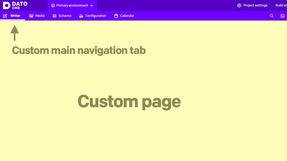
To add one or more tabs to the top bar of the interface, you can use the mainNavigationTabs hook:
1import { connect, MainNavigationTabsCtx } from 'datocms-plugin-sdk';2
3connect({4  mainNavigationTabs(ctx: MainNavigationTabsCtx) {5    return [6      {7        label: 'Analytics',8        icon: 'analytics',9        pointsTo: {10          pageId: 'analytics',11        },12      },13    ];14  },15});
The pageId property is crucial here, as it specifies which custom page you want to display when you click the tab. If you wish, you can also customize the insertion point of the menu item via the placement property:
{ // ...other properties placement: ['before', 'content'],}In this case, we are asking to show the tab before the default "Content" tab.
As for the icon, you can either use one of the Awesome 5 Pro solid icons by their name, explicitly pass a custom SVG or use an emoji:
icon: { type: 'svg', viewBox: '0 0 448 512', content: '<path fill="currentColor" d="M448,230.17V480H0V230.17H141.13V355.09H306.87V230.17ZM306.87,32H141.13V156.91H306.87Z" class=""></path>',}icon: { type: "emoji", emoji: "🎉"}Menu item in the Content navigation sidebar
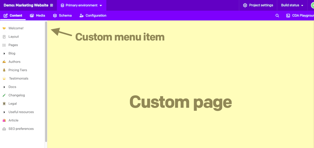
Similarly, we can use the contentAreaSidebarItems hook to add menu items to the sidebar that is displayed when we are inside the "Content" area:
1import { connect, ContentAreaSidebarItemsCtx } from 'datocms-plugin-sdk';2
3connect({4  contentAreaSidebarItems(ctx: ContentAreaSidebarItemsCtx) {5    return [6      {7        label: 'Welcome!',8        icon: 'igloo',9        placement: ['before', 'menuItems'],10        pointsTo: {11          pageId: 'welcome',12        },13      },14    ];15  },16});
This code will add a menu item above the default menu items present in the sidebar.
Custom section in the Settings area
It is also possible to add new sections in the sidebar present in the "Settings" area with the settingsAreaSidebarItemGroups hook:
1import { connect, SettingsAreaSidebarItemGroupsCtx } from 'datocms-plugin-sdk';2
3const labels: Record<string, string> = {4  "en": 'Settings',5  "it": 'Impostazioni',6  "es": 'Configuración',7};8
9connect({10  settingsAreaSidebarItemGroups(ctx: SettingsAreaSidebarItemGroupsCtx) {11    if (!ctx.currentRole.attributes.can_edit_schema) {12      return [];13    }14
15    return [16      {17        label: 'My plugin',18        items: [19          {20            label: labels[ctx.ui.locale],21            icon: 'cogs',22            pointsTo: {23              pageId: 'settings',24            },25          },26        ],27      },28    ];29  },30});
In this example, it can be seen that it is possible to show (or not) menu items depending on the logged-in user's permissions, or to show labels translated into the user's preferred interface language.
Step 2: Rendering the page
Once you enter the page through one of the links, you can render the content of the custom pages by implementing the renderPage hook:
1import React from 'react';2import ReactDOM from 'react-dom';3import { connect, RenderPageCtx } from 'datocms-plugin-sdk';4
5function render(component: React.ReactNode) {6  ReactDOM.render(7    <React.StrictMode>{component}</React.StrictMode>,8    document.getElementById('root'),9  );10}11
12connect({13  renderPage(pageId, ctx: RenderPageCtx) {14    switch (pageId) {15      case 'welcome':16        return render(<WelcomePage ctx={ctx} />);17      case 'settings':18        return render(<SettingsPage ctx={ctx} />);19      case 'analytics':20        return render(<AnalyticsPage ctx={ctx} />);21    }22  },23});
The strategy to adopt here is is to implement a switch that, depending on the pageId, will render a different, specialized React component.
The hook, in its second ctx argument, provides a series of information and methods for interacting with the main application. It is a good idea to pass it to the page component, in the form of a React prop.
Here's an example page component. It is important to wrap the content inside the Canvas component to give our app the look and feel of the DatoCMS web app:
1import { RenderPageCtx } from 'datocms-plugin-sdk';2import { Canvas } from 'datocms-react-ui';3
4type PropTypes = {5  ctx: RenderPageCtx,6};7
8function WelcomePage({ ctx }: PropTypes) {9  return (10    <Canvas ctx={ctx}>11      Hi there!12    </Canvas>13  );14}
mainNavigationTabs(ctx)
Use this function to declare new tabs you want to add in the top-bar of the UI.
Return value
The function must return: MainNavigationTab[].
Context object
The following properties and methods are available in the ctx argument:
Properties and methods available in every hook
Every hook available in the Plugin SDK shares the same minumum set of properties and methods.
Authentication properties
ctx.currentUser: User | SsoUser | Account | Organization The current DatoCMS user. It can either be the owner or one of the
collaborators (regular or SSO).
ctx.currentUser: User | SsoUser | Account | Organization The current DatoCMS user. It can either be the owner or one of the
collaborators (regular or SSO). The current DatoCMS user. It can either be the owner or one of the collaborators (regular or SSO).
ctx.currentRole: Role The role for the current DatoCMS user.
ctx.currentRole: Role The role for the current DatoCMS user. The role for the current DatoCMS user.
ctx.currentUserAccessToken: string | undefined The access token to perform API calls on behalf of the current user. Only
available if currentUserAccessToken additional permission is granted.
ctx.currentUserAccessToken: string | undefined The access token to perform API calls on behalf of the current user. Only
available if currentUserAccessToken additional permission is granted. The access token to perform API calls on behalf of the current user. Only
available if currentUserAccessToken additional permission is granted.
Custom dialog methods
ctx.openModal(modal: Modal) => Promise<unknown> Opens a custom modal. Returns a promise resolved with what the modal itself
returns calling the resolve() function.
ctx.openModal(modal: Modal) => Promise<unknown> Opens a custom modal. Returns a promise resolved with what the modal itself
returns calling the resolve() function. Opens a custom modal. Returns a promise resolved with what the modal itself
returns calling the resolve() function.
1const result = await ctx.openModal({2  id: 'regular',3  title: 'Custom title!',4  width: 'l',5  parameters: { foo: 'bar' },6});7
8if (result) {9  ctx.notice(`Success! ${JSON.stringify(result)}`);10} else {11  ctx.alert('Closed!');12}
ctx.openConfirm(options: ConfirmOptions) => Promise<unknown> Opens a UI-consistent confirmation dialog. Returns a promise resolved with
the value of the choice made by the user.
ctx.openConfirm(options: ConfirmOptions) => Promise<unknown> Opens a UI-consistent confirmation dialog. Returns a promise resolved with
the value of the choice made by the user. Opens a UI-consistent confirmation dialog. Returns a promise resolved with the value of the choice made by the user.
1const result = await ctx.openConfirm({2  title: 'Custom title',3  content:4    'Lorem Ipsum is simply dummy text of the printing and typesetting industry',5  choices: [6    {7      label: 'Positive',8      value: 'positive',9      intent: 'positive',10    },11    {12      label: 'Negative',13      value: 'negative',14      intent: 'negative',15    },16  ],17  cancel: {18    label: 'Cancel',19    value: false,20  },21});22
23if (result) {24  ctx.notice(`Success! ${result}`);25} else {26  ctx.alert('Cancelled!');27}
Entity repos properties
ctx.itemTypes: Partial<Record<string, ItemType>> All the models of the current DatoCMS project, indexed by ID.
ctx.itemTypes: Partial<Record<string, ItemType>> All the models of the current DatoCMS project, indexed by ID. All the models of the current DatoCMS project, indexed by ID.
ctx.fields: Partial<Record<string, Field>> All the fields currently loaded for the current DatoCMS project, indexed by
ID. If some fields you need are not present, use the loadItemTypeFields
function to load them.
ctx.fields: Partial<Record<string, Field>> All the fields currently loaded for the current DatoCMS project, indexed by
ID. If some fields you need are not present, use the loadItemTypeFields
function to load them. All the fields currently loaded for the current DatoCMS project, indexed by
ID. If some fields you need are not present, use the loadItemTypeFields
function to load them.
ctx.fieldsets: Partial<Record<string, Fieldset>> All the fieldsets currently loaded for the current DatoCMS project, indexed
by ID. If some fields you need are not present, use the
loadItemTypeFieldsets function to load them.
ctx.fieldsets: Partial<Record<string, Fieldset>> All the fieldsets currently loaded for the current DatoCMS project, indexed
by ID. If some fields you need are not present, use the
loadItemTypeFieldsets function to load them. All the fieldsets currently loaded for the current DatoCMS project, indexed
by ID. If some fields you need are not present, use the
loadItemTypeFieldsets function to load them.
ctx.users: Partial<Record<string, User>> All the regular users currently loaded for the current DatoCMS project,
indexed by ID. It will always contain the current user. If some users you
need are not present, use the loadUsers function to load them.
ctx.users: Partial<Record<string, User>> All the regular users currently loaded for the current DatoCMS project,
indexed by ID. It will always contain the current user. If some users you
need are not present, use the loadUsers function to load them. All the regular users currently loaded for the current DatoCMS project,
indexed by ID. It will always contain the current user. If some users you
need are not present, use the loadUsers function to load them.
ctx.ssoUsers: Partial<Record<string, SsoUser>> All the SSO users currently loaded for the current DatoCMS project, indexed
by ID. It will always contain the current user. If some users you need are
not present, use the loadSsoUsers function to load them.
ctx.ssoUsers: Partial<Record<string, SsoUser>> All the SSO users currently loaded for the current DatoCMS project, indexed
by ID. It will always contain the current user. If some users you need are
not present, use the loadSsoUsers function to load them. All the SSO users currently loaded for the current DatoCMS project, indexed
by ID. It will always contain the current user. If some users you need are
not present, use the loadSsoUsers function to load them.
Item dialog methods
ctx.createNewItem(itemTypeId: string) => Promise<Item | null> Opens a dialog for creating a new record. It returns a promise resolved
with the newly created record or null if the user closes the dialog
without creating anything.
ctx.createNewItem(itemTypeId: string) => Promise<Item | null> Opens a dialog for creating a new record. It returns a promise resolved
with the newly created record or null if the user closes the dialog
without creating anything. Opens a dialog for creating a new record. It returns a promise resolved
with the newly created record or null if the user closes the dialog
without creating anything.
1const itemTypeId = prompt('Please insert a model ID:');2
3const item = await ctx.createNewItem(itemTypeId);4
5if (item) {6  ctx.notice(`Success! ${item.id}`);7} else {8  ctx.alert('Closed!');9}
ctx.selectItem Opens a dialog for selecting one (or multiple) record(s) from a list of
existing records of type itemTypeId. It returns a promise resolved with
the selected record(s), or null if the user closes the dialog without
choosing any record.
ctx.selectItem Opens a dialog for selecting one (or multiple) record(s) from a list of
existing records of type itemTypeId. It returns a promise resolved with
the selected record(s), or null if the user closes the dialog without
choosing any record. Opens a dialog for selecting one (or multiple) record(s) from a list of
existing records of type itemTypeId. It returns a promise resolved with
the selected record(s), or null if the user closes the dialog without
choosing any record.
1const itemTypeId = prompt('Please insert a model ID:');2
3const items = await ctx.selectItem(itemTypeId, { multiple: true });4
5if (items) {6  ctx.notice(`Success! ${items.map((i) => i.id).join(', ')}`);7} else {8  ctx.alert('Closed!');9}
ctx.editItem(itemId: string) => Promise<Item | null> Opens a dialog for editing an existing record. It returns a promise
resolved with the edited record, or null if the user closes the dialog
without persisting any change.
ctx.editItem(itemId: string) => Promise<Item | null> Opens a dialog for editing an existing record. It returns a promise
resolved with the edited record, or null if the user closes the dialog
without persisting any change. Opens a dialog for editing an existing record. It returns a promise
resolved with the edited record, or null if the user closes the dialog
without persisting any change.
1const itemId = prompt('Please insert a record ID:');2
3const item = await ctx.editItem(itemId);4
5if (item) {6  ctx.notice(`Success! ${item.id}`);7} else {8  ctx.alert('Closed!');9}
Load data methods
ctx.loadItemTypeFields(itemTypeId: string) => Promise<Field[]> Loads all the fields for a specific model (or block). Fields will be
returned and will also be available in the the fields property.
ctx.loadItemTypeFields(itemTypeId: string) => Promise<Field[]> Loads all the fields for a specific model (or block). Fields will be
returned and will also be available in the the fields property. Loads all the fields for a specific model (or block). Fields will be
returned and will also be available in the the fields property.
1const itemTypeId = prompt('Please insert a model ID:');2
3const fields = await ctx.loadItemTypeFields(itemTypeId);4
5ctx.notice(6  `Success! ${fields7    .map((field) => field.attributes.api_key)8    .join(', ')}`,9);
ctx.loadItemTypeFieldsets(itemTypeId: string) => Promise<Fieldset[]> Loads all the fieldsets for a specific model (or block). Fieldsets will be
returned and will also be available in the the fieldsets property.
ctx.loadItemTypeFieldsets(itemTypeId: string) => Promise<Fieldset[]> Loads all the fieldsets for a specific model (or block). Fieldsets will be
returned and will also be available in the the fieldsets property. Loads all the fieldsets for a specific model (or block). Fieldsets will be
returned and will also be available in the the fieldsets property.
1const itemTypeId = prompt('Please insert a model ID:');2
3const fieldsets = await ctx.loadItemTypeFieldsets(itemTypeId);4
5ctx.notice(6  `Success! ${fieldsets7    .map((fieldset) => fieldset.attributes.title)8    .join(', ')}`,9);
ctx.loadFieldsUsingPlugin() => Promise<Field[]> Loads all the fields in the project that are currently using the plugin for
one of its manual field extensions.
ctx.loadFieldsUsingPlugin() => Promise<Field[]> Loads all the fields in the project that are currently using the plugin for
one of its manual field extensions. Loads all the fields in the project that are currently using the plugin for one of its manual field extensions.
1const fields = await ctx.loadFieldsUsingPlugin();2
3ctx.notice(4  `Success! ${fields5    .map((field) => field.attributes.api_key)6    .join(', ')}`,7);
ctx.loadUsers() => Promise<User[]> Loads all regular users. Users will be returned and will also be available
in the the users property.
ctx.loadUsers() => Promise<User[]> Loads all regular users. Users will be returned and will also be available
in the the users property. Loads all regular users. Users will be returned and will also be available
in the the users property.
1const users = await ctx.loadUsers();2
3ctx.notice(`Success! ${users.map((user) => user.id).join(', ')}`);
ctx.loadSsoUsers() => Promise<SsoUser[]> Loads all SSO users. Users will be returned and will also be available in
the the ssoUsers property.
ctx.loadSsoUsers() => Promise<SsoUser[]> Loads all SSO users. Users will be returned and will also be available in
the the ssoUsers property. Loads all SSO users. Users will be returned and will also be available in
the the ssoUsers property.
1const users = await ctx.loadSsoUsers();2
3ctx.notice(`Success! ${users.map((user) => user.id).join(', ')}`);
Navigate methods
ctx.navigateTo(path: string) => Promise<void> Moves the user to another URL internal to the backend.
ctx.navigateTo(path: string) => Promise<void> Moves the user to another URL internal to the backend. Moves the user to another URL internal to the backend.
1await ctx.navigateTo('/');Plugin properties
ctx.plugin: Plugin The current plugin.
ctx.plugin: Plugin The current plugin. The current plugin.
Project properties
ctx.site: Site The current DatoCMS project.
ctx.site: Site The current DatoCMS project. The current DatoCMS project.
ctx.environment: string The ID of the current environment.
ctx.environment: string The ID of the current environment. The ID of the current environment.
ctx.isEnvironmentPrimary: boolean Whether the current environment is the primary one.
ctx.isEnvironmentPrimary: boolean Whether the current environment is the primary one. Whether the current environment is the primary one.
ctx.cdaEndpointUrl: string The URL of the Content Delivery API (GraphQL) endpoint for the current
project and environment.
In the vast majority of cases you don't need this: the CDA endpoint is at a
well-known, stable URL. It's exposed here only to support DatoCMS internal
testing against non-production environments (e.g. staging).
ctx.cdaEndpointUrl: string The URL of the Content Delivery API (GraphQL) endpoint for the current
project and environment.
In the vast majority of cases you don't need this: the CDA endpoint is at a
well-known, stable URL. It's exposed here only to support DatoCMS internal
testing against non-production environments (e.g. staging). The URL of the Content Delivery API (GraphQL) endpoint for the current project and environment.
In the vast majority of cases you don't need this: the CDA endpoint is at a well-known, stable URL. It's exposed here only to support DatoCMS internal testing against non-production environments (e.g. staging).
ctx.cmaBaseUrl: string The base URL of the Content Management API.
In the vast majority of cases you don't need this: the CMA lives at a
well-known, stable URL. It's exposed here only to support DatoCMS internal
testing against non-production environments (e.g. staging).
ctx.cmaBaseUrl: string The base URL of the Content Management API.
In the vast majority of cases you don't need this: the CMA lives at a
well-known, stable URL. It's exposed here only to support DatoCMS internal
testing against non-production environments (e.g. staging). The base URL of the Content Management API.
In the vast majority of cases you don't need this: the CMA lives at a well-known, stable URL. It's exposed here only to support DatoCMS internal testing against non-production environments (e.g. staging).
ctx.owner: Account | Organization The account/organization that is the project owner.
ctx.owner: Account | Organization The account/organization that is the project owner. The account/organization that is the project owner.
ctx.ui UI preferences of the current user (right now, only the preferred locale is
available).
ctx.ui UI preferences of the current user (right now, only the preferred locale is
available). UI preferences of the current user (right now, only the preferred locale is available).
ctx.cssDesignTokens: CssDesignTokens Semantic color tokens for the current DatoCMS project, pre-computed by
the host. A map of CSS custom property names (e.g.
--color--raised--surface) to their resolved values for the current
color scheme.
ctx.cssDesignTokens: CssDesignTokens Semantic color tokens for the current DatoCMS project, pre-computed by
the host. A map of CSS custom property names (e.g.
--color--raised--surface) to their resolved values for the current
color scheme. Semantic color tokens for the current DatoCMS project, pre-computed by
the host. A map of CSS custom property names (e.g.
--color--raised--surface) to their resolved values for the current
color scheme.
ctx.colorScheme: 'light' | 'dark' The appearance color scheme the host CMS is currently using. Resolved —
'system' is already expanded to 'light' or 'dark' by the host.
The SDK runtime reflects this onto document.documentElement two ways:
the data-color-scheme="light" / data-color-scheme="dark" attribute,
so plugin CSS can branch with [data-color-scheme="dark"] { … }
selectors; and the actual color-scheme CSS property, so light-dark()
resolves to the correct branch (and native form controls / scrollbars
match) everywhere in the plugin frame. For non-CSS decisions (choosing a
logo asset, a syntax-highlighting preset, …) branch on ctx.colorScheme
directly.
ctx.colorScheme: 'light' | 'dark' The appearance color scheme the host CMS is currently using. Resolved —
'system' is already expanded to 'light' or 'dark' by the host.
The SDK runtime reflects this onto document.documentElement two ways:
the data-color-scheme="light" / data-color-scheme="dark" attribute,
so plugin CSS can branch with [data-color-scheme="dark"] { … }
selectors; and the actual color-scheme CSS property, so light-dark()
resolves to the correct branch (and native form controls / scrollbars
match) everywhere in the plugin frame. For non-CSS decisions (choosing a
logo asset, a syntax-highlighting preset, …) branch on ctx.colorScheme
directly. The appearance color scheme the host CMS is currently using. Resolved —
'system' is already expanded to 'light' or 'dark' by the host.
The SDK runtime reflects this onto document.documentElement two ways:
the data-color-scheme="light" / data-color-scheme="dark" attribute,
so plugin CSS can branch with [data-color-scheme="dark"] { … }
selectors; and the actual color-scheme CSS property, so light-dark()
resolves to the correct branch (and native form controls / scrollbars
match) everywhere in the plugin frame. For non-CSS decisions (choosing a
logo asset, a syntax-highlighting preset, …) branch on ctx.colorScheme
directly.
Toast methods
ctx.alert(message: string) => Promise<void> Triggers an "error" toast displaying the selected message.
ctx.alert(message: string) => Promise<void> Triggers an "error" toast displaying the selected message. Triggers an "error" toast displaying the selected message.
1const message = prompt(2  'Please insert a message:',3  'This is an alert message!',4);5
6await ctx.alert(message);
ctx.notice(message: string) => Promise<void> Triggers a "success" toast displaying the selected message.
ctx.notice(message: string) => Promise<void> Triggers a "success" toast displaying the selected message. Triggers a "success" toast displaying the selected message.
1const message = prompt(2  'Please insert a message:',3  'This is a notice message!',4);5
6await ctx.notice(message);
ctx.customToast Triggers a custom toast displaying the selected message (and optionally a
CTA).
ctx.customToast Triggers a custom toast displaying the selected message (and optionally a
CTA). Triggers a custom toast displaying the selected message (and optionally a CTA).
1const result = await ctx.customToast({2  type: 'warning',3  message: 'Just a sample warning notification!',4  dismissOnPageChange: true,5  dismissAfterTimeout: 5000,6  cta: {7    label: 'Execute call-to-action',8    value: 'cta',9  },10});11
12if (result === 'cta') {13  ctx.notice(`Clicked CTA!`);14}
Update plugin parameters methods
ctx.updatePluginParameters(params: Record<string, unknown>) => Promise<void> Updates the plugin parameters.
Always check ctx.currentRole.meta.final_permissions.can_edit_schema
before calling this, as the user might not have the permission to perform
the operation.
ctx.updatePluginParameters(params: Record<string, unknown>) => Promise<void> Updates the plugin parameters.
Always check ctx.currentRole.meta.final_permissions.can_edit_schema
before calling this, as the user might not have the permission to perform
the operation. Updates the plugin parameters.
Always check ctx.currentRole.meta.final_permissions.can_edit_schema
before calling this, as the user might not have the permission to perform
the operation.
1await ctx.updatePluginParameters({ debugMode: true });2await ctx.notice('Plugin parameters successfully updated!');
ctx.updateFieldAppearance(...) Performs changes in the appearance of a field. You can install/remove a
manual field extension, or tweak their parameters. If multiple changes are
passed, they will be applied sequencially.
Always check ctx.currentRole.meta.final_permissions.can_edit_schema
before calling this, as the user might not have the permission to perform
the operation.
ctx.updateFieldAppearance(...) Performs changes in the appearance of a field. You can install/remove a
manual field extension, or tweak their parameters. If multiple changes are
passed, they will be applied sequencially.
Always check ctx.currentRole.meta.final_permissions.can_edit_schema
before calling this, as the user might not have the permission to perform
the operation. Performs changes in the appearance of a field. You can install/remove a manual field extension, or tweak their parameters. If multiple changes are passed, they will be applied sequencially.
Always check ctx.currentRole.meta.final_permissions.can_edit_schema
before calling this, as the user might not have the permission to perform
the operation.
1const fields = await ctx.loadFieldsUsingPlugin();2
3if (fields.length === 0) {4  ctx.alert('No field is using this plugin as a manual extension!');5  return;6}7
8for (const field of fields) {9  const { appearance } = field.attributes;10  const operations = [];11
12  if (appearance.editor === ctx.plugin.id) {13    operations.push({14      operation: 'updateEditor',15      newParameters: {16        ...appearance.parameters,17        foo: 'bar',18      },19    });20  }21
22  appearance.addons.forEach((addon, i) => {23    if (addon.id !== ctx.plugin.id) {24      return;25    }26
27    operations.push({28      operation: 'updateAddon',29      index: i,30      newParameters: { ...addon.parameters, foo: 'bar' },31    });32  });33
34  await ctx.updateFieldAppearance(field.id, operations);35  ctx.notice(`Successfully edited field ${field.attributes.api_key}`);36}
Upload dialog methods
ctx.selectUpload Opens a dialog for selecting one (or multiple) existing asset(s). It
returns a promise resolved with the selected asset(s), or null if the
user closes the dialog without selecting any upload.
ctx.selectUpload Opens a dialog for selecting one (or multiple) existing asset(s). It
returns a promise resolved with the selected asset(s), or null if the
user closes the dialog without selecting any upload. Opens a dialog for selecting one (or multiple) existing asset(s). It
returns a promise resolved with the selected asset(s), or null if the
user closes the dialog without selecting any upload.
1const item = await ctx.selectUpload({ multiple: false });2
3if (item) {4  ctx.notice(`Success! ${item.id}`);5} else {6  ctx.alert('Closed!');7}
ctx.editUpload(...) Opens a dialog for editing a Media Area asset. It returns a promise
resolved with:
The updated asset, if the user persists some changes to the asset itself
null, if the user closes the dialog without persisting any change
An asset structure with an additional deleted property set to true, if
the user deletes the asset.
ctx.editUpload(...) Opens a dialog for editing a Media Area asset. It returns a promise
resolved with:
The updated asset, if the user persists some changes to the asset itself
null, if the user closes the dialog without persisting any change
An asset structure with an additional deleted property set to true, if
the user deletes the asset. Opens a dialog for editing a Media Area asset. It returns a promise resolved with:
- The updated asset, if the user persists some changes to the asset itself
null, if the user closes the dialog without persisting any change- An asset structure with an additional
deletedproperty set to true, if the user deletes the asset.
1const uploadId = prompt('Please insert an asset ID:');2
3const item = await ctx.editUpload(uploadId);4
5if (item) {6  ctx.notice(`Success! ${item.id}`);7} else {8  ctx.alert('Closed!');9}
ctx.editUploadMetadata(...) Opens a dialog for editing a "single asset" field structure. It returns a
promise resolved with the updated structure, or null if the user closes
the dialog without persisting any change.
ctx.editUploadMetadata(...) Opens a dialog for editing a "single asset" field structure. It returns a
promise resolved with the updated structure, or null if the user closes
the dialog without persisting any change. Opens a dialog for editing a "single asset" field structure. It returns a
promise resolved with the updated structure, or null if the user closes
the dialog without persisting any change.
1const uploadId = prompt('Please insert an asset ID:');2
3const result = await ctx.editUploadMetadata({4  upload_id: uploadId,5  alt: null,6  title: null,7  custom_data: {},8  focal_point: null,9});10
11if (result) {12  ctx.notice(`Success! ${JSON.stringify(result)}`);13} else {14  ctx.alert('Closed!');15}
renderPage(pageId: string, ctx)
This function will be called when the plugin needs to render a specific
page (see the mainNavigationTabs, settingsAreaSidebarItemGroups and
contentAreaSidebarItems functions).
Context object
The following properties and methods are available in the ctx argument:
Hook-specific properties and methods
This hook exposes additional information and operations specific to the context in which it operates.
ctx.pageId: string The ID of the page that needs to be rendered.
ctx.pageId: string The ID of the page that needs to be rendered. The ID of the page that needs to be rendered.
ctx.location Current page location.
ctx.location Current page location. Current page location.
Properties and methods available in every hook
Every hook available in the Plugin SDK shares the same minumum set of properties and methods.
Authentication properties
ctx.currentUser: User | SsoUser | Account | Organization The current DatoCMS user. It can either be the owner or one of the
collaborators (regular or SSO).
ctx.currentUser: User | SsoUser | Account | Organization The current DatoCMS user. It can either be the owner or one of the
collaborators (regular or SSO). The current DatoCMS user. It can either be the owner or one of the collaborators (regular or SSO).
ctx.currentRole: Role The role for the current DatoCMS user.
ctx.currentRole: Role The role for the current DatoCMS user. The role for the current DatoCMS user.
ctx.currentUserAccessToken: string | undefined The access token to perform API calls on behalf of the current user. Only
available if currentUserAccessToken additional permission is granted.
ctx.currentUserAccessToken: string | undefined The access token to perform API calls on behalf of the current user. Only
available if currentUserAccessToken additional permission is granted. The access token to perform API calls on behalf of the current user. Only
available if currentUserAccessToken additional permission is granted.
Custom dialog methods
ctx.openModal(modal: Modal) => Promise<unknown> Opens a custom modal. Returns a promise resolved with what the modal itself
returns calling the resolve() function.
ctx.openModal(modal: Modal) => Promise<unknown> Opens a custom modal. Returns a promise resolved with what the modal itself
returns calling the resolve() function. Opens a custom modal. Returns a promise resolved with what the modal itself
returns calling the resolve() function.
1const result = await ctx.openModal({2  id: 'regular',3  title: 'Custom title!',4  width: 'l',5  parameters: { foo: 'bar' },6});7
8if (result) {9  ctx.notice(`Success! ${JSON.stringify(result)}`);10} else {11  ctx.alert('Closed!');12}
ctx.openConfirm(options: ConfirmOptions) => Promise<unknown> Opens a UI-consistent confirmation dialog. Returns a promise resolved with
the value of the choice made by the user.
ctx.openConfirm(options: ConfirmOptions) => Promise<unknown> Opens a UI-consistent confirmation dialog. Returns a promise resolved with
the value of the choice made by the user. Opens a UI-consistent confirmation dialog. Returns a promise resolved with the value of the choice made by the user.
1const result = await ctx.openConfirm({2  title: 'Custom title',3  content:4    'Lorem Ipsum is simply dummy text of the printing and typesetting industry',5  choices: [6    {7      label: 'Positive',8      value: 'positive',9      intent: 'positive',10    },11    {12      label: 'Negative',13      value: 'negative',14      intent: 'negative',15    },16  ],17  cancel: {18    label: 'Cancel',19    value: false,20  },21});22
23if (result) {24  ctx.notice(`Success! ${result}`);25} else {26  ctx.alert('Cancelled!');27}
Entity repos properties
ctx.itemTypes: Partial<Record<string, ItemType>> All the models of the current DatoCMS project, indexed by ID.
ctx.itemTypes: Partial<Record<string, ItemType>> All the models of the current DatoCMS project, indexed by ID. All the models of the current DatoCMS project, indexed by ID.
ctx.fields: Partial<Record<string, Field>> All the fields currently loaded for the current DatoCMS project, indexed by
ID. If some fields you need are not present, use the loadItemTypeFields
function to load them.
ctx.fields: Partial<Record<string, Field>> All the fields currently loaded for the current DatoCMS project, indexed by
ID. If some fields you need are not present, use the loadItemTypeFields
function to load them. All the fields currently loaded for the current DatoCMS project, indexed by
ID. If some fields you need are not present, use the loadItemTypeFields
function to load them.
ctx.fieldsets: Partial<Record<string, Fieldset>> All the fieldsets currently loaded for the current DatoCMS project, indexed
by ID. If some fields you need are not present, use the
loadItemTypeFieldsets function to load them.
ctx.fieldsets: Partial<Record<string, Fieldset>> All the fieldsets currently loaded for the current DatoCMS project, indexed
by ID. If some fields you need are not present, use the
loadItemTypeFieldsets function to load them. All the fieldsets currently loaded for the current DatoCMS project, indexed
by ID. If some fields you need are not present, use the
loadItemTypeFieldsets function to load them.
ctx.users: Partial<Record<string, User>> All the regular users currently loaded for the current DatoCMS project,
indexed by ID. It will always contain the current user. If some users you
need are not present, use the loadUsers function to load them.
ctx.users: Partial<Record<string, User>> All the regular users currently loaded for the current DatoCMS project,
indexed by ID. It will always contain the current user. If some users you
need are not present, use the loadUsers function to load them. All the regular users currently loaded for the current DatoCMS project,
indexed by ID. It will always contain the current user. If some users you
need are not present, use the loadUsers function to load them.
ctx.ssoUsers: Partial<Record<string, SsoUser>> All the SSO users currently loaded for the current DatoCMS project, indexed
by ID. It will always contain the current user. If some users you need are
not present, use the loadSsoUsers function to load them.
ctx.ssoUsers: Partial<Record<string, SsoUser>> All the SSO users currently loaded for the current DatoCMS project, indexed
by ID. It will always contain the current user. If some users you need are
not present, use the loadSsoUsers function to load them. All the SSO users currently loaded for the current DatoCMS project, indexed
by ID. It will always contain the current user. If some users you need are
not present, use the loadSsoUsers function to load them.
Item dialog methods
ctx.createNewItem(itemTypeId: string) => Promise<Item | null> Opens a dialog for creating a new record. It returns a promise resolved
with the newly created record or null if the user closes the dialog
without creating anything.
ctx.createNewItem(itemTypeId: string) => Promise<Item | null> Opens a dialog for creating a new record. It returns a promise resolved
with the newly created record or null if the user closes the dialog
without creating anything. Opens a dialog for creating a new record. It returns a promise resolved
with the newly created record or null if the user closes the dialog
without creating anything.
1const itemTypeId = prompt('Please insert a model ID:');2
3const item = await ctx.createNewItem(itemTypeId);4
5if (item) {6  ctx.notice(`Success! ${item.id}`);7} else {8  ctx.alert('Closed!');9}
ctx.selectItem Opens a dialog for selecting one (or multiple) record(s) from a list of
existing records of type itemTypeId. It returns a promise resolved with
the selected record(s), or null if the user closes the dialog without
choosing any record.
ctx.selectItem Opens a dialog for selecting one (or multiple) record(s) from a list of
existing records of type itemTypeId. It returns a promise resolved with
the selected record(s), or null if the user closes the dialog without
choosing any record. Opens a dialog for selecting one (or multiple) record(s) from a list of
existing records of type itemTypeId. It returns a promise resolved with
the selected record(s), or null if the user closes the dialog without
choosing any record.
1const itemTypeId = prompt('Please insert a model ID:');2
3const items = await ctx.selectItem(itemTypeId, { multiple: true });4
5if (items) {6  ctx.notice(`Success! ${items.map((i) => i.id).join(', ')}`);7} else {8  ctx.alert('Closed!');9}
ctx.editItem(itemId: string) => Promise<Item | null> Opens a dialog for editing an existing record. It returns a promise
resolved with the edited record, or null if the user closes the dialog
without persisting any change.
ctx.editItem(itemId: string) => Promise<Item | null> Opens a dialog for editing an existing record. It returns a promise
resolved with the edited record, or null if the user closes the dialog
without persisting any change. Opens a dialog for editing an existing record. It returns a promise
resolved with the edited record, or null if the user closes the dialog
without persisting any change.
1const itemId = prompt('Please insert a record ID:');2
3const item = await ctx.editItem(itemId);4
5if (item) {6  ctx.notice(`Success! ${item.id}`);7} else {8  ctx.alert('Closed!');9}
Load data methods
ctx.loadItemTypeFields(itemTypeId: string) => Promise<Field[]> Loads all the fields for a specific model (or block). Fields will be
returned and will also be available in the the fields property.
ctx.loadItemTypeFields(itemTypeId: string) => Promise<Field[]> Loads all the fields for a specific model (or block). Fields will be
returned and will also be available in the the fields property. Loads all the fields for a specific model (or block). Fields will be
returned and will also be available in the the fields property.
1const itemTypeId = prompt('Please insert a model ID:');2
3const fields = await ctx.loadItemTypeFields(itemTypeId);4
5ctx.notice(6  `Success! ${fields7    .map((field) => field.attributes.api_key)8    .join(', ')}`,9);
ctx.loadItemTypeFieldsets(itemTypeId: string) => Promise<Fieldset[]> Loads all the fieldsets for a specific model (or block). Fieldsets will be
returned and will also be available in the the fieldsets property.
ctx.loadItemTypeFieldsets(itemTypeId: string) => Promise<Fieldset[]> Loads all the fieldsets for a specific model (or block). Fieldsets will be
returned and will also be available in the the fieldsets property. Loads all the fieldsets for a specific model (or block). Fieldsets will be
returned and will also be available in the the fieldsets property.
1const itemTypeId = prompt('Please insert a model ID:');2
3const fieldsets = await ctx.loadItemTypeFieldsets(itemTypeId);4
5ctx.notice(6  `Success! ${fieldsets7    .map((fieldset) => fieldset.attributes.title)8    .join(', ')}`,9);
ctx.loadFieldsUsingPlugin() => Promise<Field[]> Loads all the fields in the project that are currently using the plugin for
one of its manual field extensions.
ctx.loadFieldsUsingPlugin() => Promise<Field[]> Loads all the fields in the project that are currently using the plugin for
one of its manual field extensions. Loads all the fields in the project that are currently using the plugin for one of its manual field extensions.
1const fields = await ctx.loadFieldsUsingPlugin();2
3ctx.notice(4  `Success! ${fields5    .map((field) => field.attributes.api_key)6    .join(', ')}`,7);
ctx.loadUsers() => Promise<User[]> Loads all regular users. Users will be returned and will also be available
in the the users property.
ctx.loadUsers() => Promise<User[]> Loads all regular users. Users will be returned and will also be available
in the the users property. Loads all regular users. Users will be returned and will also be available
in the the users property.
1const users = await ctx.loadUsers();2
3ctx.notice(`Success! ${users.map((user) => user.id).join(', ')}`);
ctx.loadSsoUsers() => Promise<SsoUser[]> Loads all SSO users. Users will be returned and will also be available in
the the ssoUsers property.
ctx.loadSsoUsers() => Promise<SsoUser[]> Loads all SSO users. Users will be returned and will also be available in
the the ssoUsers property. Loads all SSO users. Users will be returned and will also be available in
the the ssoUsers property.
1const users = await ctx.loadSsoUsers();2
3ctx.notice(`Success! ${users.map((user) => user.id).join(', ')}`);
Navigate methods
ctx.navigateTo(path: string) => Promise<void> Moves the user to another URL internal to the backend.
ctx.navigateTo(path: string) => Promise<void> Moves the user to another URL internal to the backend. Moves the user to another URL internal to the backend.
1await ctx.navigateTo('/');Plugin properties
ctx.plugin: Plugin The current plugin.
ctx.plugin: Plugin The current plugin. The current plugin.
Project properties
ctx.site: Site The current DatoCMS project.
ctx.site: Site The current DatoCMS project. The current DatoCMS project.
ctx.environment: string The ID of the current environment.
ctx.environment: string The ID of the current environment. The ID of the current environment.
ctx.isEnvironmentPrimary: boolean Whether the current environment is the primary one.
ctx.isEnvironmentPrimary: boolean Whether the current environment is the primary one. Whether the current environment is the primary one.
ctx.cdaEndpointUrl: string The URL of the Content Delivery API (GraphQL) endpoint for the current
project and environment.
In the vast majority of cases you don't need this: the CDA endpoint is at a
well-known, stable URL. It's exposed here only to support DatoCMS internal
testing against non-production environments (e.g. staging).
ctx.cdaEndpointUrl: string The URL of the Content Delivery API (GraphQL) endpoint for the current
project and environment.
In the vast majority of cases you don't need this: the CDA endpoint is at a
well-known, stable URL. It's exposed here only to support DatoCMS internal
testing against non-production environments (e.g. staging). The URL of the Content Delivery API (GraphQL) endpoint for the current project and environment.
In the vast majority of cases you don't need this: the CDA endpoint is at a well-known, stable URL. It's exposed here only to support DatoCMS internal testing against non-production environments (e.g. staging).
ctx.cmaBaseUrl: string The base URL of the Content Management API.
In the vast majority of cases you don't need this: the CMA lives at a
well-known, stable URL. It's exposed here only to support DatoCMS internal
testing against non-production environments (e.g. staging).
ctx.cmaBaseUrl: string The base URL of the Content Management API.
In the vast majority of cases you don't need this: the CMA lives at a
well-known, stable URL. It's exposed here only to support DatoCMS internal
testing against non-production environments (e.g. staging). The base URL of the Content Management API.
In the vast majority of cases you don't need this: the CMA lives at a well-known, stable URL. It's exposed here only to support DatoCMS internal testing against non-production environments (e.g. staging).
ctx.owner: Account | Organization The account/organization that is the project owner.
ctx.owner: Account | Organization The account/organization that is the project owner. The account/organization that is the project owner.
ctx.ui UI preferences of the current user (right now, only the preferred locale is
available).
ctx.ui UI preferences of the current user (right now, only the preferred locale is
available). UI preferences of the current user (right now, only the preferred locale is available).
ctx.cssDesignTokens: CssDesignTokens Semantic color tokens for the current DatoCMS project, pre-computed by
the host. A map of CSS custom property names (e.g.
--color--raised--surface) to their resolved values for the current
color scheme.
ctx.cssDesignTokens: CssDesignTokens Semantic color tokens for the current DatoCMS project, pre-computed by
the host. A map of CSS custom property names (e.g.
--color--raised--surface) to their resolved values for the current
color scheme. Semantic color tokens for the current DatoCMS project, pre-computed by
the host. A map of CSS custom property names (e.g.
--color--raised--surface) to their resolved values for the current
color scheme.
ctx.colorScheme: 'light' | 'dark' The appearance color scheme the host CMS is currently using. Resolved —
'system' is already expanded to 'light' or 'dark' by the host.
The SDK runtime reflects this onto document.documentElement two ways:
the data-color-scheme="light" / data-color-scheme="dark" attribute,
so plugin CSS can branch with [data-color-scheme="dark"] { … }
selectors; and the actual color-scheme CSS property, so light-dark()
resolves to the correct branch (and native form controls / scrollbars
match) everywhere in the plugin frame. For non-CSS decisions (choosing a
logo asset, a syntax-highlighting preset, …) branch on ctx.colorScheme
directly.
ctx.colorScheme: 'light' | 'dark' The appearance color scheme the host CMS is currently using. Resolved —
'system' is already expanded to 'light' or 'dark' by the host.
The SDK runtime reflects this onto document.documentElement two ways:
the data-color-scheme="light" / data-color-scheme="dark" attribute,
so plugin CSS can branch with [data-color-scheme="dark"] { … }
selectors; and the actual color-scheme CSS property, so light-dark()
resolves to the correct branch (and native form controls / scrollbars
match) everywhere in the plugin frame. For non-CSS decisions (choosing a
logo asset, a syntax-highlighting preset, …) branch on ctx.colorScheme
directly. The appearance color scheme the host CMS is currently using. Resolved —
'system' is already expanded to 'light' or 'dark' by the host.
The SDK runtime reflects this onto document.documentElement two ways:
the data-color-scheme="light" / data-color-scheme="dark" attribute,
so plugin CSS can branch with [data-color-scheme="dark"] { … }
selectors; and the actual color-scheme CSS property, so light-dark()
resolves to the correct branch (and native form controls / scrollbars
match) everywhere in the plugin frame. For non-CSS decisions (choosing a
logo asset, a syntax-highlighting preset, …) branch on ctx.colorScheme
directly.
Toast methods
ctx.alert(message: string) => Promise<void> Triggers an "error" toast displaying the selected message.
ctx.alert(message: string) => Promise<void> Triggers an "error" toast displaying the selected message. Triggers an "error" toast displaying the selected message.
1const message = prompt(2  'Please insert a message:',3  'This is an alert message!',4);5
6await ctx.alert(message);
ctx.notice(message: string) => Promise<void> Triggers a "success" toast displaying the selected message.
ctx.notice(message: string) => Promise<void> Triggers a "success" toast displaying the selected message. Triggers a "success" toast displaying the selected message.
1const message = prompt(2  'Please insert a message:',3  'This is a notice message!',4);5
6await ctx.notice(message);
ctx.customToast Triggers a custom toast displaying the selected message (and optionally a
CTA).
ctx.customToast Triggers a custom toast displaying the selected message (and optionally a
CTA). Triggers a custom toast displaying the selected message (and optionally a CTA).
1const result = await ctx.customToast({2  type: 'warning',3  message: 'Just a sample warning notification!',4  dismissOnPageChange: true,5  dismissAfterTimeout: 5000,6  cta: {7    label: 'Execute call-to-action',8    value: 'cta',9  },10});11
12if (result === 'cta') {13  ctx.notice(`Clicked CTA!`);14}
Update plugin parameters methods
ctx.updatePluginParameters(params: Record<string, unknown>) => Promise<void> Updates the plugin parameters.
Always check ctx.currentRole.meta.final_permissions.can_edit_schema
before calling this, as the user might not have the permission to perform
the operation.
ctx.updatePluginParameters(params: Record<string, unknown>) => Promise<void> Updates the plugin parameters.
Always check ctx.currentRole.meta.final_permissions.can_edit_schema
before calling this, as the user might not have the permission to perform
the operation. Updates the plugin parameters.
Always check ctx.currentRole.meta.final_permissions.can_edit_schema
before calling this, as the user might not have the permission to perform
the operation.
1await ctx.updatePluginParameters({ debugMode: true });2await ctx.notice('Plugin parameters successfully updated!');
ctx.updateFieldAppearance(...) Performs changes in the appearance of a field. You can install/remove a
manual field extension, or tweak their parameters. If multiple changes are
passed, they will be applied sequencially.
Always check ctx.currentRole.meta.final_permissions.can_edit_schema
before calling this, as the user might not have the permission to perform
the operation.
ctx.updateFieldAppearance(...) Performs changes in the appearance of a field. You can install/remove a
manual field extension, or tweak their parameters. If multiple changes are
passed, they will be applied sequencially.
Always check ctx.currentRole.meta.final_permissions.can_edit_schema
before calling this, as the user might not have the permission to perform
the operation. Performs changes in the appearance of a field. You can install/remove a manual field extension, or tweak their parameters. If multiple changes are passed, they will be applied sequencially.
Always check ctx.currentRole.meta.final_permissions.can_edit_schema
before calling this, as the user might not have the permission to perform
the operation.
1const fields = await ctx.loadFieldsUsingPlugin();2
3if (fields.length === 0) {4  ctx.alert('No field is using this plugin as a manual extension!');5  return;6}7
8for (const field of fields) {9  const { appearance } = field.attributes;10  const operations = [];11
12  if (appearance.editor === ctx.plugin.id) {13    operations.push({14      operation: 'updateEditor',15      newParameters: {16        ...appearance.parameters,17        foo: 'bar',18      },19    });20  }21
22  appearance.addons.forEach((addon, i) => {23    if (addon.id !== ctx.plugin.id) {24      return;25    }26
27    operations.push({28      operation: 'updateAddon',29      index: i,30      newParameters: { ...addon.parameters, foo: 'bar' },31    });32  });33
34  await ctx.updateFieldAppearance(field.id, operations);35  ctx.notice(`Successfully edited field ${field.attributes.api_key}`);36}
Upload dialog methods
ctx.selectUpload Opens a dialog for selecting one (or multiple) existing asset(s). It
returns a promise resolved with the selected asset(s), or null if the
user closes the dialog without selecting any upload.
ctx.selectUpload Opens a dialog for selecting one (or multiple) existing asset(s). It
returns a promise resolved with the selected asset(s), or null if the
user closes the dialog without selecting any upload. Opens a dialog for selecting one (or multiple) existing asset(s). It
returns a promise resolved with the selected asset(s), or null if the
user closes the dialog without selecting any upload.
1const item = await ctx.selectUpload({ multiple: false });2
3if (item) {4  ctx.notice(`Success! ${item.id}`);5} else {6  ctx.alert('Closed!');7}
ctx.editUpload(...) Opens a dialog for editing a Media Area asset. It returns a promise
resolved with:
The updated asset, if the user persists some changes to the asset itself
null, if the user closes the dialog without persisting any change
An asset structure with an additional deleted property set to true, if
the user deletes the asset.
ctx.editUpload(...) Opens a dialog for editing a Media Area asset. It returns a promise
resolved with:
The updated asset, if the user persists some changes to the asset itself
null, if the user closes the dialog without persisting any change
An asset structure with an additional deleted property set to true, if
the user deletes the asset. Opens a dialog for editing a Media Area asset. It returns a promise resolved with:
- The updated asset, if the user persists some changes to the asset itself
null, if the user closes the dialog without persisting any change- An asset structure with an additional
deletedproperty set to true, if the user deletes the asset.
1const uploadId = prompt('Please insert an asset ID:');2
3const item = await ctx.editUpload(uploadId);4
5if (item) {6  ctx.notice(`Success! ${item.id}`);7} else {8  ctx.alert('Closed!');9}
ctx.editUploadMetadata(...) Opens a dialog for editing a "single asset" field structure. It returns a
promise resolved with the updated structure, or null if the user closes
the dialog without persisting any change.
ctx.editUploadMetadata(...) Opens a dialog for editing a "single asset" field structure. It returns a
promise resolved with the updated structure, or null if the user closes
the dialog without persisting any change. Opens a dialog for editing a "single asset" field structure. It returns a
promise resolved with the updated structure, or null if the user closes
the dialog without persisting any change.
1const uploadId = prompt('Please insert an asset ID:');2
3const result = await ctx.editUploadMetadata({4  upload_id: uploadId,5  alt: null,6  title: null,7  custom_data: {},8  focal_point: null,9});10
11if (result) {12  ctx.notice(`Success! ${JSON.stringify(result)}`);13} else {14  ctx.alert('Closed!');15}
settingsAreaSidebarItemGroups(ctx)
Use this function to declare new navigation sections in the Settings Area sidebar.
Return value
The function must return: SettingsAreaSidebarItemGroup[].
Context object
The following properties and methods are available in the ctx argument:
Properties and methods available in every hook
Every hook available in the Plugin SDK shares the same minumum set of properties and methods.
Authentication properties
ctx.currentUser: User | SsoUser | Account | Organization The current DatoCMS user. It can either be the owner or one of the
collaborators (regular or SSO).
ctx.currentUser: User | SsoUser | Account | Organization The current DatoCMS user. It can either be the owner or one of the
collaborators (regular or SSO). The current DatoCMS user. It can either be the owner or one of the collaborators (regular or SSO).
ctx.currentRole: Role The role for the current DatoCMS user.
ctx.currentRole: Role The role for the current DatoCMS user. The role for the current DatoCMS user.
ctx.currentUserAccessToken: string | undefined The access token to perform API calls on behalf of the current user. Only
available if currentUserAccessToken additional permission is granted.
ctx.currentUserAccessToken: string | undefined The access token to perform API calls on behalf of the current user. Only
available if currentUserAccessToken additional permission is granted. The access token to perform API calls on behalf of the current user. Only
available if currentUserAccessToken additional permission is granted.
Custom dialog methods
ctx.openModal(modal: Modal) => Promise<unknown> Opens a custom modal. Returns a promise resolved with what the modal itself
returns calling the resolve() function.
ctx.openModal(modal: Modal) => Promise<unknown> Opens a custom modal. Returns a promise resolved with what the modal itself
returns calling the resolve() function. Opens a custom modal. Returns a promise resolved with what the modal itself
returns calling the resolve() function.
1const result = await ctx.openModal({2  id: 'regular',3  title: 'Custom title!',4  width: 'l',5  parameters: { foo: 'bar' },6});7
8if (result) {9  ctx.notice(`Success! ${JSON.stringify(result)}`);10} else {11  ctx.alert('Closed!');12}
ctx.openConfirm(options: ConfirmOptions) => Promise<unknown> Opens a UI-consistent confirmation dialog. Returns a promise resolved with
the value of the choice made by the user.
ctx.openConfirm(options: ConfirmOptions) => Promise<unknown> Opens a UI-consistent confirmation dialog. Returns a promise resolved with
the value of the choice made by the user. Opens a UI-consistent confirmation dialog. Returns a promise resolved with the value of the choice made by the user.
1const result = await ctx.openConfirm({2  title: 'Custom title',3  content:4    'Lorem Ipsum is simply dummy text of the printing and typesetting industry',5  choices: [6    {7      label: 'Positive',8      value: 'positive',9      intent: 'positive',10    },11    {12      label: 'Negative',13      value: 'negative',14      intent: 'negative',15    },16  ],17  cancel: {18    label: 'Cancel',19    value: false,20  },21});22
23if (result) {24  ctx.notice(`Success! ${result}`);25} else {26  ctx.alert('Cancelled!');27}
Entity repos properties
ctx.itemTypes: Partial<Record<string, ItemType>> All the models of the current DatoCMS project, indexed by ID.
ctx.itemTypes: Partial<Record<string, ItemType>> All the models of the current DatoCMS project, indexed by ID. All the models of the current DatoCMS project, indexed by ID.
ctx.fields: Partial<Record<string, Field>> All the fields currently loaded for the current DatoCMS project, indexed by
ID. If some fields you need are not present, use the loadItemTypeFields
function to load them.
ctx.fields: Partial<Record<string, Field>> All the fields currently loaded for the current DatoCMS project, indexed by
ID. If some fields you need are not present, use the loadItemTypeFields
function to load them. All the fields currently loaded for the current DatoCMS project, indexed by
ID. If some fields you need are not present, use the loadItemTypeFields
function to load them.
ctx.fieldsets: Partial<Record<string, Fieldset>> All the fieldsets currently loaded for the current DatoCMS project, indexed
by ID. If some fields you need are not present, use the
loadItemTypeFieldsets function to load them.
ctx.fieldsets: Partial<Record<string, Fieldset>> All the fieldsets currently loaded for the current DatoCMS project, indexed
by ID. If some fields you need are not present, use the
loadItemTypeFieldsets function to load them. All the fieldsets currently loaded for the current DatoCMS project, indexed
by ID. If some fields you need are not present, use the
loadItemTypeFieldsets function to load them.
ctx.users: Partial<Record<string, User>> All the regular users currently loaded for the current DatoCMS project,
indexed by ID. It will always contain the current user. If some users you
need are not present, use the loadUsers function to load them.
ctx.users: Partial<Record<string, User>> All the regular users currently loaded for the current DatoCMS project,
indexed by ID. It will always contain the current user. If some users you
need are not present, use the loadUsers function to load them. All the regular users currently loaded for the current DatoCMS project,
indexed by ID. It will always contain the current user. If some users you
need are not present, use the loadUsers function to load them.
ctx.ssoUsers: Partial<Record<string, SsoUser>> All the SSO users currently loaded for the current DatoCMS project, indexed
by ID. It will always contain the current user. If some users you need are
not present, use the loadSsoUsers function to load them.
ctx.ssoUsers: Partial<Record<string, SsoUser>> All the SSO users currently loaded for the current DatoCMS project, indexed
by ID. It will always contain the current user. If some users you need are
not present, use the loadSsoUsers function to load them. All the SSO users currently loaded for the current DatoCMS project, indexed
by ID. It will always contain the current user. If some users you need are
not present, use the loadSsoUsers function to load them.
Item dialog methods
ctx.createNewItem(itemTypeId: string) => Promise<Item | null> Opens a dialog for creating a new record. It returns a promise resolved
with the newly created record or null if the user closes the dialog
without creating anything.
ctx.createNewItem(itemTypeId: string) => Promise<Item | null> Opens a dialog for creating a new record. It returns a promise resolved
with the newly created record or null if the user closes the dialog
without creating anything. Opens a dialog for creating a new record. It returns a promise resolved
with the newly created record or null if the user closes the dialog
without creating anything.
1const itemTypeId = prompt('Please insert a model ID:');2
3const item = await ctx.createNewItem(itemTypeId);4
5if (item) {6  ctx.notice(`Success! ${item.id}`);7} else {8  ctx.alert('Closed!');9}
ctx.selectItem Opens a dialog for selecting one (or multiple) record(s) from a list of
existing records of type itemTypeId. It returns a promise resolved with
the selected record(s), or null if the user closes the dialog without
choosing any record.
ctx.selectItem Opens a dialog for selecting one (or multiple) record(s) from a list of
existing records of type itemTypeId. It returns a promise resolved with
the selected record(s), or null if the user closes the dialog without
choosing any record. Opens a dialog for selecting one (or multiple) record(s) from a list of
existing records of type itemTypeId. It returns a promise resolved with
the selected record(s), or null if the user closes the dialog without
choosing any record.
1const itemTypeId = prompt('Please insert a model ID:');2
3const items = await ctx.selectItem(itemTypeId, { multiple: true });4
5if (items) {6  ctx.notice(`Success! ${items.map((i) => i.id).join(', ')}`);7} else {8  ctx.alert('Closed!');9}
ctx.editItem(itemId: string) => Promise<Item | null> Opens a dialog for editing an existing record. It returns a promise
resolved with the edited record, or null if the user closes the dialog
without persisting any change.
ctx.editItem(itemId: string) => Promise<Item | null> Opens a dialog for editing an existing record. It returns a promise
resolved with the edited record, or null if the user closes the dialog
without persisting any change. Opens a dialog for editing an existing record. It returns a promise
resolved with the edited record, or null if the user closes the dialog
without persisting any change.
1const itemId = prompt('Please insert a record ID:');2
3const item = await ctx.editItem(itemId);4
5if (item) {6  ctx.notice(`Success! ${item.id}`);7} else {8  ctx.alert('Closed!');9}
Load data methods
ctx.loadItemTypeFields(itemTypeId: string) => Promise<Field[]> Loads all the fields for a specific model (or block). Fields will be
returned and will also be available in the the fields property.
ctx.loadItemTypeFields(itemTypeId: string) => Promise<Field[]> Loads all the fields for a specific model (or block). Fields will be
returned and will also be available in the the fields property. Loads all the fields for a specific model (or block). Fields will be
returned and will also be available in the the fields property.
1const itemTypeId = prompt('Please insert a model ID:');2
3const fields = await ctx.loadItemTypeFields(itemTypeId);4
5ctx.notice(6  `Success! ${fields7    .map((field) => field.attributes.api_key)8    .join(', ')}`,9);
ctx.loadItemTypeFieldsets(itemTypeId: string) => Promise<Fieldset[]> Loads all the fieldsets for a specific model (or block). Fieldsets will be
returned and will also be available in the the fieldsets property.
ctx.loadItemTypeFieldsets(itemTypeId: string) => Promise<Fieldset[]> Loads all the fieldsets for a specific model (or block). Fieldsets will be
returned and will also be available in the the fieldsets property. Loads all the fieldsets for a specific model (or block). Fieldsets will be
returned and will also be available in the the fieldsets property.
1const itemTypeId = prompt('Please insert a model ID:');2
3const fieldsets = await ctx.loadItemTypeFieldsets(itemTypeId);4
5ctx.notice(6  `Success! ${fieldsets7    .map((fieldset) => fieldset.attributes.title)8    .join(', ')}`,9);
ctx.loadFieldsUsingPlugin() => Promise<Field[]> Loads all the fields in the project that are currently using the plugin for
one of its manual field extensions.
ctx.loadFieldsUsingPlugin() => Promise<Field[]> Loads all the fields in the project that are currently using the plugin for
one of its manual field extensions. Loads all the fields in the project that are currently using the plugin for one of its manual field extensions.
1const fields = await ctx.loadFieldsUsingPlugin();2
3ctx.notice(4  `Success! ${fields5    .map((field) => field.attributes.api_key)6    .join(', ')}`,7);
ctx.loadUsers() => Promise<User[]> Loads all regular users. Users will be returned and will also be available
in the the users property.
ctx.loadUsers() => Promise<User[]> Loads all regular users. Users will be returned and will also be available
in the the users property. Loads all regular users. Users will be returned and will also be available
in the the users property.
1const users = await ctx.loadUsers();2
3ctx.notice(`Success! ${users.map((user) => user.id).join(', ')}`);
ctx.loadSsoUsers() => Promise<SsoUser[]> Loads all SSO users. Users will be returned and will also be available in
the the ssoUsers property.
ctx.loadSsoUsers() => Promise<SsoUser[]> Loads all SSO users. Users will be returned and will also be available in
the the ssoUsers property. Loads all SSO users. Users will be returned and will also be available in
the the ssoUsers property.
1const users = await ctx.loadSsoUsers();2
3ctx.notice(`Success! ${users.map((user) => user.id).join(', ')}`);
Navigate methods
ctx.navigateTo(path: string) => Promise<void> Moves the user to another URL internal to the backend.
ctx.navigateTo(path: string) => Promise<void> Moves the user to another URL internal to the backend. Moves the user to another URL internal to the backend.
1await ctx.navigateTo('/');Plugin properties
ctx.plugin: Plugin The current plugin.
ctx.plugin: Plugin The current plugin. The current plugin.
Project properties
ctx.site: Site The current DatoCMS project.
ctx.site: Site The current DatoCMS project. The current DatoCMS project.
ctx.environment: string The ID of the current environment.
ctx.environment: string The ID of the current environment. The ID of the current environment.
ctx.isEnvironmentPrimary: boolean Whether the current environment is the primary one.
ctx.isEnvironmentPrimary: boolean Whether the current environment is the primary one. Whether the current environment is the primary one.
ctx.cdaEndpointUrl: string The URL of the Content Delivery API (GraphQL) endpoint for the current
project and environment.
In the vast majority of cases you don't need this: the CDA endpoint is at a
well-known, stable URL. It's exposed here only to support DatoCMS internal
testing against non-production environments (e.g. staging).
ctx.cdaEndpointUrl: string The URL of the Content Delivery API (GraphQL) endpoint for the current
project and environment.
In the vast majority of cases you don't need this: the CDA endpoint is at a
well-known, stable URL. It's exposed here only to support DatoCMS internal
testing against non-production environments (e.g. staging). The URL of the Content Delivery API (GraphQL) endpoint for the current project and environment.
In the vast majority of cases you don't need this: the CDA endpoint is at a well-known, stable URL. It's exposed here only to support DatoCMS internal testing against non-production environments (e.g. staging).
ctx.cmaBaseUrl: string The base URL of the Content Management API.
In the vast majority of cases you don't need this: the CMA lives at a
well-known, stable URL. It's exposed here only to support DatoCMS internal
testing against non-production environments (e.g. staging).
ctx.cmaBaseUrl: string The base URL of the Content Management API.
In the vast majority of cases you don't need this: the CMA lives at a
well-known, stable URL. It's exposed here only to support DatoCMS internal
testing against non-production environments (e.g. staging). The base URL of the Content Management API.
In the vast majority of cases you don't need this: the CMA lives at a well-known, stable URL. It's exposed here only to support DatoCMS internal testing against non-production environments (e.g. staging).
ctx.owner: Account | Organization The account/organization that is the project owner.
ctx.owner: Account | Organization The account/organization that is the project owner. The account/organization that is the project owner.
ctx.ui UI preferences of the current user (right now, only the preferred locale is
available).
ctx.ui UI preferences of the current user (right now, only the preferred locale is
available). UI preferences of the current user (right now, only the preferred locale is available).
ctx.cssDesignTokens: CssDesignTokens Semantic color tokens for the current DatoCMS project, pre-computed by
the host. A map of CSS custom property names (e.g.
--color--raised--surface) to their resolved values for the current
color scheme.
ctx.cssDesignTokens: CssDesignTokens Semantic color tokens for the current DatoCMS project, pre-computed by
the host. A map of CSS custom property names (e.g.
--color--raised--surface) to their resolved values for the current
color scheme. Semantic color tokens for the current DatoCMS project, pre-computed by
the host. A map of CSS custom property names (e.g.
--color--raised--surface) to their resolved values for the current
color scheme.
ctx.colorScheme: 'light' | 'dark' The appearance color scheme the host CMS is currently using. Resolved —
'system' is already expanded to 'light' or 'dark' by the host.
The SDK runtime reflects this onto document.documentElement two ways:
the data-color-scheme="light" / data-color-scheme="dark" attribute,
so plugin CSS can branch with [data-color-scheme="dark"] { … }
selectors; and the actual color-scheme CSS property, so light-dark()
resolves to the correct branch (and native form controls / scrollbars
match) everywhere in the plugin frame. For non-CSS decisions (choosing a
logo asset, a syntax-highlighting preset, …) branch on ctx.colorScheme
directly.
ctx.colorScheme: 'light' | 'dark' The appearance color scheme the host CMS is currently using. Resolved —
'system' is already expanded to 'light' or 'dark' by the host.
The SDK runtime reflects this onto document.documentElement two ways:
the data-color-scheme="light" / data-color-scheme="dark" attribute,
so plugin CSS can branch with [data-color-scheme="dark"] { … }
selectors; and the actual color-scheme CSS property, so light-dark()
resolves to the correct branch (and native form controls / scrollbars
match) everywhere in the plugin frame. For non-CSS decisions (choosing a
logo asset, a syntax-highlighting preset, …) branch on ctx.colorScheme
directly. The appearance color scheme the host CMS is currently using. Resolved —
'system' is already expanded to 'light' or 'dark' by the host.
The SDK runtime reflects this onto document.documentElement two ways:
the data-color-scheme="light" / data-color-scheme="dark" attribute,
so plugin CSS can branch with [data-color-scheme="dark"] { … }
selectors; and the actual color-scheme CSS property, so light-dark()
resolves to the correct branch (and native form controls / scrollbars
match) everywhere in the plugin frame. For non-CSS decisions (choosing a
logo asset, a syntax-highlighting preset, …) branch on ctx.colorScheme
directly.
Toast methods
ctx.alert(message: string) => Promise<void> Triggers an "error" toast displaying the selected message.
ctx.alert(message: string) => Promise<void> Triggers an "error" toast displaying the selected message. Triggers an "error" toast displaying the selected message.
1const message = prompt(2  'Please insert a message:',3  'This is an alert message!',4);5
6await ctx.alert(message);
ctx.notice(message: string) => Promise<void> Triggers a "success" toast displaying the selected message.
ctx.notice(message: string) => Promise<void> Triggers a "success" toast displaying the selected message. Triggers a "success" toast displaying the selected message.
1const message = prompt(2  'Please insert a message:',3  'This is a notice message!',4);5
6await ctx.notice(message);
ctx.customToast Triggers a custom toast displaying the selected message (and optionally a
CTA).
ctx.customToast Triggers a custom toast displaying the selected message (and optionally a
CTA). Triggers a custom toast displaying the selected message (and optionally a CTA).
1const result = await ctx.customToast({2  type: 'warning',3  message: 'Just a sample warning notification!',4  dismissOnPageChange: true,5  dismissAfterTimeout: 5000,6  cta: {7    label: 'Execute call-to-action',8    value: 'cta',9  },10});11
12if (result === 'cta') {13  ctx.notice(`Clicked CTA!`);14}
Update plugin parameters methods
ctx.updatePluginParameters(params: Record<string, unknown>) => Promise<void> Updates the plugin parameters.
Always check ctx.currentRole.meta.final_permissions.can_edit_schema
before calling this, as the user might not have the permission to perform
the operation.
ctx.updatePluginParameters(params: Record<string, unknown>) => Promise<void> Updates the plugin parameters.
Always check ctx.currentRole.meta.final_permissions.can_edit_schema
before calling this, as the user might not have the permission to perform
the operation. Updates the plugin parameters.
Always check ctx.currentRole.meta.final_permissions.can_edit_schema
before calling this, as the user might not have the permission to perform
the operation.
1await ctx.updatePluginParameters({ debugMode: true });2await ctx.notice('Plugin parameters successfully updated!');
ctx.updateFieldAppearance(...) Performs changes in the appearance of a field. You can install/remove a
manual field extension, or tweak their parameters. If multiple changes are
passed, they will be applied sequencially.
Always check ctx.currentRole.meta.final_permissions.can_edit_schema
before calling this, as the user might not have the permission to perform
the operation.
ctx.updateFieldAppearance(...) Performs changes in the appearance of a field. You can install/remove a
manual field extension, or tweak their parameters. If multiple changes are
passed, they will be applied sequencially.
Always check ctx.currentRole.meta.final_permissions.can_edit_schema
before calling this, as the user might not have the permission to perform
the operation. Performs changes in the appearance of a field. You can install/remove a manual field extension, or tweak their parameters. If multiple changes are passed, they will be applied sequencially.
Always check ctx.currentRole.meta.final_permissions.can_edit_schema
before calling this, as the user might not have the permission to perform
the operation.
1const fields = await ctx.loadFieldsUsingPlugin();2
3if (fields.length === 0) {4  ctx.alert('No field is using this plugin as a manual extension!');5  return;6}7
8for (const field of fields) {9  const { appearance } = field.attributes;10  const operations = [];11
12  if (appearance.editor === ctx.plugin.id) {13    operations.push({14      operation: 'updateEditor',15      newParameters: {16        ...appearance.parameters,17        foo: 'bar',18      },19    });20  }21
22  appearance.addons.forEach((addon, i) => {23    if (addon.id !== ctx.plugin.id) {24      return;25    }26
27    operations.push({28      operation: 'updateAddon',29      index: i,30      newParameters: { ...addon.parameters, foo: 'bar' },31    });32  });33
34  await ctx.updateFieldAppearance(field.id, operations);35  ctx.notice(`Successfully edited field ${field.attributes.api_key}`);36}
Upload dialog methods
ctx.selectUpload Opens a dialog for selecting one (or multiple) existing asset(s). It
returns a promise resolved with the selected asset(s), or null if the
user closes the dialog without selecting any upload.
ctx.selectUpload Opens a dialog for selecting one (or multiple) existing asset(s). It
returns a promise resolved with the selected asset(s), or null if the
user closes the dialog without selecting any upload. Opens a dialog for selecting one (or multiple) existing asset(s). It
returns a promise resolved with the selected asset(s), or null if the
user closes the dialog without selecting any upload.
1const item = await ctx.selectUpload({ multiple: false });2
3if (item) {4  ctx.notice(`Success! ${item.id}`);5} else {6  ctx.alert('Closed!');7}
ctx.editUpload(...) Opens a dialog for editing a Media Area asset. It returns a promise
resolved with:
The updated asset, if the user persists some changes to the asset itself
null, if the user closes the dialog without persisting any change
An asset structure with an additional deleted property set to true, if
the user deletes the asset.
ctx.editUpload(...) Opens a dialog for editing a Media Area asset. It returns a promise
resolved with:
The updated asset, if the user persists some changes to the asset itself
null, if the user closes the dialog without persisting any change
An asset structure with an additional deleted property set to true, if
the user deletes the asset. Opens a dialog for editing a Media Area asset. It returns a promise resolved with:
- The updated asset, if the user persists some changes to the asset itself
null, if the user closes the dialog without persisting any change- An asset structure with an additional
deletedproperty set to true, if the user deletes the asset.
1const uploadId = prompt('Please insert an asset ID:');2
3const item = await ctx.editUpload(uploadId);4
5if (item) {6  ctx.notice(`Success! ${item.id}`);7} else {8  ctx.alert('Closed!');9}
ctx.editUploadMetadata(...) Opens a dialog for editing a "single asset" field structure. It returns a
promise resolved with the updated structure, or null if the user closes
the dialog without persisting any change.
ctx.editUploadMetadata(...) Opens a dialog for editing a "single asset" field structure. It returns a
promise resolved with the updated structure, or null if the user closes
the dialog without persisting any change. Opens a dialog for editing a "single asset" field structure. It returns a
promise resolved with the updated structure, or null if the user closes
the dialog without persisting any change.
1const uploadId = prompt('Please insert an asset ID:');2
3const result = await ctx.editUploadMetadata({4  upload_id: uploadId,5  alt: null,6  title: null,7  custom_data: {},8  focal_point: null,9});10
11if (result) {12  ctx.notice(`Success! ${JSON.stringify(result)}`);13} else {14  ctx.alert('Closed!');15}