
Have you ever tried to work on DatoCMS on a small screen? And how much did you hate us after this excruciatingly painful experience? I imagine a little. DatoCMS dashboard works well on high-resolution monitors but not so much on mobile and on low pixel density screens.
For this reason, we analyzed some of the most problematic parts of the dashboard in the last weeks, and we found a way to fix them. We have already released a new, more usable version of it.
We cannot say that the new dashboard is fully responsive with a straight face, but we believe it is a step in the right direction.
Let's see what has changed!
"New Record" and Publish buttons changes
We decided to split the Save and Publish button from the record's sidebar, locking them at the top when you scroll down. Now you can check the publication status, save and publish content without the need to go back to the top.
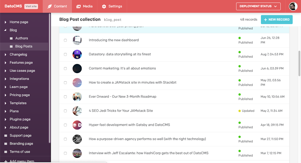
The same applies to the "new record" button, which now follows you as you scroll down the record list.
Collapsible record info panel
By separating the save and publish button from the rest, we considered the always visible record info panel no longer necessary. You can now hide it, offering you a cleaner and clearer editing experience.
Furthermore, this new approach allowed us to show you actions like deleting, duplicating, or unpublishing more explicitly.
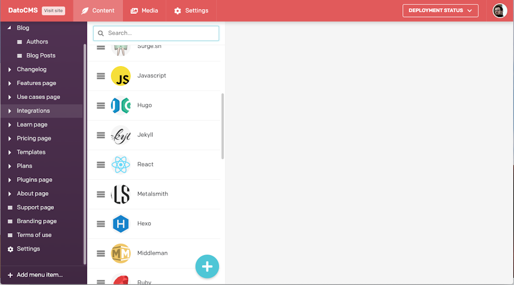
Simple search options
It is possible to set a more simplified search on records that do not need additional filters, such as the authors' page or, in our case, the integrations list.
Minor stuff
We have touched up other less visible aspects of the dashboard, as well as having revised the graphic element of the modals. We're probably going to tinker with them for quite a while, though.
What do you think? Do you like the changes? We're still testing everything even now that the update is live, so send us your feedback on Community!