How To Build a Landing Page in Next.js

In recent years, marketing campaigns have kept evolving and most of them now rely on landing pages. These pages are designed with conversion in mind and to guide users toward taking a particular action, namely the goal of the campaign. A landing page builder, allows you to create a reusable landing page template is not that difficult, and here you will learn how to build the landing page of your dreams in Next.js.
First, let’s learn what a landing page is. Then, let’s focus on what section it should contain and how to implement it in Next.js. Finally, let’s see what a landing page builder has to offer to you.
Follow this tutorial to learn how to build the following landing page.

Want to get started right away?
If you want to try it right away, you can install our landing page template. By clicking on the deploy button, DatoCMS will automatically clone the template to your Github account, create a DatoCMS backend, and publish it to Netlify or Vercel!


What Is a Landing Page Builder?
A landing page is a standalone web page where visitors “land” after clicking on a link coming from emails, ads, social posts, or other places on the web. Usually, such pages are specifically created with a goal in mind for a marketing campaign.
So, while generic web pages generally encourage exploration and might have many goals, landing pages focus on only one marketing goal. This goal is also known as a CTA (Call To Action), a marketing term used to define any design devised to prompt an action from the user.
In other words, users reaching your landing page are encouraged to take an action, such as buying your products, downloading a document, joining your newsletter, or clicking on some business-relevant links. A landing page can be considered successful if many users take the action it was designed for.
It is very common to create different landing pages for different purposes, like optimizing for different SEO keywords, so instead of createing multiple landing page templates, you can only create one template and repeat it, just using with different words and colors.
Now, let’s study the building blocks of a landing page.
What Elements a Landing Page Should Include
The recipe for a good landing page is simple. Let's see the section a landing page should have.
1. Header
The header section of a landing page typically includes a navigation bar (from now on navbar) containing the anchor links to the other sections included in the page. Its goal is to help the visitor traverse the landing page. The links contained in the header must be anchor links because you do not want your users to leave the page. The header section should also include your logo.

2. Hero
The hero section is the first thing users see when landing your landing page. In other terms, it represents the area that goes from the header to the next section, and it is generally designed to take up all the vertical and horizontal space on the screen. Its goal is to impress the visitor with its design and colors and lead them to the next section of the landing page, which is the one containing the CTA.

3. CTA
This is the most important part of a landing page and the only one that is really mandatory. This is where you want to guide your visitor so that they can take the action the landing page was designed for. The CTA section may be a list of products, a form, or a download link.

4. About
An optional section to add some details and better explain what the landing page is about.

5. Footer
A small section that typically includes links to the privacy policy or any mandatory information for GDPR reasons.

Landing Page Template in Next.js
So, let’s now learn how to build a landing page builder template in Next.js. In the following step-by-step tutorial, you will see how to craft a cool landing page designed entirely with Bootstrap.
Prerequisites
This is the list of all the prerequisites required for the demo application:
Next.js >= 12.x
React >= 18.x
Bootstrap >= 5.x
React Bootstrap >= 2.x
Building a Landing Page in Next.js and Bootstrap
You can clone the GitHub repository supporting the article and give a look locally at the landing page you are about to learn how to build by launching the following commands:
git clone https://github.com/Tonel/landing-page-template-nextjscd landing-page-template-nextjsnpm inpm run devThen, visit the http://localhost:3000 page in your browser to see the landing page.
Otherwise, keep following this how-to and build the landing page by yourself.
1. Initializing the Next.js Project
The best way to initialize a blank Next.js project is through Create Next App. This is the official and recommended way to generate a Next.js blank application, and you can easily initialize a project called landing-page-template-nextjs by launching the command below:
npx create-next-app landing-page-template-nextjsThe landing-page-template-nextjs folder should now contain the following file structure:
multi-language-blog-demo-nextjs├── README.md├── node_modules├── package.json├── .gitignore├── .eslintrc.json├── next.config.js├── public│ ├── favicon.ico│ └── vercel.svg├── styles│ ├── globals.css│ └── Home.module.css└── pages ├── _app.js ├── index.js └── api └── hello.jsNow, enter the landing-page-template-nextjs folder and launch the local server by running these two commands:
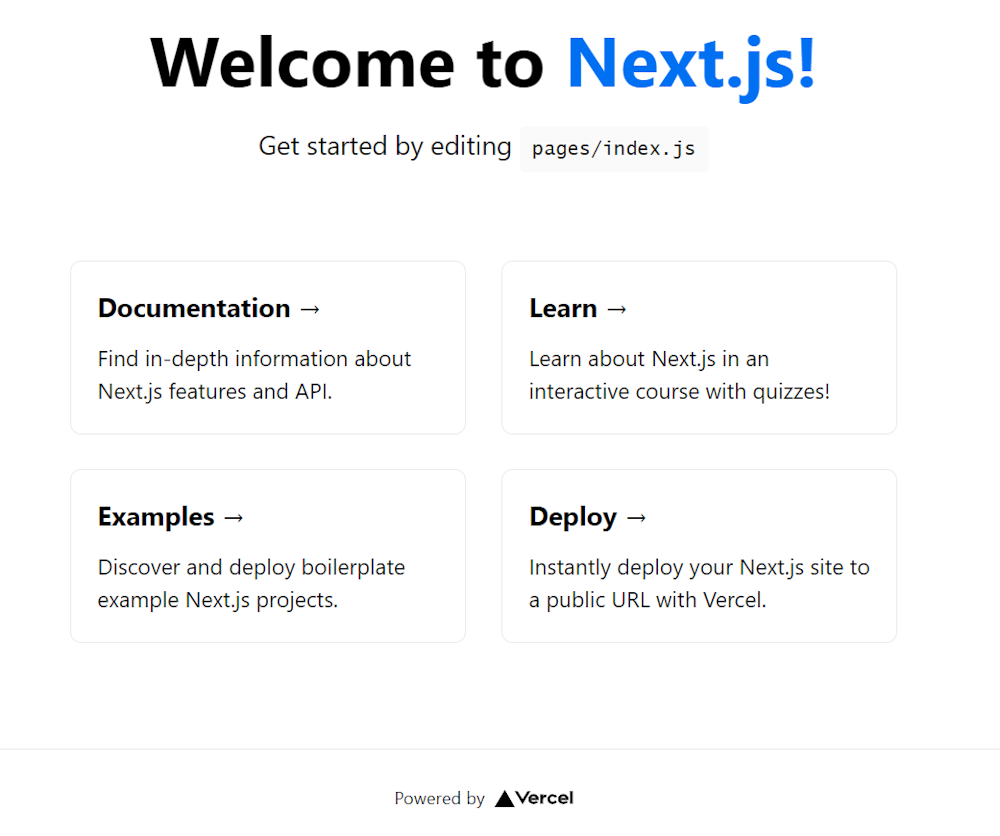
cd landing-page-template-nextjsnpm run devVisit http://localhost:3000/ in your browser, and you should be seeing the default Create Next App page below:
2. Building the Landing Page Components
First, let’s add the required dependencies. You can add bootstrap and react-bootstrap to your project’s dependencies with the following command:
npm install bootstrap react-bootstrapYour package.json file should now contain the required dependencies.
Let’s now delve deeper into how to implement each of the components the landing page consists of. The components the landing page depends on were inspired by this project.
Header
import React from "react"import { Container, Navbar, Nav } from "react-bootstrap"
export default function Header() { return ( <div className={"header"}> <Navbar bf={"light"} expand="md"> <Container> <Navbar.Brand href="/">Your Logo</Navbar.Brand> <Navbar.Toggle /> <Navbar.Collapse> <Nav className="m-auto"> <Nav.Link href="/#">Home</Nav.Link> <Nav.Link href="/#services">Services</Nav.Link> <Nav.Link href="/#about">About</Nav.Link> </Nav> </Navbar.Collapse> </Container> </Navbar> </div> )}
Hero
import React from "react"import { Container, Row, Col } from "react-bootstrap"import hero from "../assets/images/hero.png"import Link from "next/link"import Image from "next/image"
export default function Hero() { return ( <section className="section position-relative bg-light hero"> <Container> <Row className="align-items-center"> <Col lg={6}> <div className="pr-lg-5"> <h1 className="mb-4 font-weight-normal line-height-1_4"> Your Fantastic <span className="text-warning font-weight-medium">Landing Page</span> </h1> <p className="text-muted mb-4 pb-2"> Lorem ipsum dolor sit amet, consectetur adipisci elit, sed do eiusmod tempor incidunt ut labore et dolore magna aliqua. Ut enim ad minim veniam, quis nostrum exercitationem ullamco laboriosam, nisi ut aliquid ex ea commodi consequatur. </p> <Link href="#services"> <a className="btn btn-warning"> Find Out More <span className="ml-2">↓</span> </a> </Link> </div> </Col> <Col lg={6}> <div className="mt-5 mt-lg-0"> <Image layout={"responsive"} src={hero.src} width={1000} height={710} alt="" className="img-fluid mx-auto d-block" /> </div> </Col> </Row> </Container> </section> )}Notice that the “Find Out More” button leads to the CTA section below. This is what a hero section should do.
Also, this section might contain large images, and this is why the Next.js <Image/> component was used. Follow this to learn more about how image optimization works in Next.js.
Services
In this example, the CTA section is represented by the following list of services:
import React from "react"import { Container, Row, Col } from "react-bootstrap"import Service from "./Service"
export default function Services({ services }) { return ( <section className="section" id="services"> <Container> <Row className="justify-content-center"> <Col lg={6} md={8}> <div className="title text-center mb-5"> <h3 className="font-weight-normal text-dark"> <span className="text-warning">Services</span> </h3> <p className="text-muted"> Lorem ipsum dolor sit amet, consectetur adipisci elit, sed do eiusmod tempor incidunt ut labore et dolore magna aliqua. Ut enim ad minim veniam, quis nostrum exercitationem ullamco laboriosam, nisi ut aliquid ex ea commodi consequatur. </p> </div> </Col> </Row> {services.map((service, i) => { return <Service service={service} key={i} /> })} </Container> </section> )}The list of services is passed as a prop. So, the services to display are not hard-coded into the component, making this component more dynamic. In fact, you can retrieve this list from an API, for example. This way, by changing the service content in your content management platform, your landing page will update accordingly.
Then, this is what the Service component referenced in Services looks like:
import React from "react"import { Row, Col } from "react-bootstrap"import serviceImg from "../assets/images/service.png"import Image from "next/image"import Link from "next/link"
export default function Service({ service }) { return ( <> {service.id % 2 !== 0 ? ( <Row className={service.id === 1 ? "align-items-center" : "align-items-center mt-5"}> <Col md={5}> <div> <Image layout={"responsive"} src={service.img || serviceImg.src} width={1000} height={667} alt="" className="img-fluid d-block mx-auto" /> </div> </Col> <Col md={{ size: 6, offset: 1 }}> <div className="mt-5 mt-sm-0 mb-4"> <h5 className="text-dark font-weight-normal mb-3 pt-3">{service.title}</h5> <p className="text-muted mb-3 f-15">{service.description}</p> <Link href={service.url}> <a className="f-16 text-warning"> Try It Now <span className="right-icon ml-2">→</span> </a> </Link> </div> </Col> </Row> ) : ( <Row className="align-items-center mt-5"> <Col md={6}> <div className="mb-4"> <h5 className="text-dark font-weight-normal mb-3 pt-3">{service.title}</h5> <p className="text-muted mb-3 f-15">{service.description}</p> <Link href={service.url}> <a className="f-16 text-warning"> Try It Now <span className="right-icon ml-2">→</span> </a> </Link> </div> </Col> <Col md={{ size: 5, offset: 1 }} className="mt-5 mt-sm-0"> <div> <Image layout={"responsive"} src={service.img || serviceImg.src} width={1000} height={667} alt="" className="img-fluid d-block mx-auto" /> </div> </Col> </Row> )} </> )}In this example, the “Try It Now” buttons are the CTAs and what the users should be prompt to click.
About
import React from "react"import { Container, Row, Col } from "react-bootstrap"
export default function About() { return ( <section className="section bg-light" id="about"> <Container> <Row className="justify-content-center"> <Col lg={6} md={8}> <div className="title text-center mb-5"> <h3 className="font-weight-normal text-dark"> About <span className="text-warning">Us</span> </h3> <p className="text-muted"> Lorem ipsum dolor sit amet, consectetur adipisci elit, sed do eiusmod tempor incidunt ut labore et dolore magna aliqua. Ut enim ad minim veniam, quis nostrum exercitationem ullamco laboriosam, nisi ut aliquid ex ea commodi consequatur. </p> </div> </Col> </Row> <Row> <Col md={4}> <h2 className="font-weight-light line-height-1_6 text-dark mb-4">Lorem ipsum dolor sit amet</h2> </Col> <Col md={{ size: 7, offset: 1 }}> <Row> <Col md={6}> <h6 className="text-dark font-weight-light f-20 mb-3">Our Goal</h6> <p className="text-muted font-weight-light"> Lorem ipsum dolor sit amet, consectetur adipisci elit, sed do eiusmod tempor incidunt ut labore et dolore magna aliqua. Ut enim ad minim veniam, quis nostrum exercitationem ullamco laboriosam, nisi ut aliquid ex ea commodi consequatur. </p> </Col> <Col md={6}> <h6 className="text-dark font-weight-light f-20 mb-3">Our Strategy</h6> <p className="text-muted font-weight-light"> Lorem ipsum dolor sit amet, consectetur adipisci elit, sed do eiusmod tempor incidunt ut labore et dolore magna aliqua. Ut enim ad minim veniam, quis nostrum exercitationem ullamco laboriosam, nisi ut aliquid ex ea commodi consequatur. </p> </Col> </Row> </Col> </Row> </Container> </section> )}This section is totally optional, and you can omit it entirely.
Footer
import React from "react"import { Container, Row, Col } from "react-bootstrap"
export default function Footer({ links }) { return ( <section className="footer section"> <Container> <Row> <Col lg={4}> <div className="mb-4"> <p className="text-muted mt-4 mb-2">your-email@email.com</p> <h6 className="text-muted font-weight-normal">+1 555-2368</h6> </div> </Col> <Col lg={8}> <Row> {links.map((link, key) => ( <Col key={key} md={4}> <h6 className="text-dark mb-3">{link.title}</h6> <ul className="list-unstyled company-sub-menu"> {link.child.map((fLink, key) => ( <li key={key}> <a href={fLink.link}>{fLink.title}</a> </li> ))} </ul> </Col> ))}
<Col md={4}> <h6 className="text-dark mb-3">Our Address</h6> <p className="text-muted f-14">1234 Lorem Ipsum, 12345</p> <ul className="list-unstyled footer-social-list mt-4"> <li className="list-inline-item"> <a href="src/app/components/Footer#"> <i className="mdi mdi-facebook"></i> </a> </li> <li className="list-inline-item"> <a href="src/app/components/Footer#"> <i className="mdi mdi-instagram"></i> </a> </li> <li className="list-inline-item"> <a href="src/app/components/Footer#"> <i className="mdi mdi-linkedin"></i> </a> </li> </ul> </Col> </Row> </Col> </Row>
<Row className="mt-5"> <Col md={12}> <div className="text-center text-muted"> <p className="mb-0 f-15">{`©${new Date().getFullYear()} - Your Company Name`}</p> </div> </Col> </Row> </Container> </section> )}Similar to what was explained with the Services component, the Footer component depends on the links prop and can be dynamically updated at will.
3. Putting It All Together
Now, let’s see how to use the components implemented above to build your landing page. Create a index.js file under the pages folder representing your home page and define it as follows:
import Layout from "../src/app/components/Layout"import Header from "../src/app/components/Header"import Hero from "../src/app/components/Hero"import Services from "../src/app/components/Services"import About from "../src/app/components/About"import Footer from "../src/app/components/Footer"import serviceSource from "../src/app/assets/services.json"import footerSource from "../src/app/assets/footer.json"
export default function LandingPage({ services, footerLinks }) { return ( <Layout pageTitle="Landing Page Template in Next.js"> <Header /> <Hero /> <Services services={services} /> <About /> <Footer links={footerLinks} /> </Layout> )}
export function getStaticProps() { // in a real-world scenario retrieve the service list // by calling an API or performing a query const services = serviceSource
// retrieving the footer link list ... const footerLinks = footerSource
return { props: { services: services, footerLinks: footerLinks, }, revalidate: 60, }}As you can see, all you have to build your landing page is using the components presented above one below the other.
For the sake of simplicity, the service and footer link lists were retrieved from two JSON files. In a real-world scenario, you should retrieve this them more elegantly with a couple of API calls or by performing two queries in getStaticProps(). In this last case, you should use the revalidate option and take advantage of the Next.js incremental static regeneration approach. This way, your landing page will be static, fast and updated accordingly every 60 seconds.
Et voilà! Your fantastic and exciting landing page is ready to be deployed.
Why You Need a Landing Page Builder
As learned above, landing pages all share the same recipe. This is why the ideal solution when it comes to building landing pages would be to define a template that works and tweak it accordingly based on your goals. But this is something that only a landing page builder can provide you with.
Designing a new landing page from scratch for each marketing campaign takes time and money. This is why following the traditional approach to landing pages and ignoring advanced tools feel like reinventing the wheel.
On the other hand, adopting a landing page builder make everything easier and speeds up the implementation of your marketing campaigns. Also, an effective landing page builder allows you to deal with multi-site management and share the same landing page template on different websites by changing colors and text.
Now, let’s find out more about DatoCMS, the headless CMS landing page builder you were looking for.
DatoCMS: The Landing Page Builder You Dreamt Of
DatoCMS is a headless CMS that comes with advanced features specifically designed for developers and marketers. In detail, it allows you to define reusable components you can then use to create dynamic templates for one-page websites, landing pages, case study pages, and testimonial pages. Learn more about what DatoCMS has to offer when it comes to building dynamic layouts with modular blocks.
So, with DatoCMS your content management team can create a template project, link it to a frontend project, and duplicate it indefinitely. This means that several pages on your website could share the same template. But all pages should be different, and this is why DatoCMS also equips you with the ability to change colors, language, text, and much more.
Also, keep in mind that DatoCMS is much more than just a landing page builder. So, its headless CMS capabilities enable you to use the same template for different projects. This means defining an effective landing page once and then spreading it across all your websites. Also, you could use DatoCMS to manage the content, instead of using JSON files as in the example above.
Get started right away with our out-of-the-box template.
Conclusion
In this article, we learned what is a landing page, what elements should contain, and how to build a landing page template in Next.js. Although achieving this required just a bunch of lines of code and cannot be considered a difficult task, it comes with some pitfalls. So, if you are looking for a more scalable and reliable solution you should consider adopting an advanced, easy-to-use, and complete landing page builder CMS, such as DatoCMS.
Thanks for reading! We hope that you found this article helpful. Feel free to reach out to us on Twitter with any questions, comments, or suggestions.

- Want to get started right away?
- What Is a Landing Page Builder?
- What Elements a Landing Page Should Include
- 1. Header
- 2. Hero
- 3. CTA
- 4. About
- 5. Footer
- Landing Page Template in Next.js
- Prerequisites
- Building a Landing Page in Next.js and Bootstrap
- 1. Initializing the Next.js Project
- 2. Building the Landing Page Components
- 3. Putting It All Together
- Why You Need a Landing Page Builder
- DatoCMS: The Landing Page Builder You Dreamt Of
- Conclusion

