Customer Stories
On powering offline wayfinding


In conversation with Ivan Leider (Director of Engineering) and Maximilian Benner (Engineering Lead)
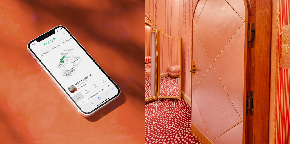
When Printemps, one of France’s most iconic retailers, decided to open its first US location at One Wall Street in New York, they didn’t just want to bring their heritage. They wanted to push the in-store experience forward. That meant rethinking what it could feel like to navigate and explore a physical retail space, and what role digital tools could play in supporting that.
This wasn’t about signage or paper maps. Printemps wanted a wayfinding system that felt integrated into the space itself. One that helped visitors find their way around the store. One that could live on in-store digital screens, flow naturally into a mobile experience, and stay connected to their broader digital ecosystem.
Doesn't sound like your classical Headless CMS use case, does it?
But that's where L+R coming into the picture changes things.
After having collaborated with Printemps for years, Ivan Leider and Maximilian Benner worked closely with the team to design and build an interactive wayfinding system. A system flexible enough to handle future updates. Simple enough that the Printemps content team could maintain it themselves. And robust enough to connect with other parts of the business like their e-commerce brand directory.
This wasn’t the usual website build. And that’s exactly what made us love everything about it.
Rethinking wayfinding as content architecture
The goal from day one was to avoid thinking about the wayfinding app as just a navigation tool. It needed to feel connected to the rest of the Printemps digital stack. The same data powering the in-store screens should also feed the QR-based mobile experience. If the brand directory was updated, that change should show up everywhere.

But keeping this kind of content in sync is where a lot of projects stumble. If you’re duplicating content across platforms, you’re setting yourself up for overheads. Updates get missed. Teams waste time. Things fall out of sync.
The philosophy behind the wayfinding setup was that it should house everything related to the in-store experience — not just maps, but brand directories and other services.
The approach that Ivan and Max took was to model the wayfinding app almost like a database, not a website. Content was structured around the real entities that existed in the store. Brands. Rooms. Amenities. Services.
Each of these existed as their own object.
Each could reference the others where needed.
That meant if a brand moved from one room to another, there was only one place to change it. No chasing down templates. No editing multiple pages. One update in the CMS, and the change was live across every endpoint that used that data.
Adding DatoCMS into the mix
L+R had used DatoCMS on previous projects, so there was already trust there. But for this project, it wasn’t about familiarity. It was about fit.
For Max, the choice came down to keeping the CMS focused on content, not on layout decisions. The last thing they wanted was a system where content editors could accidentally break the design or introduce inconsistencies. The design was already solved by the UX and creative teams. What the editors needed was a clean, structured way to manage the data that the app would use.
One of the reasons we like DatoCMS is because we model it as if it were a database. We reason about it in relational terms, not as collections of pages.
DatoCMS hit the sweet spot. It gave the flexibility to model complex relationships between brands, locations, and services, but it never pushed into the territory of making design choices. Content editors could update the information they needed without worrying about breaking the app.
That balance between developer control and editorial ease was what made DatoCMS feel like the right choice. It stayed out of the way when it needed to but gave just enough power to make the system flexible.
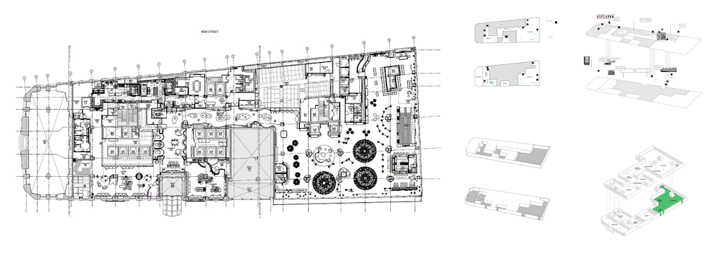
Modeling the physical space
The physical world rarely maps neatly onto digital structures. Rooms aren’t pages. Brands don’t just sit in folders.
So Max and the team modeled the CMS around the reality of the store itself.

Rooms existed as their own entity. Brands as their own entity. Amenities, services — all with their own records, fields, and relationships.

The relationships between these objects were the glue that held the system together.
The approach was simple on paper, but the impact was huge. Because the data was relational, not page-based, the same dataset could power in-store kiosks, the mobile wayfinding app, and even the Printemps e-commerce site’s brand directory. The CMS wasn’t just managing screens. It became a source of truth for how the store was organized.
Keeping the stack minimal
Part of what made the project work so smoothly was how deliberately minimal the stack was. The internal team at Printemps was lean. People were wearing multiple hats. Adding unnecessary complexity wasn’t going to help anyone.
The core stack was built around DatoCMS for content, paired with a frontend setup that could pull data via GraphQL and render across multiple endpoints. Everything was designed to reduce friction.
When it came to map rendering, Max pulled some big brain moves.
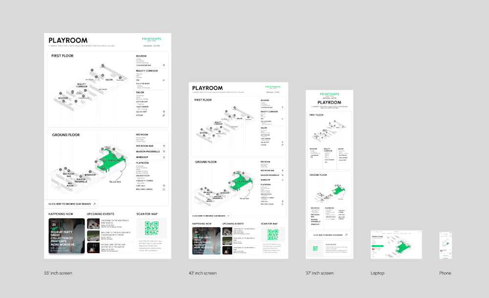
They used JS DOM in Node.js to pre-render different map states as static assets. This let them optimize performance while keeping the interactive experience intact. Visitors could see highlighted rooms, brand locations, or specific amenities, all without waiting for the browser to do the heavy lifting.
Instead of generating these maps on the fly, the system pre-baked them based on the content in DatoCMS. That meant faster load times, less client-side work, and a smoother experience across devices.
Custom previews
One of the standout features of the project was the preview environment. But interestingly, this wasn’t built inside DatoCMS using the common Web Preview approach. The team wanted previews that would reflect the true resolution and layout of the in-store screens.
We use DatoCMS fully stock: no plugins, no custom extensions. It provides all the baseline functionality we need without getting too specialized. We built a custom preview environment that mirrors the actual in-store screens at true resolution. Editors can see exactly how their updates will look before they publish.
Rather than trying to force that into the CMS itself, they created a dedicated preview page on the frontend. Editors could view scaled versions of the actual screens, rendered at the correct resolutions, and see exactly how their content would look before publishing.
This approach let them avoid overcomplicating the CMS. They didn’t need extra plugins. They didn’t need to hack around the editorial interface. DatoCMS handled the content. The frontend handled the preview.
It was a clean separation of responsibilities, and it worked.
CMS experience that actually works
From the beginning, the team took what they called a bottom-up approach to the content model. Instead of throwing in every possible feature or configuration, they started with the bare minimum required. If the content team at Printemps needed more flexibility, they could always add it later.
That helped avoid the classic CMS problem of overwhelming editors with too many options. The system only exposed the controls that were genuinely useful. Editors didn’t need to worry about layout decisions or frontend configurations. Their job was to keep the content accurate and up to date. The app would handle the rest.
If a brand moves locations in the store, editors just change that in the brand collection and the update propagates everywhere automatically — across screens, mobile, and wherever else it’s surfaced.
This also made onboarding smoother. Even for editors who weren’t familiar with headless CMS workflows, the setup was intuitive. If something in the store changed, they knew exactly where to go to update it. There was no confusion about what data lived where.
Throughout the build, the focus stayed on performance and reliability. The map pre-rendering handled the biggest potential bottleneck right at the source. The CMS setup was lean, relying on DatoCMS’s native features without unnecessary overhead.
Ivan pointed out that one of the reasons they trusted DatoCMS for this project was because they didn’t have to think twice about security, performance, or API stability. If they’d needed to solve those problems manually, it would have added significant overhead. Instead, DatoCMS gave them a solid foundation to build on without getting in the way.
The architecture was also flexible enough to support future growth. The same data that powered the wayfinding app could easily feed other systems like ecommerce integrations, additional touchpoints, and future store expansions.
This build hits different
For Max and Ivan, what stood out about this project wasn’t just the technical stack. It was how well the architecture fit the problem.
The CMS wasn’t treated as an afterthought or a place to dump content. It was the backbone of the system. The data modeling respected the reality of the physical space. The editorial experience respected the needs of the people managing that space.
Everything about the implementation favored simplicity and clarity. No unnecessary abstractions. No overengineered solutions. Just a clear path from content to experience.

In the end, the Printemps wayfinding app works because it’s designed around the right questions. How do you keep content in sync across channels? How do you make updates easy for editors without putting too much power in the wrong places? How do you structure a CMS to reflect a physical space, not just a digital one?
The way we’ve structured the CMS means it’s ready to support other integrations down the line, whether that’s e-commerce or additional in-store features.
For L+R, the answer was to treat content as data. To focus on structure over layout. To keep the stack minimal, but flexible enough to grow.
DatoCMS gave them the tools to do that. But it was the architecture and the decisions around that tooling that made the project shine.

