Preem wanted to take the next step digitally and make it easier for both private and business customers to find the right information and services. We saw an opportunity to transform a heavy and difficult-to-navigate website into a fast, clear and brand-strengthening platform.
The result is a website that loads quickly, is easy to maintain and guides customers all the way – while reflecting Preem’s role as Sweden’s leading fuel company.
OUR MISSION
Preem is in the process of reorganizing its digital channels to create a more unified, user-friendly and business-driving customer experience. In the transition, preem.se is one of the most important communication channels for both private and corporate customers. The website will not only reflect Preem's updated brand identity, it will also streamline user journeys by allowing Preem's different target groups to quickly find what they are coming to the site to do, increase conversion and make it easier to launch new functionality quickly.
Rebel and Bird was commissioned to realize this transition: from a difficult-to-navigate site with costly management, to a fast and engaging digital experience that delivers clear customer benefit and at the same time contributes to Preem's business.
THE CHALLENGE
The previous version of preem.se was technically outdated and filled with content that had become irrelevant over time. Many important flows and services, such as finding a station or renting a trailer, were not adapted to the needs of users. The technical platform also did not follow Preem's overall strategy and limited the ability to quickly deliver new functionality to the business.
To create a solution that supports Preem's long-term ambition to offer the services and functions that customers expect, at the right time, in the right channel, a holistic approach was needed where content, technology and design work together based on a service design process with clear goals.
ABOUT THE DESIGN
The design for the new preem.se is not just about giving the site a new look, but about creating an experience that is easy to navigate for users based on a clear target group adaptation and copy.
The work began by exploring and identifying needs together with Preem, which was supplemented with qualitative and quantitative data that gave us a lot of valuable insights. Through workshops, analysis of user data and target group segmentation, we were able to map where friction arose in the user journey and which functions had the potential to be developed to deliver greater value.
The old site lacked a clear structure and visual logic. Many important services were located far down in the hierarchy or were hidden behind clicks that did not follow an intuitive path. Our first step was therefore to restructure all content, both informationally and visually. We developed a new content structure and navigation that better supports visitors' intentions. Clearer paths to well-used services, stronger visual hierarchy with page templates adapted to purpose, goals and target groups.
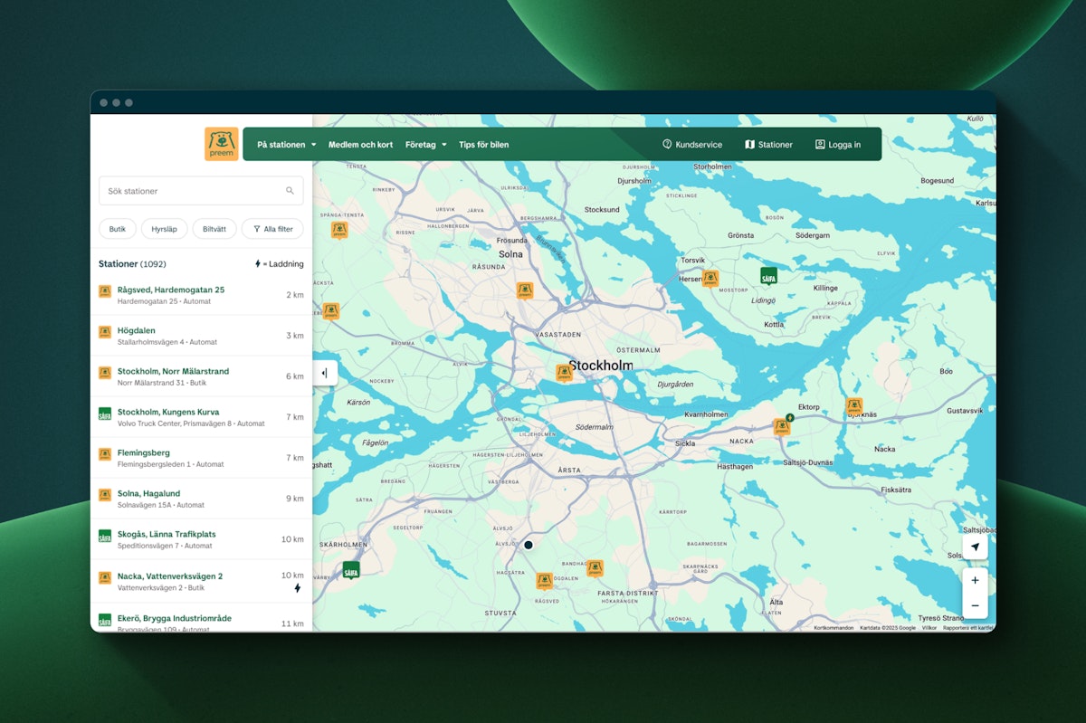
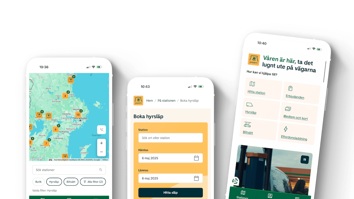
A particular focus was on features such as “Find a station” and “Book a rental trailer” – two services where we saw great potential to improve both user experience and conversion. Here we worked with clickable prototypes and MVP launch in close dialogue with Preem.
We further developed our previously developed design system and greatly expanded it in both scope and level of detail. More components, improved structure, accessibility adaptation according to WCAG 2.2 and clear guidelines ensure that everything from the home page to individual product pages is connected.
CREATING CONTENT
In order for the website to convert, a lot of work was required on the site's content. We started by taking inventory and clearing out everything that did not add value to the customer and business, and then focused on creating content that was clear and relevant.
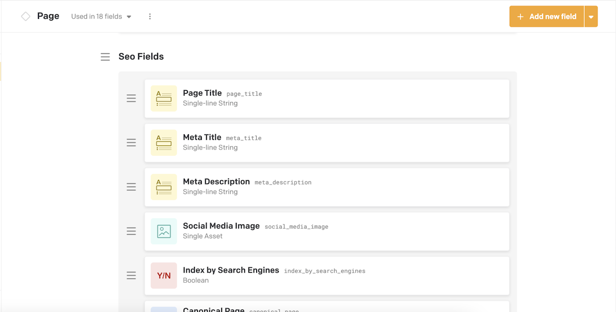
Each page type was designed with a clear function in mind, adapted to the needs of the target group and Preem's business goals. Texts were rewritten to simplify, clarify and help users towards the desired action. SEO optimization was done in parallel, without compromising on tonality or readability.
Since Preem is a social actor, very high demands are placed on the quality of the content. Therefore, we worked closely with Preem's brand and legal teams to ensure that the content complies with the law and strengthens user trust.
TECHY STUFF
Technically, we chose to build the site with Gatsby, a framework that is suitable for sites with high performance requirements. Hosting is via Netlify, which provides fast loading times, stable operation and an efficient build flow.
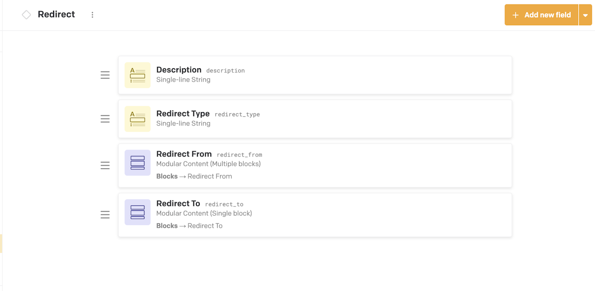
After an extensive evaluation, we chose DatoCMS as the headless CMS. This is a flexible and easy-to-use system that facilitates both editorial work and further development.
RESULT AND NEXT STEP OF THE JOURNEY
The new version of preem.se was launched with a completely new look, better user experience and a clearer focus on the most business-critical functions.
Flows that previously did not convert have now started to deliver results. “Book a rental trailer” is a clear example where the conversion rate increased from 0.7% to over 26% after launch. Preem’s editors have had a smoother working day and customers, both private and corporate, are met with an experience that is clear, easy and engaging.
Together with Preem, we now continue to further develop more features, improve user journeys and expand the content. By working exploratory and data-driven with a focus on customer benefit and business goals, we build on what we have created step by step towards a cohesive digital Preem.
